Readers:
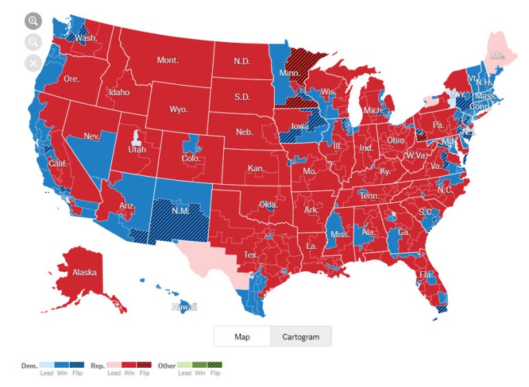
Last week, The New York Times published an interactive map for the 2018 Midterm Elections. The map and story were titled House Election Results: Democrats Take Control.
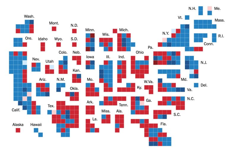
You were given two ways to view the results: one as a map and the second as a cartogram (see screenshots below).
I really enjoyed the cartogram, and there was a lot of discussion about it on Twitter.
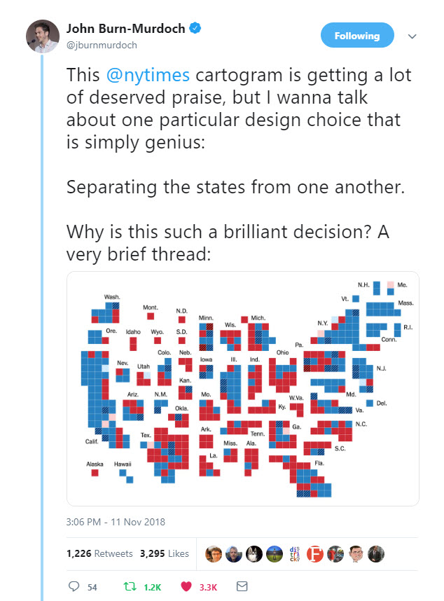
 One opinion was provided by John Burn-Murdoch, Photo, right. Mr. Burn-Murdoch creates stories, stats, and scatterplots for @FinancialTimes. He is currently working on bias in AI.
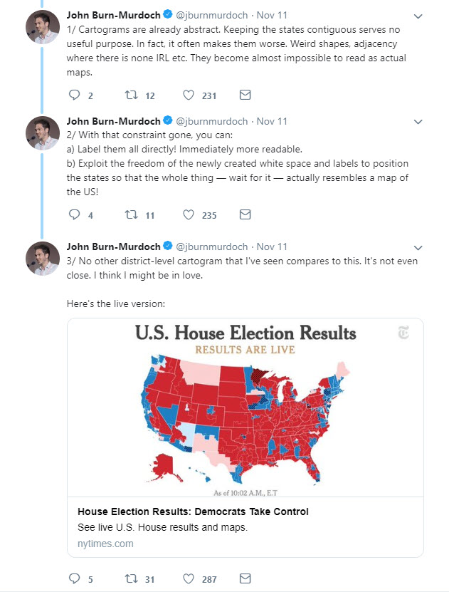
I have included screenshots of his observations in his Twitter thread below.
I really appreciate his thoughts on this and it provided me additional insights on why and how to view a cartogram.
Enjoy!
Michael