
Information is Beautiful Awards – Your Chance to Vote
Readers:
Some of the year’s best data-visualizations, interactives and scrollytellings have made the Information is Beautiful Awards 2018 Shortlist.
The last day you can vote is this Friday, October 19th. The winners will win the Community Award at their ceremony in New York on Dec 4th. Your vote and all other visitor clicks represent five virtual people on their panel of 45+ expert judges.
Here are a few of my favorites by category.
Best Regards,
Michael
Arts, Entertainment & Culture
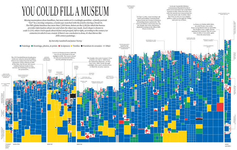
You Could Fill a Museum
by Bloomberg Businessweek
Missing masterpieces draw headlines, but most stolen art is crushingly quotidian-a family portrait “lost” by a moving company, a landscape snatched with the jewelry during a break-in. The FBI’s database global database contains more than 7,200 items – Stradivarius violins, Calder mobiles, Tiffany lamps, and at least one clown painting.
Credits: James Tarmy, words
Award: Kantar Information is Beautiful Awards 2018
Categories: Shortlist Longlist Arts, Entertainment & Culture
See more: http://iibawards-prod.s3.amazonaws.com
Breaking News
Florence Tracker: Latest maps show hurricane path and rainfall
by The Guardian
Florence was downgraded to a tropical storm on Friday evening, but still had sustained winds of 70mph.
First published: September 11, 2018
Credits: Niko Kommenda, Pablo Gutiérrez and Daniel Levitt, edited by Lydia Smears and Josh Holder – The Guardian
Award: Kantar Information is Beautiful Awards 2018
Categories: Shortlist Longlist Breaking News
See more: http://www.theguardian.com
![]()
Humanitarian
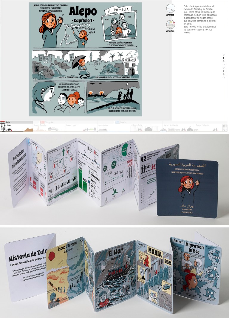
Historia De Zainab
by Visualizar
This comic wants to make visible the exodus of Zainab and her family who, like another 11 million people, have been forced to leave their home since the war in Syria began in 2011.
This story and its protagonists are based on real cases and events.
Credits Web: Sergio Galán, Illustrations: Victor Valles, Infographics: Ferran Morales, Mentor: Ignasi Mayor, Data: Amanda Figueras , Aránzazu Cruz, Mª Carmen Peñaranda, María Luisa Ocaña, Camino Prieto, PorCausa, Medialab Prado, Visualizar
Award: Kantar Information is Beautiful Awards 2018
Categories: Shortlist Longlist Humanitarian
See more: http://www.historiadezainab.org
Leisure, Games & Sport
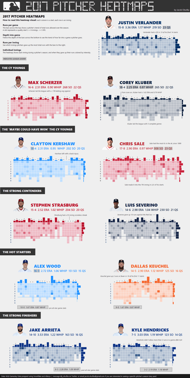
2017 MLB Pitcher Heatmaps
by Decisive Data
Visualize various top pitchers performances throughout the 2017 season using these versatile heatmaps. You can easily see patterns around when pitchers gave up runs throughout the season from a number of different lenses.
Credits: Jacob Olsufka
Award: Kantar Information is Beautiful Awards 2018
Categories: Leisure, Games & Sport Shortlist Longlist
See more: public.tableau.com
Maps, Places & Spaces
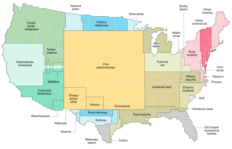
Here’s How America Uses Its Land
by Bloomberg LP
How do Americans use their land? Bloomberg’s exploration uses a series of unique 8,000-pixel maps in a distinctive, scrolling web experience.
A mash-up of the latest data from the U.S. Department of Agriculture’s Economic Research Service and the Interior Department’s National Land Cover database, the final product is a compelling analysis of our 2 billion-acre jigsaw puzzle of cities, farms, forests and pastures.
What takes up the most space? Cows.
Forty-one percent of land in the contiguous states revolves around livestock and livestock feed. What about land used to grow crops we eat? It’s almost an afterthought in U.S. overall land use, just 4 percent of the contiguous states. A slightly bigger area, at 6 percent, is designated for park and wilderness areas. Side by side, all U.S. golf courses would be larger than Delaware.
Lauded on social-media equally for its information as well as its presentation, educators, foresters, environmentalists, politicians and farmers found something to marvel at in this non-partisan look at the country.
Credits: Dave Merrill, Lauren Leatherby
Award: Kantar Information is Beautiful Awards 2018
Categories: Maps, Places & Spaces Shortlist Longlist
See more: http://www.bloomberg.com
People, Language & Identity
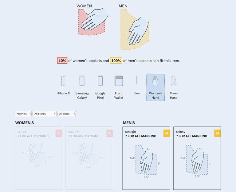
Women’s Pockets are Inferior
by The Pudding
Few things are more frustrating than collecting your belongings only to realize that your pants pockets can’t fit them. For wearers of women’s clothes, the struggle is real. Like many things on the internet, we could find complaints and anecdotes galore but little data to show just how inferior women’s pockets are. So, we went there. We measured men’s and women’s pockets in 20 of the US’ most popular jean brands. On average, women’s front pockets are 48% shorter and 6.5% narrower than men’s.
Credits:
Award: Kantar Information is Beautiful Awards 2018
Categories: Shortlist Longlist People, Language & Identity
See more: http://www.pudding.cool
Science & Technology
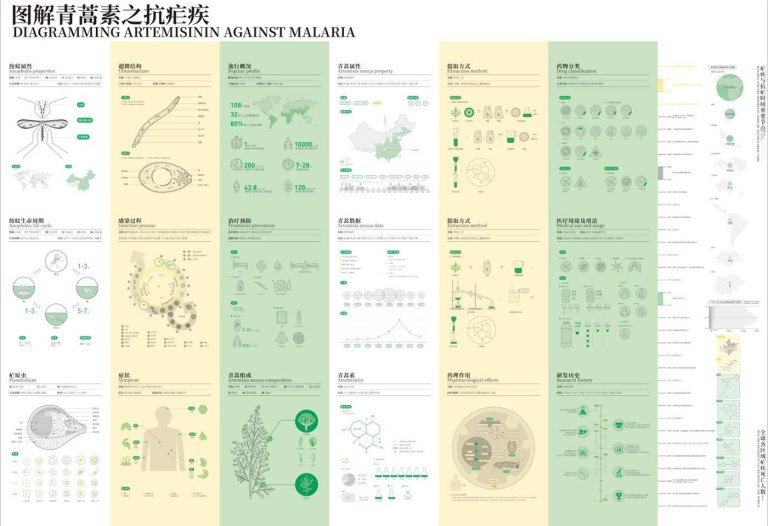
图解青蒿素之抗疟疾(Diagramming Artemisinin Against Malaria)
by 南京艺术学院
Artemisinin is the most effective means of treating malaria. For the knowledge of artemisinin and malaria, I use the information visualization form to graphically express the pharmacological effects between them, and clearly understand the pharmacological knowledge of artemisinin and malaria.
Credits: 余丹花(Yu Dan Hua)
Award: Kantar Information is Beautiful Awards 2018
Categories: Shortlist Longlist Science & Technology
See more: http://www.behance.net
Unusual
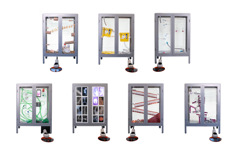
The Long Run
by The BMA, The BMJ
A physical dataviz installation that represents the cost of health care for different age groups, based on the time it takes for a marble to fall. Each of the 7 runs represents a different decade of life, and the fall time represents the average cost of care to the UK’s National Health Service, for a person in that year of their life. Each run is constructed from medical equipment. It was commissioned to mark the NHS’s 70th Birthday on the 5 July 2018.
Credits: Will Stahl-Timmins – commissioner Tom Chambers – design and build Theo Papatheodorou – design and build Jesse Wolpert – design and build
Award: Kantar Information is Beautiful Awards 2018
Categories: Unusual Shortlist Longlist
See more: http://www.youtube.com
Visualization & Information Design
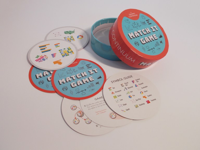
Match It Game
by Jonathan Schwabish
This fast-paced, data visualization-themed game consists of 31 cards with 6 chart icons on each. There is one and exactly one identical chart icon on any two cards. It’s up to you to find the match.
There are multiple ways to play. The basic game is as follows: Each person takes one card and places it face down in front of them. The rest of the deck is placed face up between the players. Each player flips over his or her card–the first person to find the matching chart icon takes the card off the top of the center pile. The game continues until the deck is gone. The person with the most cards wins.
Each deck comes with a glossary of chart types so you can become familiar with the different icons.
Credits: Severino Ribecca, https://datavizcatalogue.com/
Award: Kantar Information is Beautiful Awards 2018
Categories: Shortlist Longlist Visualization & Information Design
See more: http://www.policyviz.com

Thank you very much for recommending Historia de Zainab’s work, it’s a pity that we did not do the English version, some texts are from interviews in Greek refugee camps of the ONG Por Causa
Your work is still incredible regardless if it is not in English! 🙂
Hello Michael
I made an interview where I explain how we do the work, I think you may be interested.
Thank you very much for the mention once more
https://onlinejournalismblog.com/2018/03/09/ferran-morales-refugees-data-journalism/#more-25568
Thanks !!!!