Joey Cherdarchuk Bio
Joey Cherdarchuk is a co-founder and the design lead at Darkhorse Analytics. A data visualization expert, his work has been featured in Fast Company, the Huffington Post, and the Washington Post. His Breathing City graphic was shortlisted for an Information is Beautiful award. Joey developed his design expertise after a 15-year quantitative analysis and consulting career. It is this analytical foundation that helps him create visuals that are both clear and engaging. He offers training on data visualization and his Data Looks Better Naked series is used in visualization curricula around the world. He is a sought-after speaker and lectures on Data Visualization at the University of Alberta.
![]()
QUESTIONS
Michael: Hi Joey. Can you tell my readers what you do at Darkhorse Analytics? Also, can you tell us a bit about Darkhorse Analytics as well?
Joey: Darkhorse started out primarily focused on analytic consulting, hence the name. But we began to notice that just doing the analysis and providing the “right answer” wasn’t always enough. People needed to understand the data or the process or the answer itself better before they would act on our recommendations. Visualization was the key that unlocked that understanding for our clients and ensured our work actually had an impact.
I spearheaded our dive into visualization and how to effectively communicate with data for our analytics projects and now we create bespoke visualization tools for others to explore and communicate their own data. My current role involves designing and managing the development of these interactive tools.

Michael: I really love The Opportunity Atlas your company developed. Can you tell us a bit about The Opportunity Atlas, how your company got involved, and the process involved to create this site?
Link: https://www.opportunityatlas.org/
Joey: Thanks, we’re quite proud of the Atlas as well. We were fortunate that the incredibly smart folks at Opportunity Insights gave us the chance to work with them and their amazingly detailed data. We were among a few firms recommended to them by someone at the New York Times and, after some initial discussions on how we would approach the project, they eventually choose us to collaborate on creating this interactive.
With any project you need to start by understanding your Audience, your Purpose, and your Data.
With any project you need to start by understanding your Audience, your Purpose, and your Data. Opportunity Insights (OI) had large volumes of data in extremely fine geographic detail. They wanted to enable policy-makers and practitioners to better understand where and why opportunity exists and how to increase equality of opportunity in their own cities and towns. But they also wanted to engage the public showing them how neighborhoods can shape a child’s future economic and education success.
Finding ways to deal with mapping that volume of data and to engage and enable a couple of different audiences were the major technical and design hurdles we needed to overcome. We spent a lot of time discussing and iterating with the OI team and getting feedback from potential users to really hone in on what made sense and what was confusing, what worked and what would enable them to accomplish even more.
In the end we introduce the interactive with simple steps to find yourself in the data but created a number scrolling stories to tour people through some of the data’s findings and introduce policy-makers to some of the more powerful functionality within the tool. A number of the features stay tucked away until they are needed, keeping the interface from overwhelming first time or casual users.
It’s incredibly rewarding to work on something that doesn’t just look cool, but could actually help change lives.
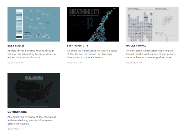
Link: https://www.darkhorseanalytics.com/portfolio/breathing-city?rq=breathing
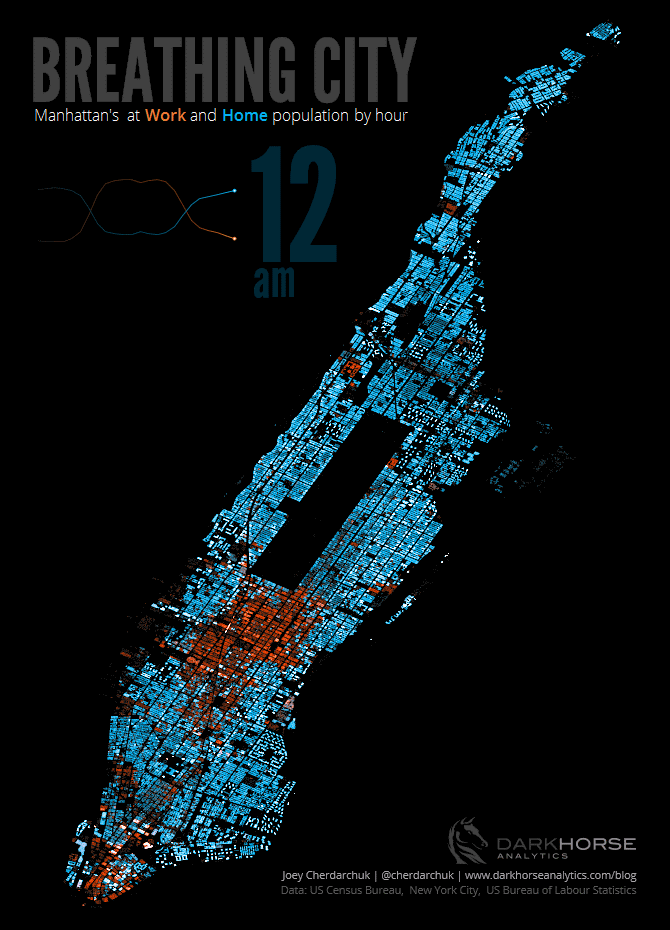
Michael: Your Breathing City data visualization was shortlisted for an Information is Beautiful Award. Can you tell us a bit about the challenges for creating this dataviz and how you were able to provide a solution?
Joey: This visual was actually inspired by a blog post from Conveyal. It showed how they were able to take block level census data for New York and distribute it into the actual building footprints which added a sense of realism to otherwise staid data. Seeing that I wanted to bring in a sense of the life and movement that happens throughout a day in Manhattan.
The first challenge, as with most projects, was finding and collecting the appropriate data. Just to recreate what Conveyal had done involved finding data on population, employment, land-use, and building footprints and writing custom scripts to combine and give precise locations to the data from these disparate sources.
However, to create the sense of the flow over a 24 hour period required that I join that data with additional information on work activity and workday hours. After finding that data I had to simulate the schedules of the 3.5 million people living and working in Manhattan which I did using MSExcel.
Then of course we have to bring that data to life. I actually found it easiest to map and chart the data with MSExcel. Taking screen grabs from the static Excel maps and charts for each of the days 24 hours, and putting them together in some photo editing software, allowed me to visualize the pulse of the city with the looping animated gif.
And finally finding the right chart to visualize the aggregate level data took some time. After trying bar charts, area charts, and line charts, I finally landed on the idea a heart-rate monitor style chart, which fit nicely with the breathing city theme.
Michael: What are some of the primary toolsets your team uses to create their data visualizations? For people just entering the data visualization profession, what toolsets do you recommend they start learning?
Joey: My go to tool is Microsoft Excel. I use it to clean data, explore data, chart data and often times design or prototype the interactives we build. But I do that because it is what I’ve spent my career using, so I can get to my results quicker due to its familiarity. I’ve also started using Figma more often as I design our tools because of its sharing and collaboration features. To build our interactives we most often use D3 for the visuals and Mapbox for more detailed mapping.
Depending on the project and who is on the team we may use Python, R, QGIS, Tableau, or something else to help us along the way. I think becoming intimately familiar with a tool is more important than which tool you choose. Intimate knowledge allows you to explore the solution space faster and wider. But if I were to start from a blank slate, I’d probably say learn R and/or Tableau for data prep and exploration, and learn D3 for creating interactive visuals.
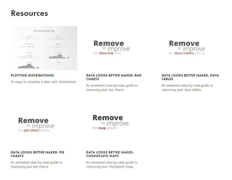
Michael: I really love your Data Looks Better Naked videos. I have even used them as examples in some internal presentations I have done at work. Are you going to be creating more of these in the near future?
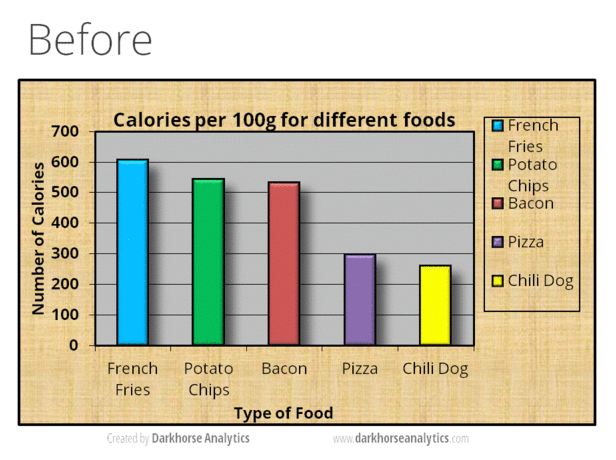
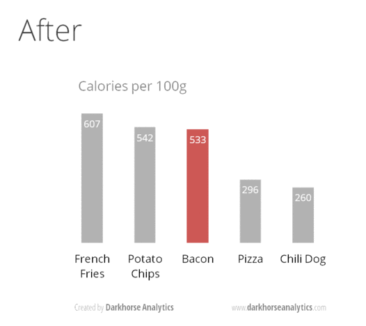
Joey: That series has been great fun to put together and use in my own teaching. There is something very satisfying and intuitive about progressively removing elements and watching things become clearer as a result.
I’m not sure if there will be more in the future. Charts, tables, and maps each have their own nuances that warranted a separate graphic. And while pie charts was entertaining, most basic chart types will follow the same guidelines as the bar chart and I’m not sure I want to introduce that repetitiveness to the series. If I ever find the right flow chart/ org chart example, I think that might make a good addition. And of course I’m open to suggestions, I’m sure others have inspiration that has passed me by.
Link: https://www.darkhorseanalytics.com/blog/data-looks-better-naked
Michael: What are five top recommendations you would give to someone who is just about to start having to create a data visualization?
Joey:
Know your data
The data may contain new insights but it may also limit what you can communicate, becoming intimately familiar with it will ensure you know its limits and its stories. Learn where it came from, how it was collected. Ask what is really being measured.
Visualize early and often
Visualization allows us to see in our data what tables of numbers and statistical figures don’t as Anscombe’s Quartet nicely illustrates. It can assist in: Identifying and addressing missing and incorrect data; exposing changes and shifts in data collection processes; spotting and understanding outliers and anomalies; and revealing patterns and trends.
Know your audience
What is their background knowledge? How interested or invested are they in the topic or the data? How familiar are they with the data? How familiar are they with the visuals you are using? What kind of context will be helpful to them? How will it be used? Understanding them will help you craft something they engage with and comprehend.
Know your purpose
What points do you want to get across? What information is most important to share? What are you looking to reveal? These questions will help ensure what you create isn’t just pretty to look at, but actually makes an impact.
Ask what can I eliminate?
Less is more. Our message is often strengthened by focusing it. Less decoration, can make something more attractive. Less information can make something have more impact. Asking, do I really need this?, does this add to the effectiveness? will hone your visuals even further.
Michael: What is next on your “To Do” list? What can the Tableau community expect to see from you in the near future?
Joey: After the big push to get the Opportunity Atlas out, I am literally going to Disneyland. It will be a nice time away with my family. After that, I’m hoping to put more time in to our blog, and we’ll see what new problems come our way from our clients.
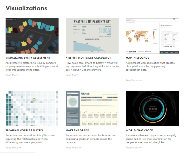
Darkhorse Analytics Portfolio
Link: https://www.darkhorseanalytics.com/portfolio-all/