
 James Round (photo, above) is a graphic designer and illustrator based in London who has created beautiful, award winning work for companies like Facebook and BAFTA.
James loves to create beautiful printed products, engaging data visualizations, rich illustrations and clean digital experiences that surprise and delight people.
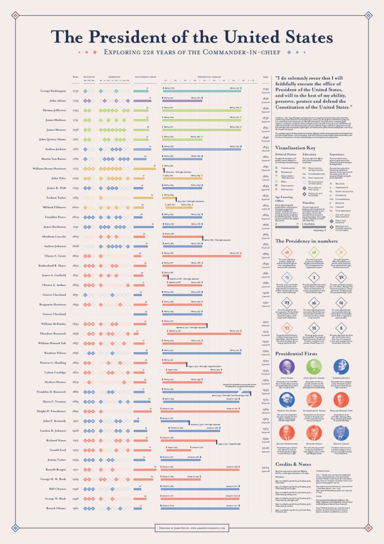
Today, I am showcasing Mr. Round’s infographic exploring 228 years of The President of the United States. This infographic was longlisted for the 2017 Information is Beautiful Awards.
On April 30, 1789, George Washington made history when he was inaugurated as the first President of the United States, under the newly created Constitution. Over the following four centuries, 44 other people have inhabited what quickly came to be considered the world’s most powerful role. With unprecedented power, the president leads a contemporary global superpower, including the most expensive military and largest economy in the world. As many Americans, and indeed the wider world, look towards the current administration with a sense of uncomfortable intrigue, it feels like an appropriate time to look back at the legacy of this unique position in global affairs, and remind ourselves of those who have previously taken on the role of ‘Mr. President’ over the years.
This visualization explores the history of American leadership, displaying a timeline of every past president and charting their lives from birth, through education, career and presidency. It also looks at some key numerical insights related to the presidency, taken from data in the visualization on the left, and finally displays some interesting ‘firsts’ from past presidents.


Source: Round, James, 228 years of POTUS Data Visulization, James Round Design, https://www.jamesrounddesign.com/presidents-data-viz/.

thanks for site, whats next post?