
Readers:
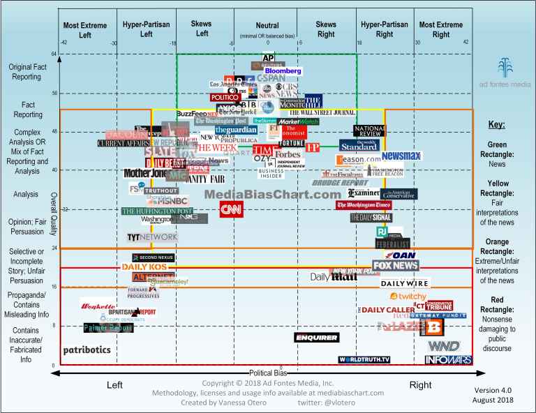
 I had previously blogged about Vanessa Otero’s Media Bias Chart v3.0 (blog post link here). Ms. Otero has revised and enhanced her chart and just released v4.0 through her company, ad fontes media.
Vanessa Otero and ad fontes media
Vanessa Otero is a practicing patent attorney in the Denver, Colorado area, and has a B.A. in English from UCLA and a J.D. from the University of Denver. She describes herself as not a journalist by training, and doesn’t claim to be one.
 Vanessa and her company, ad fontes media, has a lot to say about the quality and bias of the news. Her site started out as her own personal blog, and evolved into ad fontes media because of popularity of the Media Bias Chart. She has created all the content on her site. As a result, She feels it is important to be transparent about who she is and what her political biases are. You can read about those here.
Ms. Otero plans to incorporated feedback from others across the political spectrum into her chart, and increase the objectivity of the source ratings by using other people and technology tools. You can read more about those plans here.
What’s New in Media Bias Chart v4.0
Per Ms. Otero, in addition to the aesthetic changes, quite a lot is new. This new version is searchable and enlargeable at http://www.adfontesmedia.com. Also, ad fontes media will be launching an interactive web version where you can select additional sources to view and deselect others to give the view more clarity.
The upcoming interactive web version will be the first iteration of the Media Bias Chart Web App. Vanessa encourages all of us to help build the features we want to see by supporting their crowdfunding effort, which will be launching soon. For now, you can support them via this link.
What’s New:
- No more circles and ellipses in the background. In previous versions, those were meant to express a range in which individual stories would typically fall for sources within them. But that was a bit confusing. In place of this, on the interactive version, you will be able to click on a single source and see a sub-chart for shows and/or articles ranked within that source.
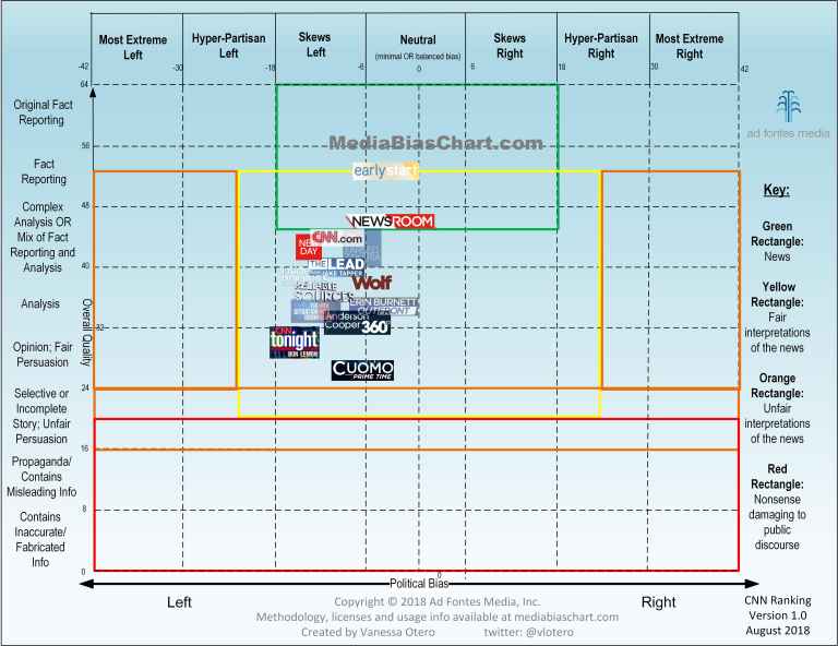
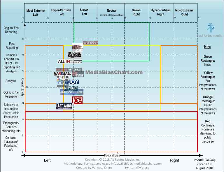
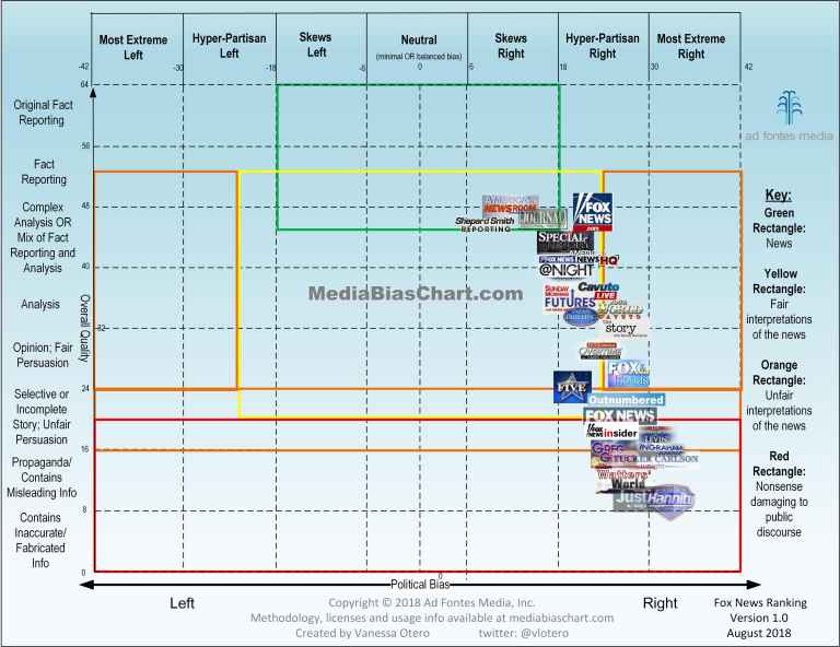
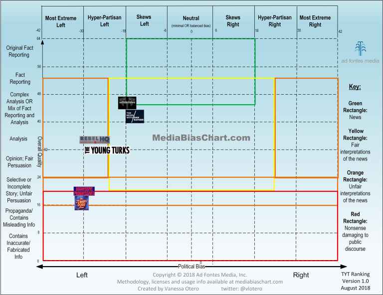
- Sub-charts! If you’ve ever wondered how the different shows on the TV network affect the overall ranking, take a look at these first ones for Fox News, MSNBC, CNN, and TYT (The Young Turks) Network.
- The green, yellow, orange, and red lines overlap and cover more areas. These overlaps show more intuitively that sources within the overlaps consistently comprise individual articles that fall across the categories.
- The designations “left” and “right” replace “liberal” and “conservative” for a number of reasons, the most important of which is that many political concepts fall outside many people’s contemporary definitions of “liberal” and “conservative” (even though “liberal” and “conservative” can quite broadly defined in contemporary usage). “Left” and “right” are broader.
- The lines are evenly spaced, which shifted the distribution of sources. While they still fall in somewhat of a bell-curve, they do so less than before.
- The category “Complex Analysis” has been updated to “Complex Analysis OR Mix of Fact Reporting and Analysis.” This update more accurately reflects the existence of a large and important genre of news that combines fact reporting and analysis as necessary for context and ease of understanding. Not all of these kinds of sources provide what Vanessa would call “complex analysis,” though. In fact, many stories in this genre of news are quite short. In terms of overall quality, they are often just as important in the news eco-system as complex analysis stories.
- There is alt-text in the image to make it accessible to the visually impaired.
- There is an underlying coordinate system to the categories, which is on an arbitrary scale of 0 to 64 vertically and -42 to +42 horizontally. The numbers marking the division lines between the categories are visible. If you are having trouble finding a particular source, there’s a table next to it on the home page that has the coordinates of each source. You can sort it alphabetically or numerically.
Examples of the Sub-Charts
Below are sub-charts that rank individual shows on each network. Right now, ad fontes media has these sub-charts for CNN, FOX, MSNBC, and TYT Network, but they will be coming out with more sub-charts in the near future. For more on how these shows were ranked, see this post:
How Ad Fontes Ranks News Sources
CNN
MSNBC
FOX
TYT Network
New Sources:
- Business Insider
- Daily Signal
- Financial Times
- Forbes
- Fortune
- FreeSpeech TV
- Guacamoley
- IJR
- LA Times
- Marketwatch
- News and Guts
- OZY
- Quartz
- ShareBlue
- The Gateway Pundit
- The Skimm
- The Young Turks
- Talking Points Memo
- Think Progress
- Truthout
- Twitchy
- Vice News
- Washington Monthly
- WND
- Wonkette
- YourNewsWire
To see more detailed information about the changes to the Media Bias Chart v4.0, please visit Vanessa’s web site at
adfontesmedia.com

The concept of the Media Bias Chart outstanding and very helpful.
I come from an Imagery Interpreter/Analysis, National and Defense Intelligence, System Engineering, Documentation Author and Blogger background. Each have their own process and procedures to follow to help ensure creditable results that are consistent. One such is the Admiralty Code and or Field Manual FM 2-22.3 – to help determine the source and reliability of information.
From my perspective, that seems to be missing in your product along with others that I have viewed over the past six years.
Part two of that, is the lack of separation between reporting the facts and opinions of those reporting information. In the past, print news and broadcast news local and national separated the two. Allowing readers/viewers to make up their own minds of the said subject matter.
I am thankful for folks like you that are trying to help others better understand what they are hearing, watching and or reading and to understand the perspective that source is most likely spinning the information.
Thank you,
Laughable