Simon Beaumont – Biography
 Simon Beaumont is Head of Information, Data Visualizer, and Tableau UK Healthcare User Group co-chair. He is passionate about all things data and Tableau.
Working in the NHS, he leads a Tableau Centre of Excellence, consisting of 15 analytical staff, supporting improvements in care through informed, visual, analytics.
In his spare time, Simon actively participates in Makeover Monday, Viz For Social Good and Data For A Cause in addition to vizzing about his favorite past time, sport, as part of the team responsible for #SportsVizSunday.
Simon’s thoughts and insights can be found on his blog, Vizionary (https://www.vizionaryblog.co.uk/).
Questions
Michael: Since I work in local (City) government, I was especially interested in your Workforce profiles Tableau Workbook you published on Tableau Public last year. Can you discuss the process you follow to develop workbooks like this (e.g., data prep, design, development)?
Simon: This report actually forms part of our annual accounts; within which we are required to provide an overview of our workforce in terms of age, pay grade, role and length of service.
Prior to Tableau this was provided through multiple, lengthily, tables that were produced from Excel Pivot Tables. One of the founding principles of our Tableau Centre of Excellence is the phrase ‘intrigue leads to insight’; when I reviewed the previous presentation of this data I quickly realised it was just that, data. There is was no intrigue, let along insight, it was reporting for reporting sake; we were asked to provide numbers so that is just what we did.
As with any of our internal reports the first step in designing this report was to understand the use case for the visualisation. In this example the key objective is to present analysis of our workforce in such a way that the public can understand our staffing profiles. Using visualisation best practice examples from across the community, we quickly realised a heatmap was a visual way of representing profiles, encouraging the user to move beyond the numbers and to, instead, understand the key messages. Beyond this we also wanted the report to be of value internally to managers; for this reason we added some filters at the top to allow internal users to filter the data by Gender, Working Hour and Month.

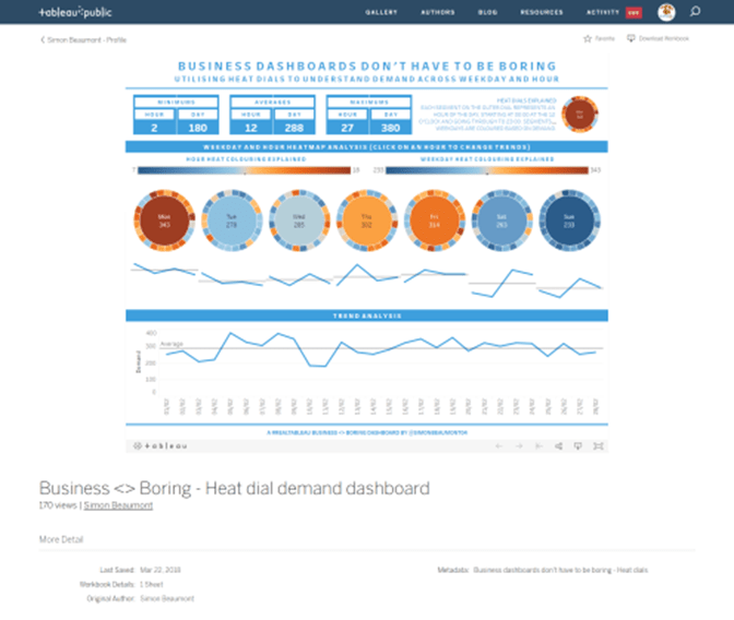
Michael: In your blog post last March, in the article, Business <> Boring : Heat dial demand analysis, you introduce the heat dial data visualization. Right now, I am going through some struggles as my business partners want to use pie charts as one of their visuals. Your heat dial somewhat resembles a pie chart. Did you have any concerns using this new dataviz and how did your business partners react to it?

I often find that whilst many users may state ‘give it to me as a table’ or ‘ I just want a bar chart’ in reality if you can provide something that is genuinely intriguing and captures their imagination it can lead to many more open conversations about the data.
Simon: The main purpose of my blog post was to encourage people to recognize that even within the confides of a working environment you can still be creative when developing your visualisations. I often find that whilst many users may state ‘give it to me as a table’ or ‘ I just want a bar chart’ in reality if you can provide something that is genuinely intriguing and captures their imagination it can lead to many more open conversations about the data.
With this particular example the goal was to visualize hourly trends and outliers and as such we decided to try and replicate the look of a 24 hour clock, allowing the user to identify the ‘hotspots’.
What was really refreshing about this visualisation was the amount of conversation it, and the associated blog post, generated within the community. It was never my intention to suggest heat dials were the purist form of data visualisation best practice for this type of use case. Chris Luv shared, in a very kind and gentle manner that actually this data may be better suited to a grid style heat map, and to some extent I agree; however what everyone agreed with is that colour and segments are a far better medium to share thematic data than a table full of numbers. This is exactly the key message I was trying to get across.
In terms of our business customers, many are now used to our analysts ‘pushing the envelope’ when it comes to visualising complex data. We actually visualise our internal, team, benchmarking reports through the use of lollipop charts and we find the majority of our customers find creative visualisations intriguing, albeit with any new technique there is a requirement for customers to be educated to ensure they full understand and appreciate what the chart is depicting.
Link to Lollipop chart: https://public.tableau.com/profile/simon.beaumont#!/vizhome/BusinessBoring-Performancebenchmarkinglollipopcharts/BusinessBoring-Performancebenchmarkinglollipopcharts

Michael: Can you tell us three of your favorite Tableau tips and tricks?
Simon: My three favourite tips and tricks would be:
Creating a Tableau 45 degree reference line
In a recent #MakeoverMonday visualisation I utilized a Tuesday Top Tip post by Andy Kriebel that shared how to create a 45 degree reference line; this trick was perfect for the week’s challenge during which I created a scatter diagram about the UK’s favourite chocolate bars.
http://www.vizwiz.com/2016/03/tableau-tip-tuesday-how-to-create-45.html
Centering your highlighted jitter plot
Jitter plots are one of my favourite visualisation techniques in Tableau. I think they are fantastic when needing to visualise the distribution of a large number of points; in scenarios when a scatter plot wouldn’t work due to multiple data points with the same value being visualized on top of each other. To take a jitter plot to the next level I like to center any highlighted data points; this creates consistency and makes it easy for a user to always identify the key points of the viz. Doing this is a simple technique; fixing the axis from 0 to 1 and then plotting the highlighted points at 0.5.
https://www.vizionaryblog.co.uk/blog/centring-your-highlighted-jitter-point
Multiple viz in tool tip for the same viz
Viz in tooltips give us a great opportunity to enhance the functionality of a viz; recently I found you can use dual axis worksheets to apply one viz in tool tip to one aspect of the dual axis and another viz in tool tip to the other aspect. I think it is quite a cool way of increasing the insight a visualisation offers to users; for example one viz in tooltip could be a trend analysis whilst another could be benchmarking.
https://www.vizionaryblog.co.uk/blog/one-viz-in-tooltip-or-two
Michael: You have been involved in the recent Tableau Fringe Festival – EMEA. Can you tell us what this is and how you were involved?
Simon: The Tableau Fringe Festival is a virtual Tableau Festival that is run multiple times a year; with Festivals being hosted within APAC, EMEA and North America (I think there may even be a Latin America one in the making too). The initiative was started by Emily Kund; originally it was a way to help people, who may not have had the chance to do speak at Tableau Conference, to share their Tableau stories and expertise. Since its inception the Tableau Fringe Festival has grown into a ‘cannot miss’ event within the Tableau Community.
When Emily reached out on Twitter to say she needed help getting an EMEA Tableau Fringe Festival up and running I was really keen to get involved. The Tableau community has been so welcoming and supportive during my Tableau journey, for me this was a way of being able to give something back, to say thank you.
The actual day completely blew me away; myself, Sarah Bartlett and Waseem Ali hosted 12 hours of Tableau content and the speakers were of a phenomenally high content; just check out the closing session by Mike Cisneros, talk about going out with a bang, his talk could easily have been a key note session at many a conference.
Better still, after the day, all of the content is published online through the Fringe Festival YouTube site. This means the opportunity to learn from TFF never stops; indeed there have been many teams meetings in the last year during which my analysts have enjoyed a Fringe Festival presentation.
Speaker applications are currently open for TFF APAC and I would encourage anyone who is passionate about Tableau to consider presenting; it is a great way to share your expertise and you don’t even have to leave your home or office to do so!
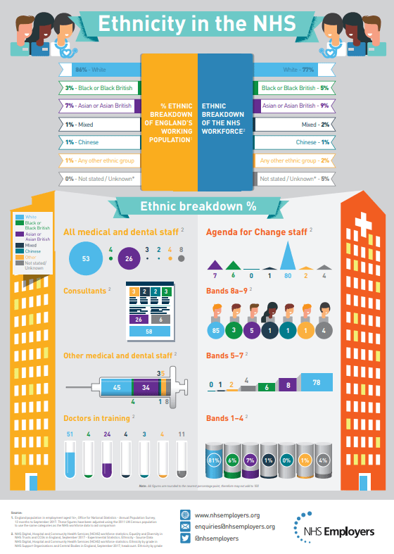
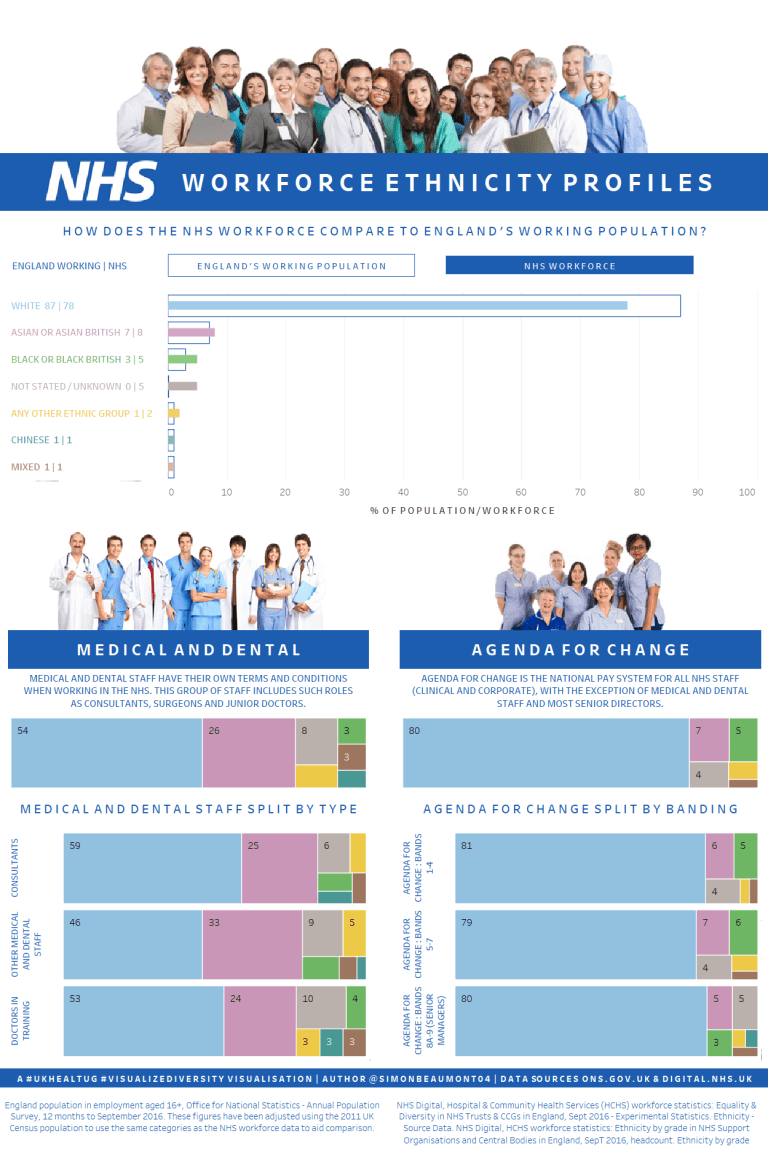
Michael: In another previous blog post last March, in the article, An infographic rant and a much needed UKHealthTUG makeover, you give a strong tongue lashing to an NHS Infographic. Can you discuss what frustrated you so much about this infographic?
Link: https://www.vizionaryblog.co.uk/blog/an-infographic-rant-and-a-much-needed-ukhealthtug-makeover
Simon: Infographics, when done well, can be great; they can make data more accessible, presenting the key elements of analysis in a visual way and providing insight without the need for a user to have to interpret complex data.
When done badly infographics can be infuriating; using superficial visual techniques for the sake of looking ‘fancy’, offering little insight and actually making it far more difficult for a user to interpret the key messages.
When done badly infographics can be infuriating; using superficial visual techniques for the sake of looking ‘fancy’, offering little insight and actually making it far more difficult for a user to interpret the key messages. This was the case for the NHS Infographic I shared within my blog post.
Nearly every element of the infographic was at odds with data visualisation best practice;
- Colour was used inconsistently,
- Scales changed across different aspects of the visualisation,
- Size is used as a visual representation of differences between values, but the size can be different for 2 data points with the same value,
- Ordering of data items is confusing and lacking consistency,
- There is superfluous labelling
Reflecting on the infographic I found myself constantly wishing the author had gone back to basics; keeping the infographic simple and focusing on sharing insight. There are some aspects of the viz that, whilst not visual best practice, are still cool (for example the syringe is easily identifiable as a healthcare related piece of equipment and has a stacked bar within it), however it feels as though the author has tried to use a different visual technique for every aspect of the infographic and by doing so they have actually over complicated the viz and made it far less engaging for the user.
Before:
After:
Michael: In your day-today work activities, what do you feel are your business partners (or clients) biggest pain points when it comes to data prep and data visualization? How are you able to help them here?
Simon: I work in a healthcare environment; our biggest challenge is most of our staff are, rightly, busy prioritising treating patients. As such the biggest challenge we face is that visualisations need to instantly add value and convey the key information to our end users. We have over 4,000 staff registered on our Tableau Server and most of them use Tableau by subscribing to visualisations; because of this we need to design our visualisations in such a way that they work both interactively but also static when people view them embedded within an email.
When we have successfully achieved this joint use of a visualisation the business benefits are phenomenal; in particular the validation of our data is more robust now that it has ever been and teams have a far better understanding of their operational performance. I find that if you empower people by allowing them direct access to their own data, and explain why it is important, you demystify data and people then focus on doing something with it as opposed to arguing why it is important and questioning how it has been calculated.
Michael: What is next on your “To Do” list? What can the Tableau community expect to see from you in the near future?
Simon: The big thing currently on my Tableau ‘To Do’ list is to continue to work with James Smith and Spencer Baucke to lead #SportsVizSunday. This is a community initiative we developed to help showcase sports visualisations and to provide everyone with a monthly data set that they can create visualisations from. The response from the community, to date, has been overwhelming. We have had multiple Tableau Viz Of The Day as a result of #SportsVizSunday visualisations and I am really keen to try and host, in person, sports viz get togethers in London and New Orleans, as part of Tableau Conferences so people get a chance to connect with other sports enthusiasts and learn from the amazing visualisations that are created every day of the week.
Link to #SportsVizSunday is : https://data.world/sportsvizsunday/sports-viz-sundays-2018
Simon’s Tableau Public Link: https://public.tableau.com/profile/simon.beaumont#!/