
Tableau Community Spotlight: Ten Questions with Mike Cisneros
Mike Cisneros – Biography
 Mike Cisneros has enjoyed a career in the tech world that has spanned three decades; during this time, he variously served as an editor, a software developer, a graphic designer, a data analyst, and an online community builder.
While working at a large federal contractor in the mid-2000s, he discovered an affinity and passion for a field that combined elements of all of these roles: the emerging discipline of data visualization. He quickly gained a reputation with his customers and within his company for creating elegant, persuasive, and effective visual designs.
In 2012, Mike became the Head of Data Visualization at Evince Analytics, serving commercial and public-sector customers in the Washington, D.C. area.
In addition to his “official” work, Mike also produces visualizations on various topics of personal and social interest. His interactive designs have won several awards, and in 2018 he was named a Tableau Zen Master for his visualization work and his contributions to the dataviz community.
Michael: Mike, one of the first words that comes to mind when I look at the data visualizations you have created using Tableau is “beautiful.” I remember your Gold and Oil dataviz and wanted to ask what your process was in creating this?
Mike Cisneros: Thank you for saying so. “Gold and Oil” was a project that came out of Andy Kriebel and (by that time) Eva Murray’s Makeover Monday initiative, where participants are provided a data set each week, and challenged to create a visualization based upon it.
This particular dataset was about how the relationship between the monthly prices of two commodities—and the Consumer Price Index—changed over time, going back to 1983.
My process for this design began the same way almost every design of mine does: with no particular idea of what the final product would be. I had no prior knowledge about the topic area, so the first thing I did was to open up the dataset in Tableau and start getting familiar with what was included.
I threw together a few preliminary charts, but I could see right away that on an absolute scale, the costs of oil and gold didn’t mesh very easily. So, I decided to create an index that would show, within that time period, when each commodity hit its peak price and its minimum price. I thought that normalizing the chart in this way would present better insights.
After some additional fiddling with formatting, I started to realize that using mirrored area charts while turning the worksheet on its side would make the entire page look like a pool of oil. The color choices were pretty obvious, and after finding the right imagery to complement the chart, it almost made itself.
While the specific technical approaches I used may be of interest to some people, I think the more important part of the process to highlight is that in Gold and Oil, as is the case for 95%+ of the designs I create, there is no pre-existing vision in my head for what the final product will look like before looking at the data. The first step is looking at what information the dataset provides; then asking questions of that data; then finding some kind of insight; then figuring out how to present that data accurately and informatively; and only at the very last point, deciding how to add the graphic design layer.
An audience’s attention will probably be captured initially by color, layout, general aesthetics, or even a good headline. But I almost never start there, because all of those pieces exist for the specific purpose of serving the insights and the analyses…and if you don’t know what your insights or messages are, but you’re already deciding on the visual look and feel, then I think you’re often forcing pieces to fit that don’t belong together.

https://public.tableau.com/profile/mikevizneros#!/vizhome/goldandoil_0/OilandGold
BLOG NOTE: The next series of questions related to Mike’s presentation, Truth ● Beauty ● Data ● And You, that he gave at the Tableau Fringe Festival – EMEA (TFFEMEA) a few weeks back.
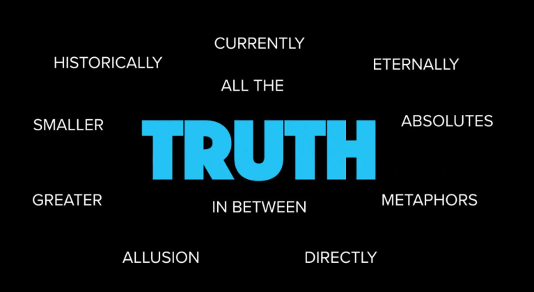
Michael: I really enjoyed your Tableau Fringe Festival – EMEA (TFFEMEA) presentation, Truth ● Beauty ● Data ● And You. I found it somewhat existential. Can you tell my readers how you define “truth”?
Mike Cisneros: Well, let me start by talking about the genesis of the presentation. You used the word “existential,” and that’s a perceptive choice on your part.
Several months ago, I was starting to feel worn down by the state of public discourse in America. I’ve chosen to pursue a career—a calling, even—that is predicated on the bedrock notion that Facts Matter. I think every analyst who works with data has to share this notion…that there are certain undeniable facts in the world. Some of them are things you can see for yourself (boiling water cooks eggs, sharp scissors cut paper, you can’t ski through a revolving door); some of them are things we’ve proven with science (cigarettes are carcinogenic, polio is preventable, humans first appeared on Earth in Africa).
It used to be that our public arguments had to do with disagreement over the interpretation of facts. If I say that women are more and more disproportionately underrepresented in American companies, compared to the demographics of the working population as a whole, the higher you go in the organization, that is a fact. But the political debate was about the interpretation of those facts—the root causes, mechanisms to correct the imbalance or even the idea that this is a problem at all.
But now, more and more, the arguments are about the facts themselves—that is, the essential validity of the facts are denied by one side or another. “Climate change is a hoax”? Well, no, it’s not. We have lots of measurements and analyses and scientific consensus that it’s happening. But a significant subset of American people deny the facts. Not just the interpretation of the facts, but the very data itself.
So, the existential crisis I felt was, if we, as a society, can’t have debates based on mutually agreed upon facts, even on issues that are critical to the survival of our very species, then what is the point of doing data analysis at all? Why try to use logic and reason to dispassionately direct our decision making, when we are increasingly turning away from facts and grasping instead onto denial, short-term pleasure seeking, and emotionally-driven choices?
And out of that funk, I came to realize that there have been many times and many places in the history of human existence when the promotion of science, facts, and logic was a heretical pursuit. In those times and in those places, people did not simply throw up their hands and stop working to ensure that the truth would persist, despite the worst efforts of the people in power. They simply had to be more oblique about how they conveyed their messages.
That truth would be contained, undercover, in artwork of all varieties; in oral histories; later, in underground publications, in performances, in street art, in music…. There has always been a subversive element to art, but not simply for the sake of upsetting the apple cart. It has been a way for the voices of people without an official platform to express their perception of the truth of the situation—the political situation, sure, but also their perception of the truth of the human condition.
I came to realize that we, as data analysts and data visualizers, are a brand-new subtype of artists…but we have a new medium with which to work. That medium is data itself. We can create art with objective data, insofar as data can be truly objective; and we can remix that data with all other existing media to create fact-based art.
So much in the way that artists throughout history have tried to carry on the mantle of being truth-tellers, in the face of oppressive regimes, or institutional discrimination, or other restrictive circumstances, we as data visualizers and analysts can carry on this truth-telling tradition by honoring the validity of data, and fact, in the works we create, with the aim of ensuring that they survive (or reverse) the current tide of anti-intellectualism and conspiracy theory affinity.
To answer the question: I define “truth” as the honest, sincere appraisal of the situation, based on facts that should be universally agreed-upon, whether or not they are inconvenient, messy, or frightening. Should there be future generations, it would be nice if they realized that some of us were preserving the scientific and artistic tradition in this tumultuous era.
Synecdoche is a rhetorical device, which means using the part of something to refer to the whole thing or using the whole thing to refer to just a part of it.
Michael: Can you explain synecdoche as it relates to data visualization?
Mike Cisneros: Sure! Synecdoche is a rhetorical device, which means using the part of something to refer to the whole thing or using the whole thing to refer to just a part of it. For example, if you saw someone driving a car you liked and said, “Hey, nice wheels,” you were using synecdoche. Because when you said “wheels,” you weren’t specifically saying you liked the wheels on the car. You were referring to the entire car. Likewise, when you say, “I think Houston can win the World Series again this year,” you don’t literally mean the entire city of Houston. You’re using synecdoche to refer to the Houston Astros baseball team—referring to the whole but meaning a specific subset.
In the context of data visualization, and specifically in public, socially-aware data visualization, I consider synecdoche to be the means by which we can publish honestly and sincerely researched work on politically charged topics; and, the way we can give them the greatest chance to be heard by all parties.
An example I referenced in my Fringe Festival talk is a visualization Lila Manheim created called “Sidewalk Egg Frying Days.”

The literal point of this chart is to show, scientifically, whether or not it is actually hot enough to fry an egg on the sidewalk in Arizona. Lila’s design here is quite ingenious, on many levels. Visually, it’s engaging and whimsical; she uses a small multiple-style infographic to show days in any given year in which sidewalk egg-frying was possible. The graphic design she uses to show those years could be seen as a frying egg, or as a sun in front of a cloud beaming down rays of light. Either way, the metaphor works. The left-hand column explains the methodology of the chart’s analysis and is reminiscent of a Nutritional Data label.
It’s a fun, silly, engaging visual that catches your attention no matter who you are or what your belief system is. But this graphic, while literally about eggs in Arizona, is genuinely about climate change. Looking closer at the chart, you can see that as the years go by, there are more and more days when eggs could be fried on the sidewalk. The days start earlier in the year, and end later; longer streaks of egg-fry-able days in the middle of summer persist.
This visualization is an example of synecdoche, in data visualization terms, because it speaks the factual truth about one story—Arizona heat—that in turn is just a part of, and stands in for, the greater story—climate change.
By telling smaller stories, with well-researched data to support them and without explicit references to the larger, hot-button topics they might serve as examples of, data visualizers can help to combat the all-too-prevalent tendencies these days for people to reject anything that challenges their existing worldviews.
If I didn’t believe in climate change, I wouldn’t look twice at an article, visualization, or video that said “The Earth is getting hotter! Here’s all the data,” because I’d have already decided that your “data” is bogus.
But if I see a visualization like Lila’s, I’m just entertained and engaged by it. It’s funny, right? You can really fry an egg on a sidewalk! And since I’m not primed to jump immediately to a defensive, combative position by this design, I’m more inclined to listen to, engage with, and internalize the story I hear.
The short version: don’t try to explicitly tell the big story if the big story is politically charged. Tell a small story that stands in for the big story – use synecdoche – and engage a wider, more receptive audience.
Michael: One of the comments you made at TFFEMEA was that “Stories without visuals don’t get shown on Television.” Can you explain to my readers what this means?
Mike Cisneros: We once were a nation of newspapers, a nation of readers. Major cities had multiple daily newspapers, including morning and evening editions. Moreover, there were limited alternative means for people to receive information on a timely basis. So, with less competition for attention, newspapers were able to report on complex, nuanced stories—stories that might be on obtuse or abstract topics, and stories that required time to read, consider, digest, or discuss.
Today, newspapers are a shadow of their former selves. Competition for our attention is everywhere and takes increasingly invasive forms. Content is firehosed upon us. I can pick up my phone and without even leaving my home screen, cycle around Instagram, Snapchat, Feedly, Twitter, LinkedIn, Facebook, a sports news app called The Score, two email boxes, Slack, and then back to Instagram again, because by then there will be new content. There’s no room for longreads in that rotation!
The quotation you asked about, “Stories without visuals don’t get shown on television,” is something that Kenton Powell, the head of design and graphics at VICE News, said on Jon Schwabish’s PolicyViz podcast.
(https://policyviz.com/podcast/episode-105-kenton-powell/)
The meaning, or implication, of this quotation is that the world is certainly no simpler than it was in the time of newspapers’ dominance. If anything it’s exponentially more complex. To be informed and responsible members of society, we have to make even greater efforts to understand complicated and multi-faceted issues—but the most important issues don’t always have great video footage that goes along with them.
I mean, let’s break it down. Why is the local TV news full of stories about crime? Because it’s the easiest kind of story to get video footage of. Imagine you’re a news producer, and you have to fill 44 minutes of programming every night. You turn on the police scanner and hear there has been a crime. Great! You send your talent to the scene, where there will be police lights flashing, crime scene tape, willing interviewees, the whole shebang. Now you’ve filled a good 2-3 minutes of airtime.
Does that mean that this crime, this one particular criminal act, was the most important thing for the viewing public to educate themselves about? Of course not! It’s just a thing that was easy to film. Pictures, narrative, the perception of danger…it’s all there. All engaging and probably pretty easy to edit into a story, since it’s basically the same as the last story.
If an ACTUAL critical issue that DESERVES to be considered “news” doesn’t have easily created or found imagery to go along with it, then the story about that issue will not be selected to be shown on the evening broadcast. It will not get a Buzzfeed article about it. It won’t get memed. It will only ever reach a tiny audience of people: the ones who are so determined to educate themselves that they eschew all the easily-obtained entertainment competing for their attention so that they can read and consider a complicated, text-only story.
We are data visualizers, by trade, by profession, by choice. We need to be the people who figure out HOW to support complex, nuanced stories with visually appealing, informative graphics so that a wider audience can more easily understand them. And although the quote is “stories without visuals don’t get shown on television,” it doesn’t literally have to be “television.” In this case, in my interpretation, “television” is just a placeholder for “anywhere an audience might be, where they’re accustomed to getting content easily, including visual content.”
The more easily understandable you can make complex stories, the wider your audience becomes. Even if they disagree with the conclusions you draw, at the very least you’ve given them something to think about.


Michael: You touch on Joseph Campbell’s book, The Hero With a Thousand Faces. And most importantly, the hero’s journey. What does our data visualization hero’s journey look like?
Mike Cisneros: That’s the thing about the hero’s journey, isn’t it—that it can refer to so many people’s stories in so many contexts?
Every data visualizer’s overall path will be unique. But my wish, or hope, or challenge, or impassioned plea, for an archetypal dataviz hero’s journey would be that of a person leaving the ordinary world of working on Dashboards for Customers looking to increase Revenue, and cross over into the special world of visualizing in public, for the betterment of the world.
I truly believe that practitioners in our data visualization world have a collection of abilities and affinities that are critically important in promoting facts, evidence, truth, or whatever you want to call it, to the wider public. Our dataviz hero understands data and the responsible collection of it. He or she can expertly analyze that data, can derive true insights and communicate them to an audience, and has a design sensibility that helps him or her package the work in an attention-getting and appealing manner.
These skills are common, in combination, among our fellow practitioners; they are far rarer, even in isolation, among the general population. Given this, I’d expect—demand—that we don’t limit our expression of these skills to only those tasks for which we are financially compensated.
Michael: So, is Feminist data visualization actually a thing?
Mike Cisneros: Yes, it is, but probably not in the way that you might be thinking.
You’re talking about an article I cited in my Fringe Festival talk but didn’t mention by name.
It was called “Is Feminist Data Visualization Actually a Thing? (Yes, and How!),” written by Heather Krause of Datassist. That article itself refers back to a paper written by Catherine D’Ignazio and Lauren Klein, which itself is entitled “Feminist Data Visualization.”
(https://www.academia.edu/28173807/Feminist_Data_Visualization?ends_sutd_reg_path=true)
Feminism is not (just) about women, but rather draws our attention to questions of epistemology – who is included in dominant ways of producing and communicating knowledge and whose perspectives are marginalized.
Let me quote part of the abstract here:
In this paper, we begin to outline how feminist theory may be productively applied to information visualization research and practice.…Feminism is not (just) about women, but rather draws our attention to questions of epistemology – who is included in dominant ways of producing and communicating knowledge and whose perspectives are marginalized.
In the sense that we need to be mindful of the provenance of any data we use, the phrase “feminist data visualization” means that we should use the same kind of critical thinking about our data that is commonly used in feminist theory.
What does that mean? It means figuring out the data’s context in society, interrogating the methods used to build the collection, finding and explaining missing or excluded data, and considering the intentional or unintentional perspectives of the data gatherers.
Because it is true that every choice we make as data professionals is a non-neutral choice. Missing data, outlier data, what we choose to filter and what we choose to include, what we consider a “default” viewpoint…these are all significant considerations for a data visualizer and are all made from a specific perspective.
It’s depressing to think that the word “feminist” is often considered a politically charged term. A phrase like “feminist data visualization,” to a certain audience, elicits a strongly defensive and dismissive reaction. You know? Like, “Why are these women trying to make everything about gender? It’s just data. It has nothing to do with men vs. women and you’re trying to push your agenda where there’s no issue.”
But that’s not what feminist data visualization is about at all. It’s simply about making sure that traditionally *undercounted* groups are appropriately represented in data—but since it’s women, and minorities, and other out-groups who are traditionally undercounted, or whose perspectives are not considered the “default” perspective, and so on, that’s why it’s “feminist.”
At a simple, disingenuous level, you might say, kind of, maybe, that the concept we call feminist data visualization is just a different way of saying that you’re making sure that your data is a representative sample of your population, and that you’re properly accounting for missing data, and that you’re not oversimplifying your analyses based on incompletely or improperly faceted data. I say “disingenuous” because, for various reasons, it is along the same gender, racial, and socioeconomic lines, over and over again, that data samples turn out to be non-representative.
(I should mention here that it is not the individual data points that are flawed, in this case. I still am a strong advocate for the essential truth of facts, and of data. But what we are discussing isn’t whether a specific observation is valid or not. We are discussing whether observations simply aren’t requested or recorded, and whether that leads to imbalanced and misleading collections of data.)
I am far from the most qualified person to explain feminist data visualization as clearly as it ought to be explained. I would encourage people to look at D’Ignazio and Klein’s paper or to read Krause’s post on the Datassist website: (https://idatassist.com/feminist-data-visualization-actually-thing-yes/).
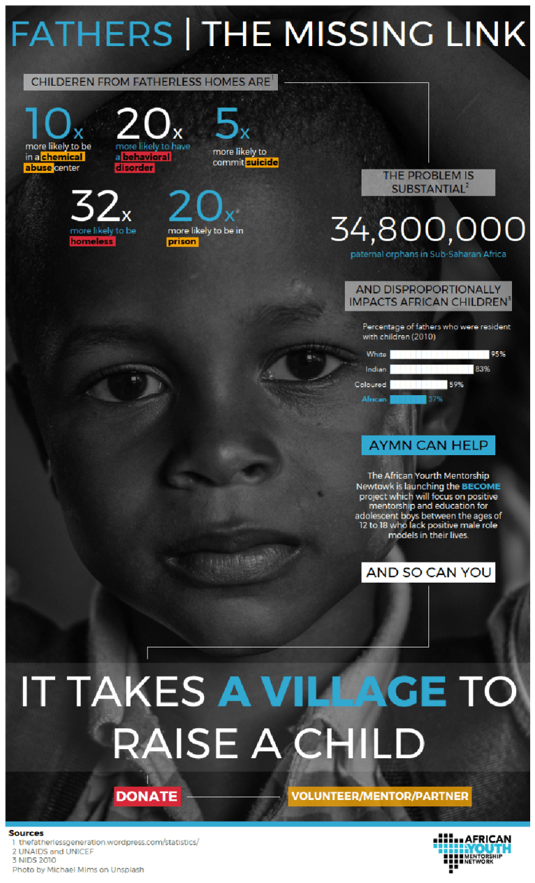
Michael: You refer to Kizley Benedict’s data visualization, It Takes a Village to Raise a Child, in your presentation. I think Kizley also creates beautiful data visualizations. Why are datavizzes like this important and what role do they play in social good?
I think all public visualizations that address social issues are valuable and important, be they part of a structured initiative like Viz for Social Good or Data For a Cause, or be they independently created and promoted.
The obvious answer is that it benefits the sponsoring organization because they get professionally-created, high-quality design pieces that can be used for outreach, calls-to-action, fundraising, and awareness-building. Many of the highlighted designs use bold imagery and color to grab a viewer’s attention, and then incorporate factual information once the viewer is engaged with the visual. That chain of attention-to-engagement-to-action is what nonprofits need in order to generate resources and support for their initiatives.
The less obvious answer is that it benefits the creator, as well. Being habituated, as it were, into working on projects that are not all about the bottom line, but about serving a greater cause, is enriching in its own way. Regular participation in these projects reinforces the idea that it is part and parcel of what a professional data visualizer should do—why not use your own unique skills to benefit others?
And when several of the more prominent members of our community are all participating, it elevates the profile of public service work across the entire Tableau and data visualization diaspora. It just becomes characteristic, not just of the few individuals who participate every time, but of the community as a whole, and as that community grows and new people join, they can see from the very beginning that yes, THIS is the sort of thing that goes along with being a visualizer—not just improving your skills, serving your company’s business needs, or doing fun vizzes on the side, but also channeling some of that effort into useful, valuable output.
In a more direct sense, The Tableau Foundation, along with the Tableau Service Corps, also engages with communities in need and provides them with data analysis- and data visualization-related resources and support.
There is a great deal that can be accomplished with data analysis to benefit communities and organizations who lack access to the kind of resources we all enjoy. When people create datavizzes like the Viz for Social Good submissions, or participate in volunteer events (as some TUGs and Data + Women chapters have organized), or pledge to be a part of a Tableau Service Corps, it all reinforces the character of the community and the implied expectation of its members.
It all makes public service—or at the very least, awareness of social issues—a major part of the formal and informal Tableau communities, and that is an inherently positive and important accomplishment.
Michael: It is getting more and more difficult to believe what we read and see in newspapers, on television, and on social media. What can we do to ensure what we are presenting in a public setting is taken seriously and that what we are stating is indeed fact?
Mike Cisneros: I will invert that question because first, we need to be confident in our analysis, and only then can we, or should we, work to make sure that our presentation is taken seriously.
First: how do we know that what we are stating is fact?
That goes back to what we discussed earlier: thinking critically about our data, exploring its provenance, getting as close to the absolute source as we can…and then, also, doing the best we can do to determine why the data was collected, and by whom, to see if there are any likely biases to watch out for. Look out for gaps in the data.
Then, use your best practices when you analyze the data. Don’t presume to know the entire story just because your one data set is telling you something interesting. Don’t oversell your results. This is a common piece of advice for Makeover Monday participants—Andy and Eva encourage designers to write a meaningful, catchy headline, but what trips many people up is that their headlines over-promise findings that their actual analysis can’t support. Or, they ask a question in the headline, but then never answer that actual question.
We shouldn’t ever feel like we have to answer all the riddles of the universe “In One Simple Chart!” Often, to be truly accurate about what our analyses are telling us, we have to write pretty convoluted sentences, full of caveats and explanations. It feels clunky and like we’re undermining ourselves…but, in fact, it’s quite the opposite. It’s better to make a small point that you can defend than try to claim an interesting finding that won’t hold up to scrutiny.
In a sense, if you are always making sure that what you are stating as your conclusions are factual—if you are hypercritical of your data and conservative with the insights you are willing to commit to—then you are far more likely to be taken seriously. The “Well, ACTually…” brigade will come for you in a heartbeat if you make claims that your data won’t support. So make smaller claims that are inarguable. Let other people draw their own conclusions as to whether those smaller claims represent larger truths. Let synecdoche do its work for you.
Michael: What can we learn from the Facebook/ Cambridge Analytica situation? What is our responsibility with the data we use?
Mike Cisneros: This is a cynical take on it, and I don’t like the asymmetry, but basically it’s this: assume that companies are not going to act in an ethical manner, because they’re not rewarded for being ethical, only for being profitable (or, for being attractive enough to investors that they can be funded long enough for the people at the top of the companies to profit).
Meanwhile, you yourself must *always* act in an ethical manner, because you are an individual, not a company, and your reputation is your professional currency, and because it’s the right thing to do as a human being in the world.
We could get deep into both of these questions but (a) getting deep into the Facebook / CA issue is unpleasant (e.g., it’s only going to get worse, as companies actually get GOOD at microtargeting based on digital exhaust profiling, since I actually don’t think CA was good at it at all), and (b) data ethics is a much bigger topic, and I don’t presume to be a proper spokesman for those issues. Beyond the things we’ve talked about earlier, relating to vetting and validating your dataset, and then making defensible choices about how you go about doing your analysis, or building models, I’d defer to other people who have studied data ethics more intensively.
Michael: Finally, what is next on your list of things to conquer?
Mike Cisneros: If I’m going to answer this specific question, then I have to say that my answer is “nothing,” because I’m not interested in conquest, per se. There’s no mountain I’m trying to ascend, no level of achievement I’m trying to rise to. Sure, I’m proud of making things that are beautiful and informative, or that are engaging and enjoyable, but I don’t see that as a competition. Except, possibly, a competition with myself and my own self-imposed expectations—and believe me, I’ll never come CLOSE to conquering those.
But, that doesn’t mean that I have no future plans.
Regarding my own specific future work, I can say that I have some ideas for new projects, but I don’t like to telegraph them ahead of time. I mean, I don’t even like people to be in the kitchen with me when I’m cooking. The first time you see the food I prepare should be when it is on the plate ready for you to eat it. Presentation is important! Pay no attention to the man behind the curtain.
I enjoy being a part of this community, without which I wouldn’t be anywhere near as capable a data visualizer as I feel I am today. So I do feel that it is my responsibility, as well as my pleasure, to do whatever I can do to elevate other people in the dataviz world, no matter much or how little they have done so far in their journey. That can mean mentoring or advising or just amplifying people who are not that far along in their dataviz lives, and it can also meaning helping to promote some of the finest and most distinctive work from our community out into the wider world, if at all possible.
Mostly, I just hope that people in the data visualization diaspora realize what an opportunity (and responsibility) they have to make an impact on the world around them, by creating and publishing their work in public.
We’ve chosen a profession, a career, a calling that allows us to express ourselves in a unique way. The same skills and tools that we use to provide value to our employers can provide value to the world, in a different but arguably more important way. I’d say that no one visualization can radically change the world; but then again, there was a TFF EMEA presentation that some guy did about slavery maps that made me think otherwise.
So whether you can radically change the world or incrementally change the world or even just get one person to reconsider one thing for a moment, all those efforts add up to a mountain of positive impact on the great big world. And if I can motivate people to start visualizing in public, to overcome whatever reluctance is holding them back, and increase the number and quality and drive of my fellow visualizers who want to make a mark on the world? Now THAT is a conquest I can get behind.
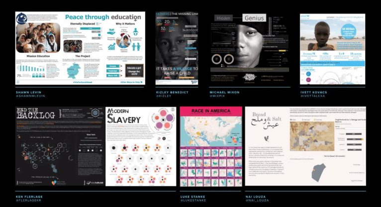
Mike’s Tableau Public Data Visualizations
Link: https://public.tableau.com/profile/mikevizneros#!/


Beautiful imagery and engaging discourse. This is a fantastic interview. Congrats to both of you.
Ken
Thanks, Ken!