
Readers:
![]() Cole Nussbaumer Knaflic, the author of the seminal book, Storytelling with Data, announced a monthly challenge last Tuesday to the data visualization community at large.
Cole Nussbaumer Knaflic, the author of the seminal book, Storytelling with Data, announced a monthly challenge last Tuesday to the data visualization community at large.
Coles reasoning behind this was as follows,
One of the best ways to learn is to do. This is something I strongly believe. We learn and get better through practice and application. It is by practice and practice—and more practice—that I’ve sharpened my own data visualization, presentation, and storytelling skills. I believe that you can do so as well.
While practicing on the job is great, it can also present some challenges. Constraints are often imposed. It can at times feel like a scary (or even risky) place to test out something new. But what if there were a safe space each month where you could take a turn flexing your skills or trying something you haven’t attempted before?
She offered this challenge as a safe space to try something new: test out a new tool, technique, or approach. [1]
The first monthly challenge for January was to create an annotated line graph. [NOTE: To learn more about this month’s challenge and the future challenges from Cole, click here.]
Panic in Detroit: A Timeline of the 1967 Detroit Riots
I usually do not have time for the various challenges and Makeover Mondays offered to help the data visualization community learn through collaboration and discussion. However, the annotated line graph fit in with a personal data visualization I wanted to create last summer.
Let me explain.
I was born and raised in inner-city Detroit, Michigan.
 It was late July 1967 and I was 9 years old. I remember we had spent the day at Boblo Island (an amusement park owned by the City of Detroit and Canada located on an island) and took the three-decker ship to the island. It was dark outside when we arrived back at the Detroit dock. As we got off the ship, there was a long row of policemen in blue uniforms on each side of us and the police were telling us to go directly to our cars, go directly home, lock our doors and stay in our houses. I remember as we rode the freeway home, buildings on the right side of the street above us were on fire for several blocks. When we got home, my parents pulled down all the shades and checked the locks on the doors. A house with a detached garage about 6 or 7 houses down from us was burned to the ground (the garage, that is). At the time, I thought this was odd since we lived at the outer boundaries of the city’s NW side by Eight Mile Road, which was the delineation between Detroit and the suburbs (Southfield, specifically). Why burn a garage probably 15-25 miles from where the riots were occurring? And why that particular house?
 My parents use to take us to some hippie art shops around 12th Street and Plum (?). I remember one of the houses was painted purple, which at that time was my favorite color (my mother had my room recently painted purple for me). I had picked up a Peace symbol necklace for a couple of bucks when we were there. Once the riots were over, we were never able to go back to that neighborhood again or those art shops because it was unsafe.
During the week of the riots (Sunday, July 23rd – Saturday, July 29th), there was an 8:00pm curfew for a while that you could not be on the streets after dark. In some ways, it was the beginning of the end for Detroit. Most of our then white neighbors put their homes up for sale and moved away, usually to the suburbs. Mostly black families were buying the houses from the whites who were moving as they were afraid of the craziness in their old neighborhoods.
We already had desegregation recently started at our schools, but relationships between the black and white kids became strained. Gangs of white kids threw rocks at the bus windows of the black kids bussed in for school when they went home at night. I remember walking down Evergreen Road home one day when an older kid hit the bus window and smashed it where a black girl with glasses was sitting. His friends cheered him when he broke the window. I was afraid of the big kid too and did not fully understand why he would want to hurt the kids on the bus.
After graduating high school, I left Detroit in 1977 and have been back maybe a dozen times for family events. I still consider it my hometown and where my roots are. My old neighborhood became a terrible place to go for many years but seems to be going through a revitalization now. The City planted large trees in front of all the houses and the yards are well kept.
I want to see Detroit succeed. It is rich with history. It is an important city in our U.S. history as well as my history. My old high school, Henry Ford, won the basketball State championship last year. I donated money towards a banner from the rafters to honor the team. I am unsure if they ever raised enough money. Perhaps, us folks from the Classes of 1975-1977 could pitch in a bit and help them get it. I think they needed $2,000. My old elementary school, McKenny, was finally closed down a few years ago. I would hate to see Ford High School closed down too.
Perhaps I am rambling now. But, the memories are flowing from my mind right now and I want to record them so you can understand my interest in the riots in the summer of 1967 and why Detroit is still a great city. I remember the slogan, “if there is nothing else we do together, take another look at Detroit.”
Yes, please, take another look at Detroit!
My Annotated Line Graph for the SWDChallenge
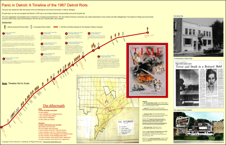
Hopefully, this explains my interest in creating a data visualization related to the 1967 Detroit Riots. My idea was to create an annotated horizontal line graph that showed the people who were killed during the week of the riots. I wanted it to make your stomach sick and for you to realize how horrific an event this was the City of Detroit and a 9-year-old kid.
Below is a screenshot of my chart.
NOTE: You can also click on the link below to see the full large PDF version of my chart.
A Timeline of the 1967 Detroit Riots 2018-01-06 0745 FINAL
Designing My Line Graph
For my line graph, I decided to show how many people were killed over the course of the riots. I used a thick red line to convey the senseless bloodshed. Since these were times of strong racial tension in Detroit, I wanted to show ethnicity people icons to indicated if the person killed was black or white.
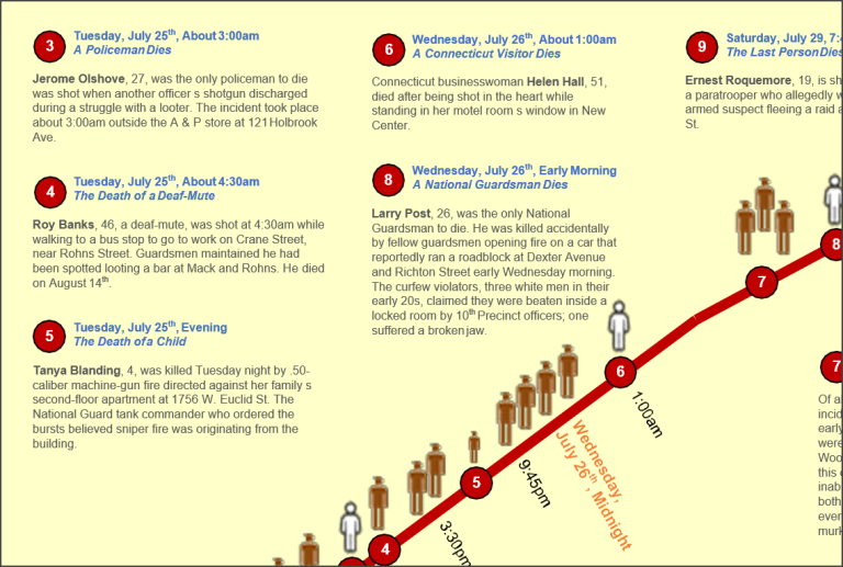
Every life was important, but I annotated a few notable deaths that occurred. For example, I thought it was important to note when four-year-old Tanya Blanding was killed. She was the only child killed in the riots and it was a senseless death.
Also, I wanted to note when 51-year-old Helen Hall, visiting Detroit from Connecticut on business, was shot through the heart and killed when she looked out her hotel window in the middle of the night.
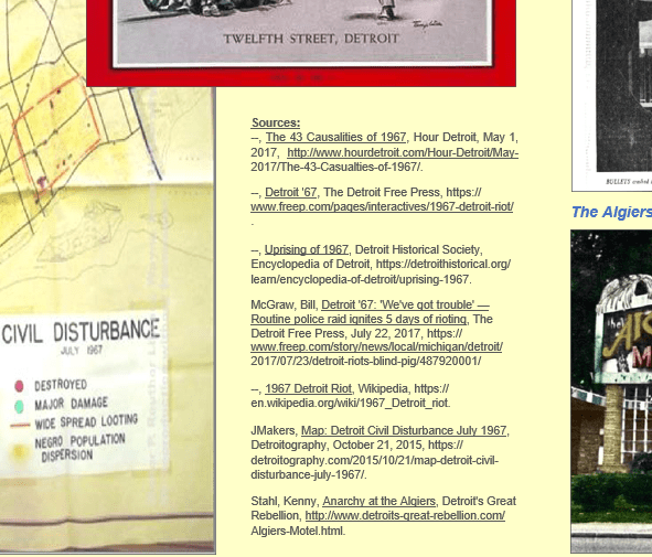
I created this chart in Visio. My goal was to try to redo it in Tableau when I was finished, but it took me most of the week to research and extract the data I needed. If you look at the bottom of my chart in the middle, I have listed all the sources I used to create it. Based on what I learned from Alberto Cairo and Heather Krause in the MOOC classes I took from them, I wanted to make sure I noted and acknowledged all the sources I used (see screenshot below).
Annotations
I have not been a big fan of the kinds of annotations where you have a bunch of “line sticks” poking into some mark type such as a horizontal line. I much prefer to add numbers in circles on the line and then add the annotations neatly above or below the line.
Below is a screenshot to show the approach I took.
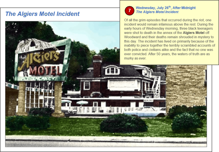
I struggled with wanting to have each annotation have an actual event photo next to it. But, I felt, this looked really cluttered and decided to have a few key photos, under the horizontal line and to the right, that had the same title I used in the annotation. For example, the annotation, The Algiers Motel Incident, is also shown as the title for the photo of The Algiers Motel on the bottom right of the data visualization (see screenshot below).
I also felt it was important to provide a summary of the statistics for the number of people killed or wounded in the riot (see screenshot below).

JANUARY #SWDchallenge: annotated line graph
So, this is my entry for the challenge. I hope you find it interesting and it helps you gain a better understanding of the racial tension that existed in Detroit in the 1960s.
Cole, thank you for providing us this opportunity to better our data visualization skills. I hope I will be able to participate in several of them this year.
Best regards,
Michael
Source: Nussbaumer Knaflic, Cole, introducing the 2018 #SWDchallenge, Storytelling with Data, January 2, 2018, http://www.storytellingwithdata.com/blog/2018/1/2/introducing-the-2018-swdchallenge.
