
Readers:
I am preparing a presentation at work on Charles Joseph Minard’s map of Napoleon’s Russian Campaign of 1812.
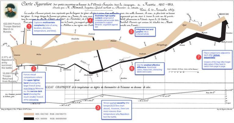
I have taken the largest version of the map I could find and added some annotations noting why Edward Tufte, in his seminal book, The Visual Display of Quantitative Information, calls Minard’s Napoleon map one of the “best statistical drawings ever created.”
Tufte called Minard’s Napoleon map one of the “best statistical drawings ever created.”
Here is a copy of my annotated map. I welcome your comments and suggestions for additions I should add to the annotations.
Thanks in advance.
Best regards,
Michael

stumbled across this today – almost a year after you’ve posted it. Really curious as to your annotations, but tough to read at the resolution and size of your image. Any chance you could increase it?
Let me dig up my original and enlarge it and send to you.
English translation of Minard map is free at 6×9″ here:
https://manywaystoseetheworld.org/products/the-minard-map-the-best-statistical-graphic-ever-drawn-6×9-free-sample
Went there to obtain, but shipping for one 6″ X 9″ card/map/graphic was $19.95.