
Data visualization techniques continue to provide popular tools for everyone from journalists, researchers and corporations to provide a better way to view often dense data and explain complex data in a more actionable way.
However, as has been shown by me as well as others in the DataViz profession, they are not a new technology, as can be noted by John Snow’s use of them to map cholera cases in London in the mid-1800s as well as Charles Minard’s famous map of what lead to Napoleon’s devastating loss in the war with Russia in the early 1800s. In fact, one of the earliest known data visualizations can be dated all the way back to the 11th century, writes Clive Thompson for Smithsonian Magazine. [1]
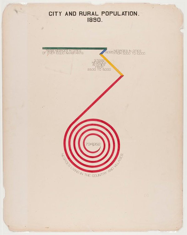
Now, a 116-year-old series of infographics by a group led by W.E.B. Du Bois, Booker T. Washington and a prominent lawyer named Thomas J. Calloway detailing the lives of African-Americans in the post-Civil War United States have begun to circulate again. In many ways, the work is just as revolutionary now as it was when it was first created. [1]
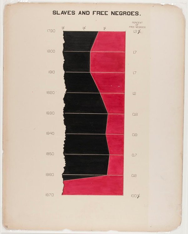
It was actually slavery that first drove some of the country’s most important data visualizations, Thompson writes. When the South began to secede from the United States in the mid-19th century, the federal government used data from the latest census to highlight the concentration of slaves in each county of Virginia. Those data visualizations helped President Abraham Lincoln understand where slavery was the weakest. [1]
When the Exposition Universelle, the Paris World Fair of 1900, occurred, slavery remained a recent memory for African-Americans. Many black intellectuals and researchers were concerned with how their community was faring in the years since slavery had been abolished. In order to represent the African-American community at the exposition, the group of researchers compiled and organized an exhibit of infographics, photographs, maps and other materials documenting their experience since the end of slavery, Brentin Mock writes for CityLab. [1]
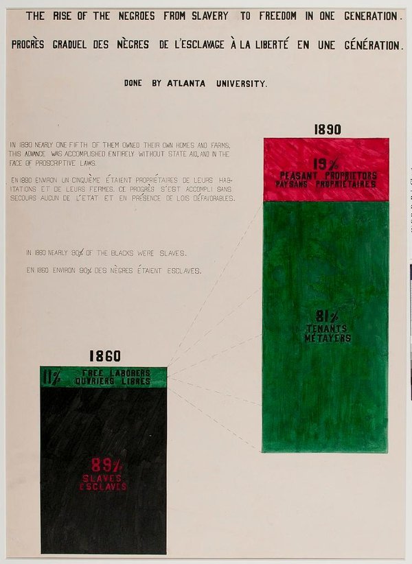
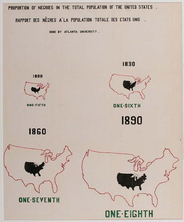
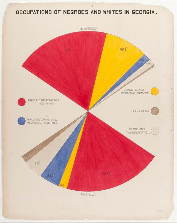
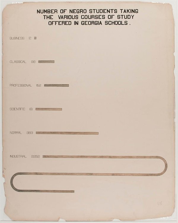
By presenting quantified data on how black people had fared in the years after the Civil War, Du Bois hoped to provide “an honest straightforward exhibit of a small nation of people, picturing their life and development without apology or gloss, and above all made by themselves.” In addition to photographic portraits of black people from the turn of the century, the infographics depict what had changed for African-Americans since slavery, in everything from education to income, Allison Meier reports for Hyperallergic. [1]
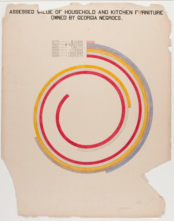
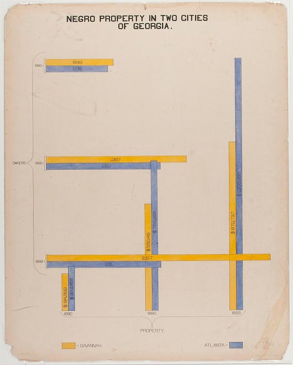
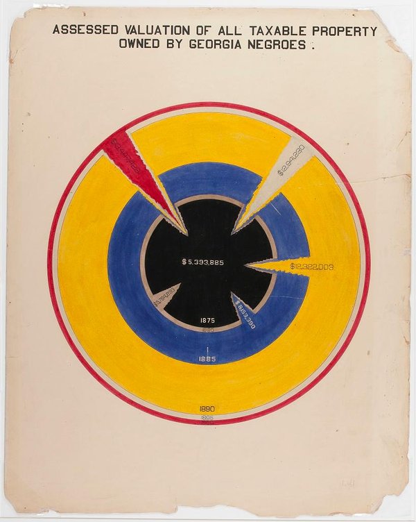
The group settled on data gathered in Georgia, as the state had the largest black population in the U.S. at the time. While Du Boise, Washington and Calloway were the banner names on the project, many of the vibrantly colored, hand-drawn infographics were made in collaboration with students from historically black colleges like Atlanta University and Tuskegee University, Mock writes. But though the drawings are over a century old, they still stand out as revolutionary for both their form and content. [1]
“Looking at the charts, they’re strikingly vibrant and modern, almost anticipating the crossing lines of Piet Mondrian or the intersecting shapes of Wassily Kandinsky,” Meier writes. “But they are in line with innovative 19th-century data visualization, which included Florence Nightingale’s “coxcomb” diagrams on causes of war mortality and William Farr’s dynamic cholera charts. Du Bois himself used horizontal bar graphs in his 1899 study The Philadelphia Negro.” [1]
The final exhibit in Paris featured 60 full-color charts on display, as well as 200 books by black authors and hundreds of photographs and maps. Taken together, the exhibition not only highlighted how far the African-American community had advanced in less than half a century, but gave the researchers an opportunity to focus on their intellectual achievements and experience in a time when the slave era was still in living memory and “human zoos” featuring people of color from colonized countries were still a common sight, as Meier writes. [1]

One thought on “DataViz as History: The Revolutionary Infographics of W.E.B. Du Bois And Booker T. Washington”