Q1: When did you get started in data visualization/infographics? What educational or career background did you previously have before you made your transition to the world of data visualization/infographics?
Before discovering Tableau, I was a student at Howard University pursuing a degree in Management Information Systems. At the time, I envisioned my career as a User Interface Designer (UI/UX Designer) for Johnson and Johnson. However, that all changed during my junior year when my professor gave an assignment to analyze millions of rows of twitter data and present it through a meaningful story. The setback of the assignment was at this point in our degree program, we had only been taught to analyze data using the standard pivot tables in excel. The data set was so large that every time the file was opened in excel the computer would crash. The professor was well aware of this major drawback and purposely left it out in the details of the assignment (which we later became aware of after turning in the assignment). As a result, I had to find another solution to analyze the data. After doing some careful research, I chose to use Tableau. I was amazed how swiftly Tableau analyzed the massive twitter data and how I was able to put a story together. I fell in love with the tool and at that point, I decided to fully immerse myself in learning Tableau, data analytics, and data visualizations.
Q2: What is the best advice you have been given, have heard or have formulated yourself that you would like to pass on to someone getting started in the field of data visualization/infographics?
The best advice I would give that I have learned is that you can design anything you want but if you are the only person who understands it, it’s pretty useless. Therefore, one must design with the end users and non-tech people in mind. If the average person stumbled across your visualization make sure they can understand the story you are trying to relay. No matter the audience your story should be clear to all times.
Q3: Who were your early influencers in data visualization/infographics? How did they inspire you?
There are so many “greats” in data visualization/ infographics that I cannot isolate just one. My influence came from a combination of scrolling through the Tableau Public Gallery, reading multiple data visualization blogs, looking at personal websites and at top data companies. They all inspired me to present stories that are visually appealing to all users and not just tech-friendly people.
Q4: Do you think that making sense of data requires analytical skills, artistic skills, both or maybe something else?
Making sense of data requires analytical skills. However, artistic skills are also required when trying to present your findings in a meaningful way that tells an insightful story that is understood by your audience.
Q5: Do you think IT professionals like data analysts, data modelers, etc. typically make good interpreters and analyzers of data?
No and yes! Typically IT professionals are great analyzers, but unfortunately that’s where it stops for a large majority of their professional expertise. It is sometimes hard for them to visually explain, interpret, and understand a lot of what they are analyzing. It also depends on how the end user wants the data analyzed and their desired end goal. For example, not all data analysts can analyze and interpret data in such a way that data scientists can and vice versa.
Q6: If you had unlimited money and time, what would you want to do to advance the field of data visualization/infographics?
Things I would work on advancing:
- Increase awareness of the field.
- Increase number of people in the field.
- Target younger generation to feed the pipeline starting with high school students.
- Teach them about the different career opportunities in data analytics.
- Teach them some of the different tools that can be used for data visualization and data analytics.
- Give them projects and “real world” experiences (internships).
- Help build their portfolio, so before college they are prepared to apply to college, have a resume, and a portfolio of projects.
- They will also be able to make an informed decision on whether or not to pursue a career in the field.
Q7: What should a young person interested in working in the field of data visualization/infographics study in college? What kinds of new courses and programs could colleges and universities offer to help them achieve their goals?
A young person interested in working in the data visualization field should take several data analytics courses as well as courses in graphic design. There are many colleges that offer degree and certificate programs in Data Analytics and Data Science etc. I would suggest to the young person to go to school, obtain a degree and become immersed in the Data Visualization/ Analytics world. I would also suggest the following: seek out “great people” in the field for mentorship and sponsorship, create a “work-related” social media presence, attend relevant meet up groups and conferences, and invest in themselves.
Q8: Do you think that the Information Technology (IT) industry generally understands data visualization and data archaeology? What are their current weaknesses and limitations?
I think the IT industry understands the basics surrounding data visualization and data archaeology. However, the full scope is not understood. The “IT” industry sometimes overthinks what needs to go into a visualization. Thus, creating a visualization that is difficult for a business user to understand and/or interact with.
Q9: Do you feel the current tools offered to non-IT information consumers are currently helpful or where do you see room for improvement?
There is an adequate number of good tools for non-IT information consumers. However, a lot of non-IT consumers resort to excel for their visualizations; therefore, the first room for improvement would be to expose/unveil the other data visualization tools that are available for non-IT consumers.
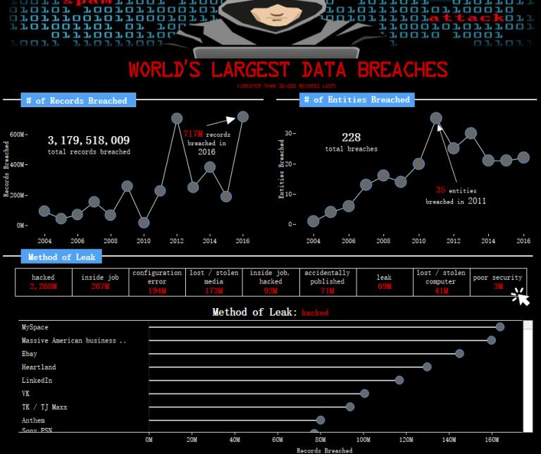
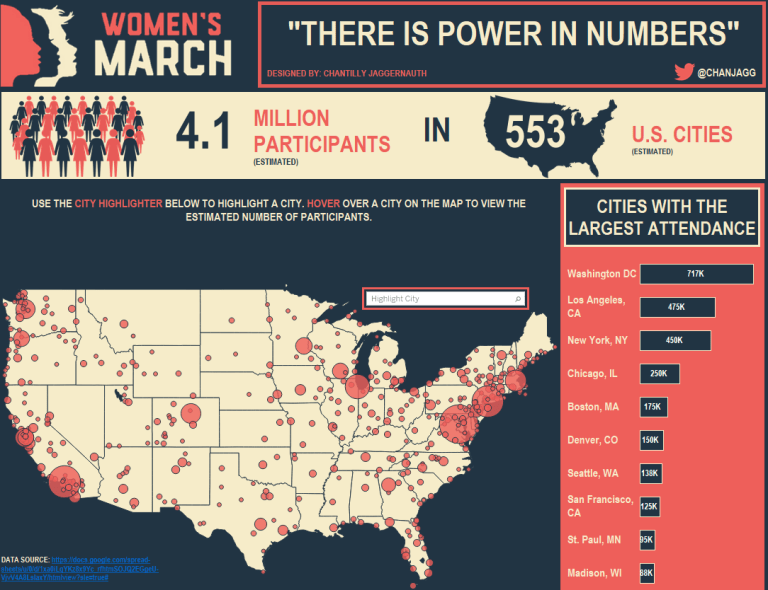
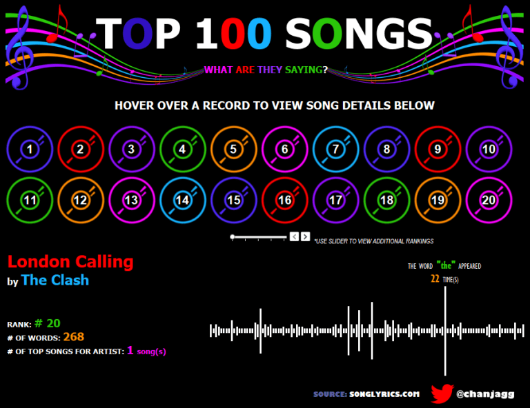
Below are some examples of Chantilly’s work on Tableau Public. Just click on an image to be redirected to it on Tableau Public.