
This chart, digitized by the Library of Congress, depicts major battles, troop losses, skirmishes, and other events in the American Civil War. (Click on the image at the end of this blog to arrive at a zoomable version, or visit the LOC’s website.).
Here are some key points to note in the chart.
- This chart was drawn 119 years ago.
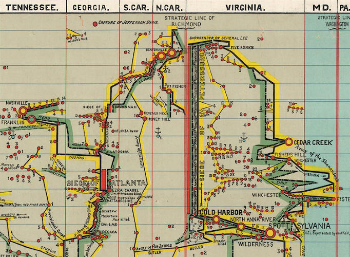
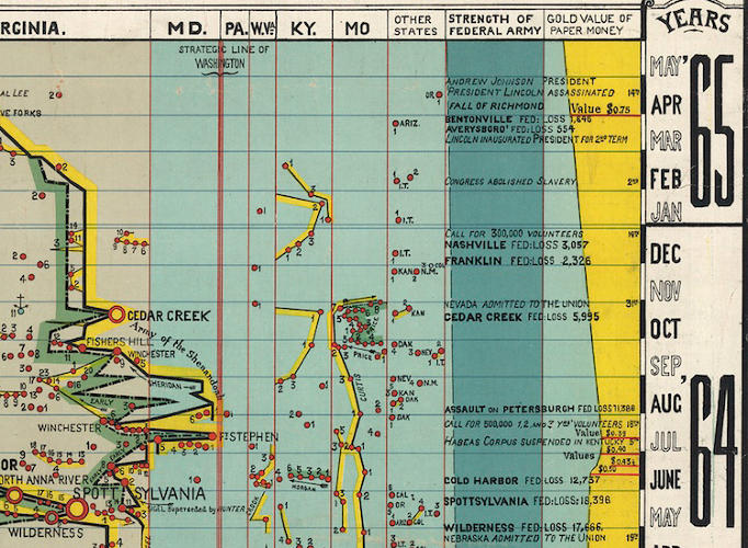
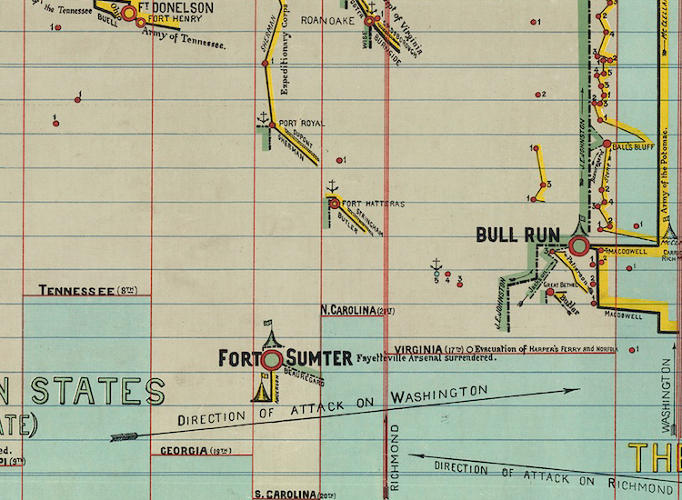
- The columns are States. They generally trend South to North as you read them left to right.
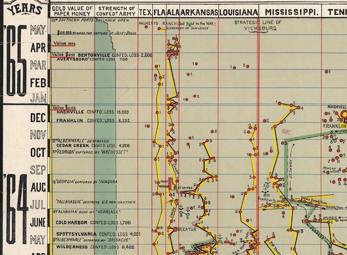
- You can watch two armies in battle over strategic lines. The yellow is the Confederacy and the green is the Union.
- If you look at the columns, Strength of the Federal Army and Gold Value of Paper Money, you can see the power of the armies and the value of money over time. Notice, for example, that the far left-hand column charts the decline in value of Confederate dollars, from one U.S. dollar in May 1861 to “nil” in April 1865, while the far right-hand column shows the decline in value of Union currency in relationship to gold, from $1 in February 1862 to $0.75 in April 1865.
- Analyzing the chart is an undertaking in itself. The level of battle-by-battle detail is incredible. The war becomes a choreography of zigzag movement.

- As you scroll down the page (chart image), you can begin to see the deceivingly simplest of starting points-the 34 hours of continuous shooting on Fort Sumter that would cause a landslide.
The “Scaife Synoptical Method,” advertised at the top of the timeline, aimed to fit as much information as possible into a single chart. Information on Arthur Hodgkin Scaife is scant, but the Comparative Synoptical Chart Company, apparently based in Toronto, also published his “Synoptical Charts” of the “Cuban Question,” English history, and the life of William Gladstone.
Figuring out how to view these charts properly would not be easy even for a person looking at the original. Get close enough to note the details and you lose sight of the overall pattern; stand far enough back to discern that pattern and you lose the details.
Jacobs’ criticism certainly applies here. A war is a complicated thing, and the chart has tried to track so many factors—geographical, political, and financial—that it’s easiest to concentrate on one or two of these at a time. However, this is a wonderful chart for those, like me, who like to graze maps and charts to see all the nuances of data involved.
Source: Rebecca Onion, Is It Possible To Fit the Civil War Into a Single Chart? Here’s One Beautiful Attempt, Slate, The Vault, September 16, 2013, http://www.slate.com/blogs/the_vault/2013/09/16/civil_war_a_chart_representing_the_major_events_of_the_conflict.html.

