India Grows, Canada Disappears: Mapping Countries By Population
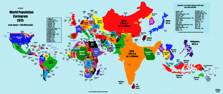
Can you find Australia and Canada? The cartogram, made by Reddit user TeaDranks, scales each country’s geographic area by its population. (Click through to see the high-resolution map.) TeaDranks/via Imgur
World maps distort — it’s inherent in their design.
Take a spherical object (the Earth) and try to represent it on a flat plane (paper), and some parts of the sphere are going to get stretched. On most maps, Canada and Russia get puffed up, while countries along the equator get shrunk.
Every now and then, though, you stumble across a map that enlightens.

A look back in time: This cartogram resizes each country by its population in 2005. Paul Breding
TeaDranks posted the graphic on Reddit’s “map porn” discussion on Jan. 16. He calls it his “magnum opus.”
“Wikipedia was my source,” TeaDranks wrote. “I was inspired by this map which is now ten years old. My map’s scale is twice as large as the old one’s.”
The older version of the graphic was made in 2005 by the cartographer Paul Breding. You can buy a copy of that map on Amazon.
But to be more accurate, both maps aren’t actually maps, they’re cartograms — graphics that scale a region’s geographic space according to a particular attribute.
In the case of TeaDranks’ cartogram, the attribute is population. A quick look at it, and a few ideas pop out.
- India has almost caught up with China as being the most populous country in the world.
- Nigeria quickly has become Africa’s population hub, with more than twice as many people as any other country on the continent.
- Cities like Delhi, India, and Shanghai, China, have more people than some European countries.
- The U.S. makes up less than 5 percent of the world’s population.
The website Worldmapper has hundreds of cartograms, showing countries sized by everything from the number of books published or tractors working to condom use by men or woman.
“One neat thing about this one [TeaDranks’ cartogram] is that unlike with some cartograms, the basic shapes of the countries are very recognizable,” Vox’s Matthew Yglesias points out.
——————————————–
Source: Michaeleen Doucleff, India Grows, Canada Disappears: Mapping Countries By Population, NPR.com, January 28, 2015, http://www.npr.org/blogs/goatsandsoda/2015/01/28/381971608/india-grows-russia-shrinks-mapping-countries-by-population.
