Readers:
 It has been a while since I have discussed some of the latest creative thoughts on data visualization from Stephen Few. I have read all of Steve’s books, attended several classes from him, and religiously follow his blog and newsletter on his website, Perceptual Edge.
For those of you who don’t know, Stephen Few is the Founder & Principal of Perceptual Edge. Perceptual Edge, founded in 2003, is a consultancy that was established to help organizations learn to design simple information displays for effective analysis and communication.
Steve has stated that his company will probably always be a company of one or two people, which is the perfect size for him. With 25 years of experience as an innovator, consultant, and educator in the fields of business intelligence and information design, he is now considered the leading expert in data visualization for data sense-making and communication.
Steve writes a quarterly Visual Business Intelligence Newsletter, speaks and teaches internationally, and provides design consulting. In 2004, he wrote the first comprehensive and practical guide to business graphics entitled Show Me the Numbers, now in its second edition. In 2006, he wrote the first and only guide to the visual design of dashboards, entitled Information Dashboard Design, also now in its second edition. In 2009, he wrote the first introduction for non-statisticians to visual data analysis, entitled Now You See It.
Here is his latest thoughts from his newsletter.
Best regards,
Michael
Why Do We Visualize Quantitative Data?
Per Stephen Few, we visualize quantitative data to perform three fundamental tasks in an effort to achieve three essential goals:
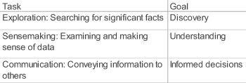
These three tasks are so fundamental to data visualization, Steve used them to define the term, as follows:
Data visualization is the use of visual representations to explore, make sense of, and communicate data.
Steve poses the question of why is it that we must sometimes use graphical displays to perform these tasks rather than other forms of representation? Why not always express values as numbers in tables? Why express them visually rather than audibly?
Essentially, there is only one good reason to express quantitative data visually: some features of quantitative data can be best perceived and understood, and some quantitative tasks can be best performed, when values are displayed graphically. This is so because of the ways our brains work. Vision is by far our dominant sense. We have evolved to perform many data sensing and processing tasks visually. This has been so since the days of our earliest ancestors who survived and learned to thrive on the African savannah. What visual perception evolved to do especially well, it can do faster and better than the conscious thinking parts of our brains. Data exploration, sensemaking, and communication should always involve an intimate collaboration between seeing and thinking (i.e., visual thinking).
Despite this essential reason for visualizing data, people often do it for reasons that are misguided. Steve dispels a few common myths about data visualization.
Myth #1: We visualize data because some people are visual learners.
While it is true that some people have greater visual thinking abilities than others and that some people have a greater interest in images than others, all people with normal perceptual abilities are predominantly visual. Everyone benefits from data visualization, whether they consider themselves visual learners or not, including those who prefer numbers.
Myth #2: We visualize data for people who have difficulty understanding numbers.
While it is true that some people are more comfortable with quantitative concepts and mathematics than others, even the brightest mathematicians benefit from seeing quantitative information displayed visually. Data visualization is not a dumbed-down expression of quantitative concepts.
Myth #3: We visualize data to grab people’s attention with eye-catching but inevitably less informative displays.
Visualizations don’t need to be dumbed down to be engaging. It isn’t necessary to sacrifice content in lieu of appearance. Data can always be displayed in ways that are optimally informative, pleasing to the eye, and engaging. To engage with a data display without being well-informed of something useful is a waste.
Myth #4: The best data visualizers are those who have been trained in graphic arts.
While training in graphic arts can be useful, it is much more important to understand the data and be trained in visual thinking and communication. Graphic arts training that focuses on marketing (i.e., persuading people to buy or do something through manipulation) and artistry rather than communication can actually get in the way of effective data visualization.
Myth #5: Graphics provide the best means of telling stories contained in data.
While it is true that graphics are often useful and sometimes even essential for data-based storytelling, it isn’t storytelling itself that demands graphics. Much of storytelling is best expressed in words and numbers rather than images. Graphics are useful for storytelling because some features of data are best understood by our brains when they’re presented visually.
We visualize data because the human brain can perceive particular quantitative features and perform particular quantitative tasks most effectively when the data is expressed graphically. Visual data processing provides optimal support for the following:
1. Seeing the big picture
Graphs reveal the big picture: an overview of a data set. An overview summarizes the data’s essential characteristics, from which we can discern what’s routine vs. exceptional.
The series of three bar graphs below provides an overview of the opinions that 15 countries had about America in 2004, not long after the events of 9/11 and the military campaigns that followed.
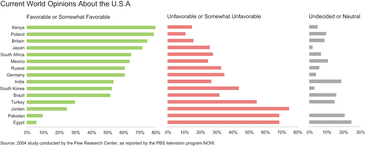
Steve first discovered this information in the following form on the website of PBS:
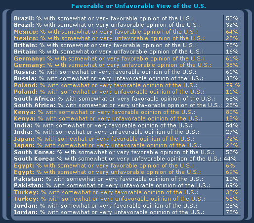
Based on this table of numbers, he had to read each value one at a time and, because working memory is limited to three or four simultaneous chunks of information at a time, he couldn’t use this display to construct and hold an overview of these countries’ opinions in his head. To solve this problem, he redisplayed this information as the three bar graphs shown above, which provided the overview that he wanted. Steve was able to use it to quickly get a sense of these countries’ opinions overall and in comparison to one another.
Bonus: Here is a link to where Steve discusses the example above on his website.
2. Easily and rapidly comparing values
Try to quickly compare the magnitudes of values using a table of numbers, such as the one shown above. You can’t, because numbers must be read one at a time and only two numbers can be compared at a time. Graphs, however, such as the bar graphs above, make it possible to see all of the values at once and to easily and rapidly compare them.
3. Seeing patterns among values
Many quantitative messages are revealed in patterns formed by sets of values. These patterns describe the nature of change through time, how values are distributed, and correlations, to name a few.
Try to construct the pattern of monthly change in either domestic or international sales for the entire year using the table below.
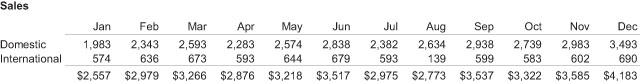
Difficult, isn’t it? The line graph below, however, presents the patterns of change in a way that can be perceived immediately, without conscious effort.
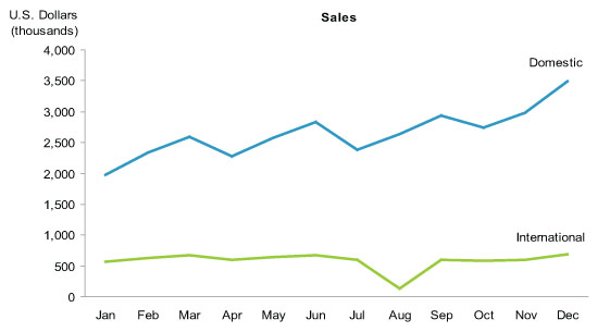
You can thank processes that take place in your visual cortex for this. The visual cortex perceives patterns and then the conscious thinking parts of our brains make sense of them.
4. Comparing patterns
Visual representations of patterns are easy to compare. Not only can the independent patterns of domestic and international sales be easily perceived by viewing the graph above, but they can also be compared to one another to determine how they are similar and different.
In Summary
These four quantitative features and activities require visual displays. This is why we visualize quantitative data.

Great post! Data is only as powerful as how it’s presented. At CDATAINSIGHTS, we help organizations make sense of their data through customized dashboards and advanced analytics. If you’re looking for the best data visualization online in Detroit or top data analysis and visualization in Mississauga, check out our services: https://cdatainsights.com/services/data-visualization – Turning data into decisions is what we do best!