Found this on the Junk Charts blog site: http://junkcharts.typepad.com/junk_charts/2013/10/deconstructing-the-map-of-beers.html
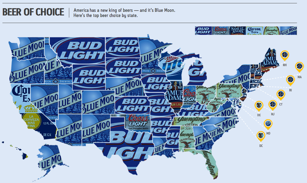
Business Insider links to this blog with a chart depicting the top beer brands by state.
I like the quilt-like appearance brought on by using the packaging of different brands. The nine glowing yellow islands sitting in the Atlantic Ocean I find annoying. This happens a lot because those New England states are smaller in area than most.
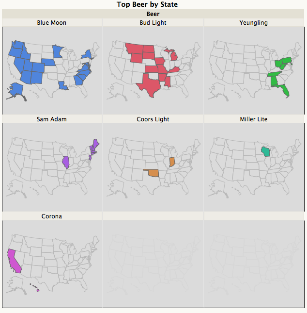
The design problem evaporates if you choose a small multiples approach. A small multiple (sometimes called trellis chart, lattice chart, grid chart, or panel chart) is a series or grid of small similar graphics or charts, allowing them to be easily compared. The term was popularized by Edward Tufte.
According to Tufte (Envisioning Information, p. 67):
-
At the heart of quantitative reasoning is a single question: Compared to what? Small multiple designs, multivariate and data bountiful, answer directly by visually enforcing comparisons of changes, of the differences among objects, of the scope of alternatives. For a wide range of problems in data presentation, small multiples are the best design solution.
As shown below, there is the added benefit that the regional pattern of brand preference is clearly visible whereas in the original chart, it is rather hard to figure out.

Information visualization or information visualisation is the study of visual representations of abstract data to reinforce human cognition. The abstract data include both numerical and non-numerical data, such as text and geographic information. However, information visualization differs from scientific visualization: “it’s infovis [information visualization] the spatial representation is chosen