The Earliest Spot Map of All
Dr. John Snow did not draw a map until December, 1854; the first spot map was produced in September of that year by Edmund Cooper, an engineer for the Metropolitan Commission of Sewers (see map below). Cooper’s investigation resulted from public complaints linking the sewers to the cholera outbreak. Rumors held sway that sewer works had disturbed the soil of an ancient pit where bodies had been buried during the plague of 1665. Many feared that this process had freed or generated noxious gases that caused the cholera. Some alleged further that cholera deaths had been especially numerous in houses next to gully-holes, the openings through which sewer gases were vented to the surface.[SOURCE]
In response, on Sept 26, 1854, the Commission held a special “court” in Greek Street, Soho, as The Times of London duly recorded the next day: “Mr Cooper had prepared a plan which accompanied his report, and on the plan a distinguishing mark was affixed, showing the houses in which death had occurred.” From his study of this map, and of the sewers themselves, Cooper concluded that the houses nearest the gully-holes had no greater number of deaths than houses not so situated. The sewers of the area where most of the deaths were clustered were in reasonable condition. The drains of the houses of the region were in generally bad condition — with many cesspools and deteriorating brickwork — and most of the houses had not taken advantage of the opportunity to connect their drains to the recently constructed sewers. Broad Street was served by two non-connecting sewers, a new one and an old one; but the numbers of deaths appeared to be equally divided between the parts of the street served by the two different sewers. Few deaths had occurred near the old plague-pit. The sewers that drained the plague-pit area flowed northward to Regent Street, where there had been few, if any, cases of cholera.
The chairman of the commission accordingly concluded, as reported by The Times of London, that “the sewers were not the cause of the cholera; that they were not in any way connected with the disease; but that the real cause of the calamitous occurrences in the locality … was the filthy and undrained state of the houses.” The commissioners expressed their hopes that these facts would be widely circulated to allay public fears.
In his report, Cooper added: “Since the outbreak, six men have been employed in these lines of sewers getting up information on this subject, all of whom, I am glad to state, are quite healthy, and entirely free from disease.” Thus, he suggested, sewer gases were unlikely to spread cholera.
Cooper’s plan appears to be the first cholera-death spot map of the Broad Street area. Moreover, his plan accounted for 316 deaths (all those recorded in the registrar general’s weekly returns to Sept 9), far more than the 83 deaths that Snow had investigated during the first week of September. It also appears from Cooper’s report that he, unlike Snow, used his map as an analytical investigative tool. Until Cooper had constructed and examined his map, he could not know whether or not more deaths had occurred close to the sewer gully holes. Indeed, he may have been the first 19th century cartographer to have used a disease map in this fashion.
Just as Snow had an agenda in drawing his maps (to implicate a contaminated pump), the sewer commission also had an agenda — to clear the gully holes and sewer excavations of suspicion. The sewers, they were happy to report, had done nothing to increase mortality in this fearful epidemic. Cooper called attention to the number of deaths in Broad Street, but apparently neither Cooper nor any of the other commissioners noticed any peculiar concentration of spots around the corner of Broad and Cambridge Streets (where the now-famous pump was located). Simply plotting deaths on a map did not lead the commission to Snow’s interpretation of the facts.

(Above) Edmund Cooper’s map of the Broad Street cholera epidemic made for the Metropolitan Commission of Sewers, September 1854. Inset: the Broad Street pump and surrounding addresses. Cooper designated each affected house by a large solid bar, and the cholera deaths occurring in each house by thin lines.
Snow’s investigation
The officials of St James’s parish (where in Golden Square is located) were aware that their locality had suffered a cholera outbreak of unusual intensity, about 500 deaths having occurred in the 10 days from Aug 31 to Sept 9, 1854, in an area of only a few square blocks. In November of that year, they appointed a cholera inquiry committee to examine the event, and asked Snow to join them. One of his tasks was to write a report on the local water supply, which he submitted on Dec 12, 1854. About a month later, Snow published a detailed monograph on the mode of communication of cholera, which included a discussion of the Broad Street outbreak. Internal evidence suggests that Snow completed the account in his monograph before he wrote his report to the parish committee. In any event, the two accounts of his methods parallel are very similar, and accord with his brief, earlier account, published in Sept 23, 1854.
Snow had observed cholera first-hand in 1831 as an apprentice surgeon-apothecary, but he seems not to have questioned prevailing theories of cholera pathology and transmission until 1848-49, when he formulated a theory quite at odds with the then-dominant views. Snow argued that cholera was a localized disease of the gut, and that its symptoms were entirely the result of fluid loss. The causal agent, he reasoned, must enter by mouth, multiply within the gut, and then spread to others by the fecal-oral route. In his 1855 monograph he suggested that the structure of the unknown agent was that of a cell but, in the absence of microscopic evidence, he avoided speculation on its exact nature. While direct contact with contaminated bedclothes, for example, could explain cholera’s spread within a household and other confined spaces, Snow deduced that the transmission of the disease across greater distances was due to drinking water contaminated with raw sewage containing the specific cholera poison. Snow described two local outbreaks of cholera in south London in 1849 that seemed to suggest strongly a water-borne route.
When epidemic cholera next arrived in England in 1853-54, Snow realized that he had an opportunity to test his hypothesis on a grand scale. Two competing water companies had laid pipes up the same streets in several south London districts. In the 1848-49 epidemic, both companies had drawn upon water from the River Thames that had been contaminated by sewage. By 1853, one company (Southwark and Vauxhall) still supplied contaminated water, while the other company (Lambeth) had moved its intake source upstream to a fairly clean section of the river. When Snow learned of his change in the water supply, he realized that this arrangement constituted a superb natural experiment. He undertook door-to-door investigations to relate cholera mortality to the source of water and found greater mortality among those drinking the water supplied by the Southwark and Vauxhall company, and made these data the centerpiece of the 1855 edition of his monograph. It was this investigation in south London that Snow suspended for several days at the beginning of September to investigate the severe localized outbreak near Golden Square.
Because he already had a hypothesis, Snow immediately investigated the water supply. The piped water was supplied by a company that drew its water from an unpolluted section of the Thames; and he knew from his own experience of living in the area that most residents preferred pump water. Moreover, his study of earlier outbreaks led him to conclude that a sharp localized outbreak pointed to a contaminated pump or well rather than a problem with the general water supply.
He turned his attention to the five pumps near Golden Square, finding that most of them contained impurities visible to the naked eye. By contrast, when Snow inspected the Broad Street pump water, on Sept 3, it looked clear; but a local resident reported that its water had smelled offensive just the day before. On Sept 5, Snow obtained from the General Register Office a list of the 83 deaths ascribed to cholera in the Golden Square area since Aug 31. In his own words:
On proceeding to the spot, I found that nearly all the deaths had taken place within a short distance of the [Broad Street] pump. There were only ten deaths in houses situated decidedly nearer to another street-pump. In five of these cases the families of the decreased persons informed me that they always sent to the pump in Broad Street, as they preferred the water to that of the pumps which were nearer. In three other cases, the deceased were children who went to school near the pump in Broad Street …
With regard to the deaths occurring in the locality belonging to the pump, there were 61 instances in which I was informed that the deceased persons used to drink the pump water from Broad Street, either constantly or occasionally …
The result of the inquiry, then, is, that there was been no particular outbreak or prevalence of cholera in this part of London except among the persons who were in the habit of drinking the water of the above-mentioned pump well.
I had an interview with the Board of Guardians of St James’s parish, on the evening of the 7th inst [Sept 7], and represented the above circumstances to them. In consequence of what I said, the handle of the pump was removed on the following day.
Thus, Snow’s initial suspicion of the Broad Street pump was a deduction based on his intensive earlier study of similar cholera outbreaks, not an induction arrived at primarily from the geographical facts of the case. While Snow was clearly thinking in topographical terms (visualizing the location of houses where deaths occurred in relation to the placement of pumps), in the case that he presented to the parish officials he neither said nor alluded to the idea that a map had been instrumental in the discovery of the source of the outbreak.
Snow first exhibited a cholera spot map (see below) (with small black bars indicating deaths) of the Broad Street area at a meeting of the Epidemiological Society of London on Dec 4, 1854, nearly 3 months after his first investigation. He had in the interim made two more local inquiries in the Broad Street area, though one was hampered by the large number of local residents who had fled the region. By December, Snow had gathered data on 616 deaths, but because he did not know the exact address of some residents of St James’s parish who had died outside the district, his map had only 574 bars.
Snow may have realized that a spot map would be a useful illustration for his report to the parish committee and for his own book. The first edition of On the mode of communication of cholera, published in 1849, contained no maps and only one table. By 1854 Snow had seen the excellent map in Shapter’s work on the cholera in Exeter, which Shapter included as a frontispiece but hardly discussed in his text. Shapter’s book, which Snow cited in the second edition of his own work, may have persuaded Snow of the value of a map as an illustration.
Snow published two slightly different versions of his map, of which the map published in his cholera monograph appears to be the earlier. By the time the parish report was published 6 months later, Snow had made a few revisions. The most important was the addition of a dotted line enclosing the area that was closer to the Broad Street pump (in walking distance) than to any other street pump (see below). Such an equidistance line dividing a map into regions is called a Voronoi diagram, and Snow’s second map has been credited with being the earliest use of this device. The map with the Voronoi diagram most closely mirrors Snow’s narrative account of his investigation on the spot; and the text of his report to the parish committee is altered from the version that appeared in the monograph to refer to this new feature of the map. This variation between Snow’s two maps lends further support to the hypothesis that he compiled them for illustrative rather than investigative purposes. As a result of his two later investigations on the spot, Snow had amassed even more data to show that most people who died of cholera, but who lived outside the Voronoi area, had nonetheless drunk water from the Broad Street pump.
Besides the Voronoi diagram, Snow made an apparently small change that later proved important. In his first map, Snow had located the Broad Street pump in the wrong place, in front of the Newcastle Arms, the public house on the corner (still there in what is now Broadwick Street but today named after John Snow) rather than adjacent to the house next door at number 40. If Snow ever saw the more accurate government maps that we will describe below, he would have discovered that the spot at which he showed the pump was actually occupied by a sewer grating. When he revised his map, he moved the pump 24 feet to the west, to its correct location.
Snow also modified the map in the parish report in several minor ways. He altered the political boundary lines to better show the area within which deaths had occurred, and added subdistrict division lines. He included one distant pump that had not been shown on his first map, raising the total number of pumps depicted from 13 to 14. He missed a more distant pump, in Nag’s Head Yard, that was shown on the other maps we will discuss below.
Because Snow was preoccupied with his more important south London study, his initial investigation in Broad Street was brief. Another member of the parish inquiry committee, Rev Henry Whitehead, eventually discovered the probable cause of the contamination in the water of the pump. In April, 1855, Whitehead learned that a child at 40 Broad Street had become ill with “diarrhea” at the end of August, and died on Sept 2. Her mother had washed the soiled nappies and disposed of the water through the house drains — drains that were later shown to run a few feet from the well of the pump. An earlier excavation of the Broad Street pump well, in the autumn of 1854, had found the brick lining apparently intact. But, in late April, 1855, a more careful excavation showed that both the house drain and the pump well had decayed brickwork that permitted percolation of fluid from the former to the latter. Snow, unaware of the death of this child, drew only four bars at number 40. Later maps incorporated Whitehead’s data and showed five bars.
(Above) Snow’s spot map of the Golden Square outbreak, 1854.
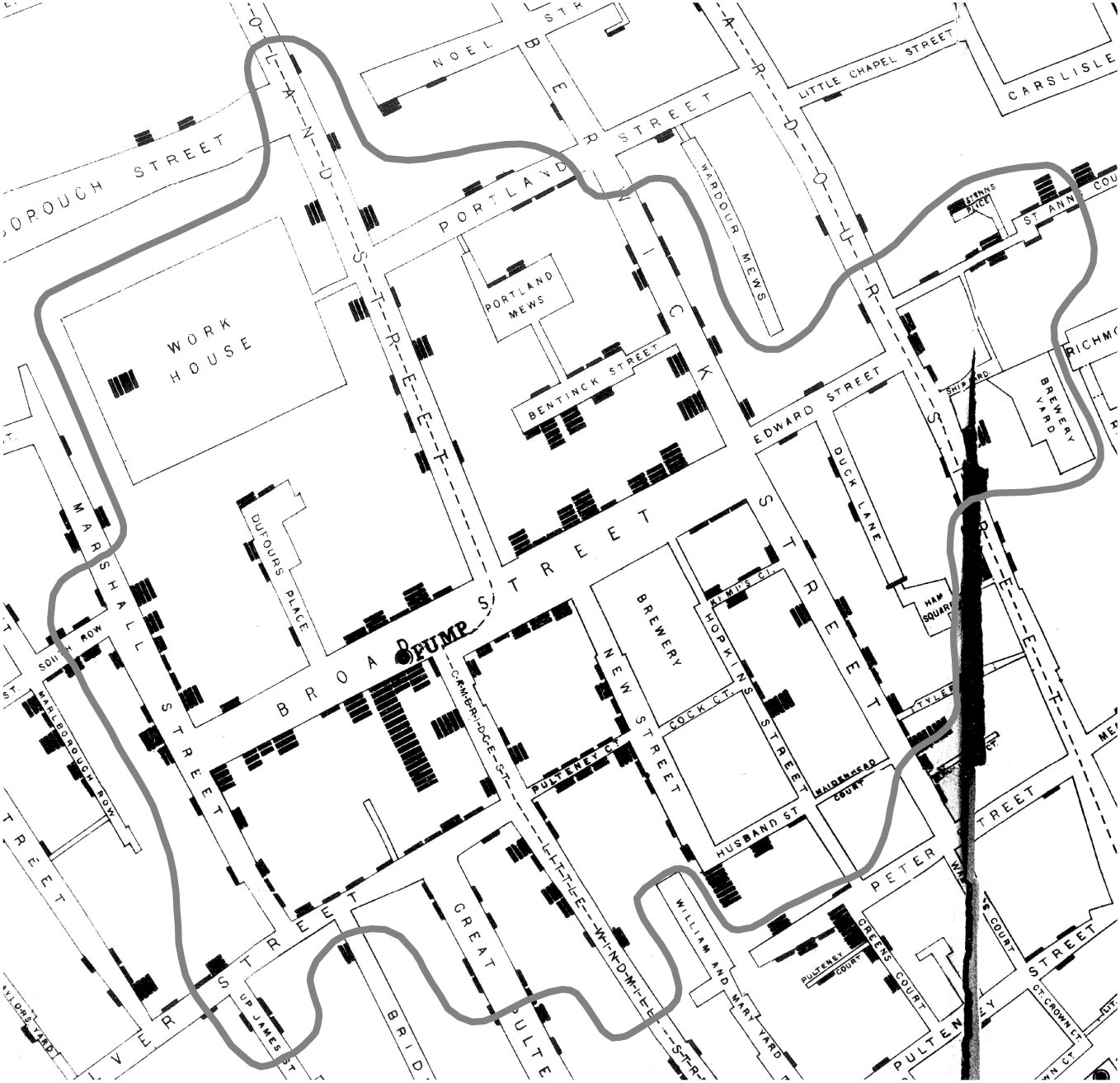
(Above) Detail from Snow’s spot map of the Golden Square outbreak showing area enclosed within the Voronoi network diagram. Snow’s original dotted line to denote equidistance between the Broad Street pump and the nearest alternative pump for procuring water has been replaced by a solid line for legibility. Fold lines and tear in original (adapted from CIC, between 106 and 07).
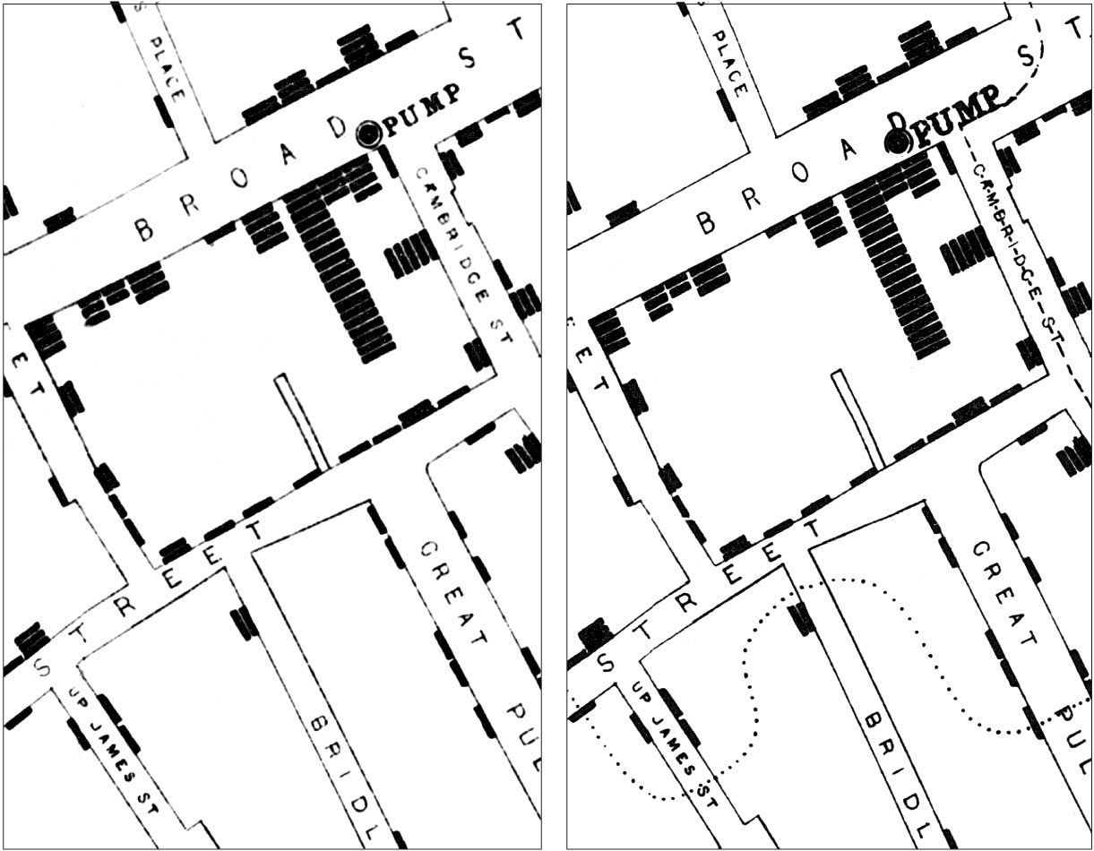
(Above left) Snow’s spot map, detail of area around the Broad Street pump (from MCC2). (Above right) Snow’s spot map, detail of area around the Broad Street pump. The finely dotted Voronoi line is in the lower half; the symbol for the Broad Street pump-circle around black dot-has been repositioned to its correct location opposite no. 40 Broad Street (from CIC, between 106 and 107).
The Later “Government” Maps
The Committee on Scientific Inquiries of the General Board of Health, the national body charged with investigating the cholera epidemic, also supervised the drawing of a spot map of the Broad Street area. This was printed both in the St James’s parish report and in the more voluminous central government report. The precise relation between this map and Cooper’s earlier map is unknown; the Parish report refers to their map as “constructed on the authority of the one published in Mr Cooper’s Report”, but it is unclear whether this refers to the map as a whole, or only to the diagram of the sewers.
The later government maps were (like Cooper’s map) more detailed than Snow’s. For example, clusters of bars depicting many deaths in the same house were better drawn, compared with Snow’s map where some of the bars appeared to be at quite a distance from the actual location of the house. The houses were numbered, making comparisons between the map and other data easier. The government investigators also had the advantage of Whitehead’s discovery of the “index case” of the infant at number 40, Broad Street — that house shows five bars on the government map (see below), compared with four bars on Snow’s two maps (see above).
But having a better map to work from assured neither adoption of Snow’s theory nor agreement among those who studied the map. The parish committee, as we have seen, supported Snow’s claim that the Broad Street pump was the source of contamination, even though they held back from endorsing Snow’s entire theory of the pathophysiology of cholera. By publishing the government map, they thought they were providing additional evidence in Snow’s favor. By contrast, the Committee on Scientific Inquiries of the General Board of Health flatly rejected the pump theory and insisted that some concentrated noxious atmospheric influence, no doubt emanating from putrefying organic matter, was the cause of the Golden Square outbreak. The committee’s thinking paralleled that of another highly respected cholera authority, Edmund A Parkes:
“On examining map given by Dr Snow, it would clearly appear that the center of the outburst was a spot in Broad-street, close to which is the accused pump; and that cases were scattered all round this nearly in a circle, becoming less numerous as the exterior of the circle is approached. This certainly looks more like the effect of an atmospheric cause than any other; if it were owing to the water, why should not the cholera have prevailed equally everywhere where the water was drunk? Dr Snow anticipates this by supposing that those nearest the pump made most use of it; but persons who lived at a greater distance, though they came farther for the water, would still take as much of it … There are, indeed, so many pumps in this district, that wherever the outbreak had taken place, it would most probably have had one pump or another in its vicinity.”
It was not unusual at that time to see spot maps invoked in defense of a miasmatist theory of disease transmission. As early as 1798, Seaman used two spot maps to illustrate a report on deaths from yellow fever in New York [16], and these maps were later used by both contagionists and anti-contagionists to advance their respective causes.
Cooper marked with a thick bar each house in which death from cholera had occurred, and indicated only by thin lines how many deaths had occurred in each house. Thus households that had suffered one and ten deaths, respectively, appeared similar on quick inspection. For Cooper, the cause of cholera was obviously a generalized environmental influence, and so what mattered were the locations at which deaths had occurred. By contrast, Snow’s theory required the unit of analysis to be the individual, since in any house, some might have drunk the pump water and some not. Nonetheless, the Board of Health adopted Snow’s method of marking the frequency of individual deaths (which was the standard method of the day), but without accepting Snow’s theory.
The different conclusions drawn by the two official investigations in Broad Street are reflected in the one change that the parish committee made in the government map. The Board of Health, in constructing their map, saw no reason to focus on the Broad Street pump. By contrast, on the otherwise identical map included in the parish report, a circle was drawn, of a radius of 210 yards, with the Broad Street pump at the center. This circle defined the “cholera area”, within which the mortality was greatest. The parish committee apparently did not realize that by depicting the high-risk zone as circular, they were inviting a rebuttal such as Parkes’, that the diffusion of an impure atmospheric influence would best explain the distribution of deaths. By contrast, Snow in drawing his irregularly-shaped area based on walking distance to the nearest pump, neatly turned aside such a criticism.
The government map-makers disagreed among themselves in one other way. The local inspectors appointed by the General Board of Health to investigate the Broad Street outbreak, Drs Fraser, Ludlow, and Hughes, found themselves walking the pavements at the same time that Cooper was making his survey of the sewers, and the two groups exchanged information on at least one occasion. But, while Cooper thought that his own map conclusively proved that the sewers were not to blame for the epidemic, the Board inspectors stated in their report that the gully-holes and their bad smells had been a major source of the cholera. Neither Cooper nor the Board inspectors offered any sort of numerical analysis in defense of their respective interpretations.
(Above) The General Board of Health map used by CIC, with Whitehead’s “cholera area” indicated by a circle (CIC, between 96 and 97).
Conclusion
It appears that John Snow thought geographically, but did not use a map to discover the likely source of the Broad Street outbreak. Snow’s map of the epidemic area was simply the visual representation of a deduction from a theory of transmission developed earlier, which in turn was grounded in a theory of the pathology of cholera as primarily a disorder of the gastrointestinal tract. But, since 1902, when reproductions of his maps began to appear in textbooks of hygiene and public health, our fascination with the map has tended to distort our understanding of his methods. As our survey of the government Broad Street maps has shown, the mere act of seeing data arranged graphically in space yields no new understanding without the support of a pathological theory.
One sees an echo of Snow the mapmaker, without the corresponding appreciation of Snow the thinker, in today’s “desktop mapping revolution” among public-health investigators, both lay and professional. Geographic information systems (GIS) are in vogue to show the geographical distribution of individual or aggregate morbidity or mortality. GIS and spatioanalytical research in general has great potential when used to test specific biologically plausible hypotheses about causes of disease. But these same methods can be dangerously misleading when used merely to generate information about geographical and epidemiological associations. Associative data, plotted in the form of a highly sophisticated and accurate map, may easily seduce us into concluding that we have learned something about the cause of disease. Resulting claims about disease “hot spots” may create unjustified worry and distract attention from solid but less visually appealing lines of research. If the methodological assumptions underlying these uses of GIS are correct, Edmund Cooper and not John Snow would have been credited with unraveling the Broad Street cholera outbreak.
As the tale of the Broad Street pump has been transformed into an anecdote resembling an urban legend, a recurring theme represents Snow as a clear-eyed modern thinker who saw the facts, and was opposed by defenders of ancient preconceived theories. But it misrepresents history, and does Snow an injustice, to imagine that he was not guided every bit as much by his own theory as his opponents were by theirs.

2 thoughts on “DataViz History: The Ghost Map: Myth-Making and Evolution of the Ghost Map”