One of my favorite data visualizations of all time is John Snow’s “Ghost Map” that helped identify the cause of the 1854 London cholera epidemic.
I am currently reading Steven Johnson’s exciting book on this tragic chapter in London’s history. The book is titled The Ghost Map: The Story of London’s Most Terrifying Epidemic – and How it Changed Science, Cities and the Modern World. I am planning on talking about Mr. Johnson’s book and the events it discusses in next month’s DataViz History blog.
As a preview of this upcoming blog (and an interesting treat), I thought I would share some paper sculpture art from Matthew Picton. Below is a photo of Mr. Picton’s art titled “Ghost Map” The 1854 London Cholera epidemic 2011.
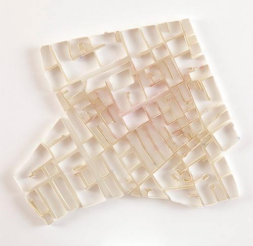
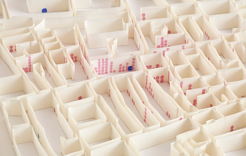
Notice that it is a 3D version of John Snow’s famous map made out of paper. In the detail view below, note that he shows the deaths at each building with red dots and the location of the water pumps with blue dots.
 Mr. Picton studied Politics and History at the London School of Economics. He has been a professional artist since 1998 and has exhibited widely on the West and East coast of the United States and participated in numerous art fairs. He has exhibited internationally in the UK and Germany His work has been reviewed in many publications including Art Forum, Art News, Art Ltd, Art Week, The Los Angeles Times, The San Francisco chronicle, The Washington Post, The Independent (UK) and the Atlantic Cities amongst others, His work is included in the collections of The De Young Museum, San Francisco, The Herbert Museum of Art, Coventry UK, The Fidelity Bank collection, London UK.
If you come across current art that depicts historical data visualizations, please send it my way and I will blog about it (and of course, credit you as the sender).
Regards,
Michael

Beautiful ! ‘The London Cholera’ was the cornerstone of our Epidemiology training as medical student in Rotterdam (The Netherlands). Certainly an inspiration for me:
http://goo.gl/photos/5dfz8thS7U