
Hello readers. Happy Belated New Year!
Back in May, I did an interview with Aurélien. He had recently started to create a series of illustrations on several themes such as data visualization best practices, funny situation or daily problems from our data lives, dashboard design, user adoption, data mindset, etc.
Since then, Aurélien has created the web site Dataviz Clarity. Through his web site, you can learn the fundamentals of data visualization where he relies on proven principles, building better products, giving your data a better impact, and avoid the technical fluff and long researching.
https://www.datavizclarity.com/
Below are a few questions with Aurélien to find out more about his new venture.

QUESTIONS

Michael: Hello, Aurélien. It has been an exciting 7 months following you on LinkedIn. Besides continuing the creation of your illustrations to help us understand data visualization and best practices, you now have a new web site, Dataviz Clarity.
Can you tell us a little bit about the new web site and what you will be offering?
Aurélien:
The aim of Dataviz Clarity is to bring knowledge and awareness to Data Visualization and Data Analytics.
We all know the tools and platforms, and many experts speak very well about that. Dataviz Clarity’s role is to bring a look at what, in my opinion, is most lacking in this field: method and a pinch of design.
Currently, only The Fundamental of Data Visualization has been released. This is a lifetime access to my private gallery, giving people access to the visuals I’m creating about best practices in high definition. The gallery gets an average of 1 new illustration per week.
The next product will be a tool enabling dashboard designers to evaluate their dashboard on 40 criteria, drawing up an inventory of the dashboard’s strengths and areas for improvement.
This year I will also build a complete training about Data Visualization best practices and methodology in any Data Visualization creation process.

Michael: I have shown above your Best Practices Cheat Sheet for Data Visualization. Can you briefly discuss each of your recommended best practices and why we should follow them?
Aurélien:
A: Margins is breathing. People tend to use borders to separate content, please don’t. It will clutter your dashboard. Use empty spaces instead.
B: The font you chose is a key element when developing dashboards or analysis reports. Choose a sans serif font that’s compatible with every computer of your company.
C: “We have to reduce the clutter” is probably the sentence I say the most during coaching session. It’s human and common to want to add more and more, but it’s important to know when to stop, to keep the dashboard uncluttered, limited to the essentials.
D: Text hierarchy allows designers to draw attention in a particular order. It’s a powerful technique that few people use. Most of the time, I see a title in H3 for the chart title and everything else in plain text. This lacks any nuance.

E: This is probably where dashboard designers spend most of their time. Choosing the best chart is not only difficult, it often takes too much time. Sometimes, aiming for simplicity can save a lot of time. Create a chart chooser dedicated to your business, it will save your designers time and energy.
F: Remove unnecessary elements to limit cognitive load to the essentials: data.
G: Follow Z pattern to help users find their ways when they are reading your dashboard. Of course this pattern could change depending on the country and culture, always pay attention to that before going to dev.
H: Always add more context than you think. In 99% of cases, the dashboards I see lack context. Put yourself in the end-user’s shoes for a minute and try to spot any part of your dashboard that forces the user to guess or search for information on their own.
I: Titles, filters and buttons should be placed close to their target. When you call an elevator, you expect the elevator doors in front of you to open. Wouldn’t you? It’s the same here. Don’t complicate things.
J: Never, ever make your users tilt their heads to read your text or chart. It’s a terrible idea. I always look at end-users’ body posture when they first discover the dashboard. You can learn a lot about end-users and your product by observing their body posture.

Michael: One of my favorite illustrations you have created is The History of the Dashboard. Can you tell us about 3 dashboards or data vizzes that have inspired you over your career?
Aurélien:
The very first dashboard that took my breath away was the one by Yvan Fornes presented at TC Paris in 2015. I found his dashboard so logical, well thought out and well designed. I was certain that Yvan had a user-centric approach and that he couldn’t have developed such a product without interviewing users, without understanding the need. I think it was from that day on that I really fell in love with data visualization.
Thank you Yvan! He has no clue about this.
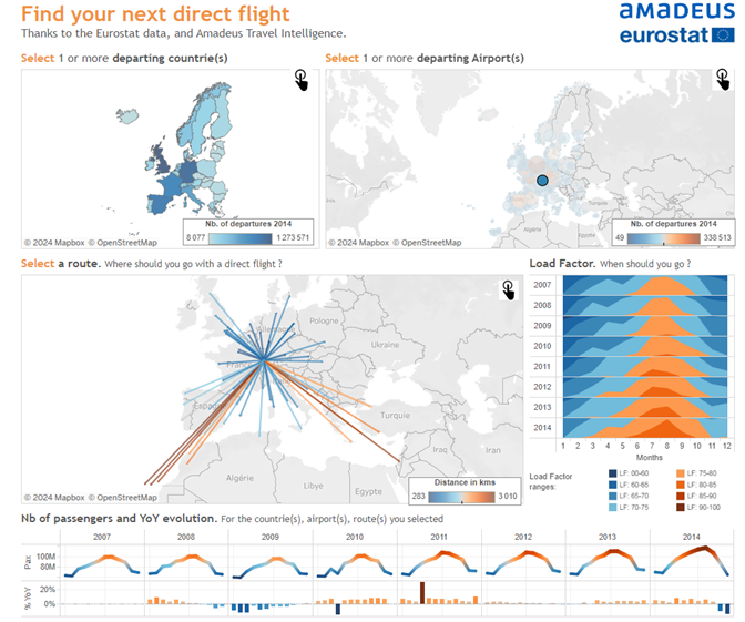
https://public.tableau.com/app/profile/yvan.fornes/viz/YourfuturDestination/FindyourDirectFlight
The second one is Pulling String from my friend Ludovic Tavernier :
https://public.tableau.com/app/profile/ludovic.tavernier/viz/PullingStrings/PullingStrings
What an incredible piece of art based on data. Ludovic’s creativity never ceased to surprise me. And he know how to blend data, design and visual poetry. His work was and still is a true inspiration to me.
And the last one is a D3JS Data Visualization created by Shan Carter
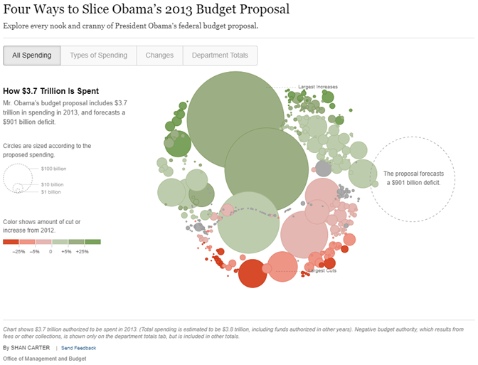
The layout of the elements is perfect. The animation allows the user to follow the story as the data transforms. It’s fascinating.

Michael: In another one of your illustrations, you show some Big Aggregate Numbers (BANs) and note that “more context = better adoption.” Can you discuss how BANs help us with user adoption of our dashboards?
Aurélien:
BANs are a good way to initiate people to Data Visualization. Simply create an section containing a KPI, compare it to the previous year and add a sparkline to obtain a harmonious card that can be placed at the top of the dashboard for a clear view of the most important indicators.
The sparkline is slight and elegant, suggesting the data without imposing itself. From that point, we can add a second chart and then demonstrate the potential of data visualization.
Michael: Over the years, I have created dashboards based on user requirements. We had numerous meetings, iterated through data and design, conducted user testing and QA, etc. Yet, many times, the user will look at the dashboard once or twice and never use it again. Often, they revert to the data they have in Excel.
Can you discuss what the problem may be here?
Aurélien:
Several reasons motivate users to export to Excel.
– They have legal obligations that go beyond the scope of BI.
– They’re not sufficiently trained and prefer to stick to a tool they’ve already mastered (Excel).
– They don’t trust the data enough to see it in aggregate form.
– They have not been invited to participate in brainstorming, sketching and giving their opinions and feedback. They don’t feel included in the process.
Michael: Thanks again for updating my readers about your new web site. Let’s talk again in July or August and gain more insights from you.
Aurélien:
Thank you so much for this opportunity, Michael. It’s always a pleasure to answer your questions and delve deeper into these fascinating subjects.
