Will Perkins Bio
A native and proud Texan, Will and his family live in the Dallas metroplex. He’s happily married to his wife of almost 10 years and have an almost 2 year old boy full of energy. He’s a big FC Dallas fan and can’t wait for things to go back to normal so he can sit on the stands again and feel that energy of the game and cheers. Professionally, he has been working in the financial services world for nearly 9 years. His work background is rather diverse ranging from bussing and waiting tables, bartending, being an extra on Walker Texas Ranger and Any Given Sunday, volunteer mentor for an international young men’s leadership group called DeMolay, and even a brief stint as A valet. All of those experiences helped him form a foundation that he uses today: customer service, communication, wearing many hats, and patience.
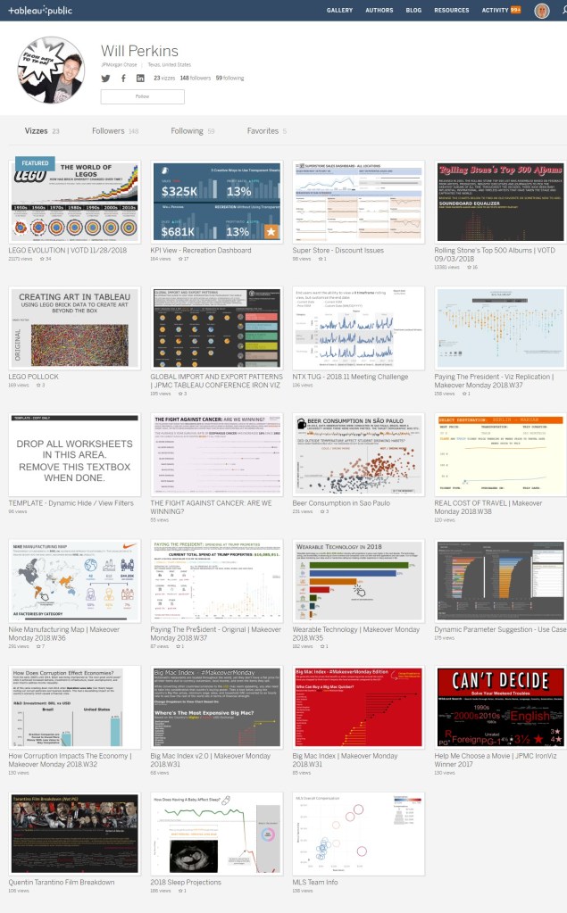
Regarding his Tableau journey, he is super inspired by the exponential growth of content. Just a few years ago, the primary, mainstream sources he knew of were Andy Kriebel (#MakeoverMonday and his blog) and The Big Book of Dashboards by Steve Wexler, Andy Cotgreave, and Jeff Shaffer. Since discovering the #DataFam community, he has seen diverse content, amazing willing, and open content creators, amazing feedback loops, and so on. It’s truly inspiring what a piece of software has done for the world.
QUESTIONS
Michael: Hello Will. How did you find out that data analytics was your passion?
Will: Hey Michael! I’m happy to be here with you. Can I first say? Long time reader. First time interviewed.
I have been in data analyst type roles since roughly 2011. I kind of fell into it by luck/chance. Being a fairly recent newlywed, I had grown tired of the refresh rant industry life and hours. I needed something more stable and didn’t know what that was. A buddy of mine got me an interview with a financial services consulting firm looking to ramp up a large project in a short timeframe. I had zero experience in both consulting and financial services, but I was able to sell my transferable skills and land that role.
During the first couple of months, I realized my inexperience helped me see things in a Different light than everyone else who had been doing this for years. I found shortcuts to processes, had better quality scores, and eventually was moved to be the Subject Matter Expert (SME) partnered with IT to build a user tool. Eventually I moved to a couple different projects building my Access/Excel VBA skills with a great mentor. I landed on a role with JPMorgan Chase and they eventually hired me on. That role with Chase opened up many doors to me.
I learned a little about this tool called “Tableau” that was being forced onto our team. I was very resistant because I could do dynamic “reports” in Access/Excel through automation scripts and custom dashboards. I eventually saw the light and built HORRIBLE dashboards (because we all start that way) and it started making major differences in how our business ran. I slowly learned more and more, read more and more blogs, discovered the #datafam, and needless to say, I was hooked.
Michael: Hello, Will. You recently posted the following tweet.
I’m a big fan of vizzes that I can use in the office and have repeatable. I saw this viz from @ryanvizzes (NOTE: Ryan Sleeper) when he talked about transparent worksheets and thought, “Why do I need a transparent sheet for that?”
Can you tell us the thought processes behind this and the trick you used to do this without transparent sheets?
Will: As I mentioned in the tweet, my main viz-spiration comes from those who create useful and informative ways to stretch the tool in practical daily applications I can use at the office. I optimistically think that we have an advanced data culture at JPMorgan Chase even though a lot of people still revert back to recreating bad Excel “reports” because that’s what’s asked of them. Some of my favorite public creators of this type of content are Ryan Sleeper, Lindsey Poulter, Luke Stanke, Ann Jackson, Curtis Harris, and so on. It’s not that I don’t like the fun/different vizzes like Zach Bowders, the Flerlage brothers, Toan Hoang, and others make, in fact, quite the opposite. I love seeing how far the tool can be stretched and molded into “what it’s not”! It’s just 99% of the time, those would never see the light of day at JPMC because they are either one-off vizzes or what I consider “one and done” dashboards.
I Google vizzes all the time and saw this image from Ryan’s blog about transparent worksheets and different functions of them. When I saw it, I knew it could be done with one worksheet. There isn’t really a trick per se, just solving of a puzzle. I like to break things down into their lowest common denominator when solving the problem. Here I saw a 13 month bar chart, 2 colors (current and prior months), and a KPI title and value at the front. I knew I could do the bar chart as a single axis with the colors and then did a dual axis with AVG(0) and a blank shape chart. I then formatted the label to show only min value applied to the date range and formatted accordingly.
Michael: You are a Data Visualization Manager at JPMorgan Chase. Can you discuss how you use Tableau in your current role?
Will: Suffice it to say, the foundation for my role is Tableau and Alteryx focused. I consider myself a Tableau evangelist. One of my peers gave me a Game of Thrones type name. Will Perkins, first of his name, buzzer of data, breaker of crosstabs, destroyer of pie charts, leader of GIFs.
I build solutions for multiple stakeholders, improve reporting processes for our partners, and drive the data culture to the next level. These are things I truly am passionate about and proud to say I think we do a good job. Our primary customers support our C-Suite and Market Leadership Teams so data is both mission-critical to accuracy and understanding. I have no problem asking questions like a 2-year-old kid. “What are you trying to measure?” “Why are you trying to measure it?” “So what?” I don’t always “win” those conversations, but I do draw out more of the solution than when I started.
I am one of the most vocal members of our internal Tableau community. We have an internal chat room for all the developers and probably once a week I get on my soapbox of driving the culture to the next level. Too many non-data people want only what they’re comfortable with: Excel. A lot of developers either don’t have the confidence in the tool or themselves to speak up and offer that other solution. I have told countless people to feel free to make me look like the bad guy, add me to meetings, etc so I can say they should never create this 80 column, 50k row crosstab because it doesn’t really provide quick answers. At least 90% of what we solve can be solutioned with KPIs, bar/columns, and lines. Everyone measures widgets: How many? Who’s doing better? What are the statuses? Etc. There’s not a big reason to reinvent the wheel.
I helped stand up our first internal TUG for JPMC outside of our COE’s quarterly updates. We had a gap in our community so we’re filling it with networking, continuous training, and helping members build strengths like public speaking and communication. We thought we were original coming up with a Pimp My Viz segment where we help people understand the process is not just providing what’s asked, but providing a true solution to the need. The amount of “lightbulbs” going off during that session was amazing. The last time I checked, I believe there are 7 other hubs that stood up their own TUGs based on our structure.
One of the things I’m currently working on is a training program with a couple people from my team. We are working on how to bring new developers up to what our group expectations are while at the same time, raising our group’s standards. Turning black belts into Chuck Norris. You know, a rising tide. We are going to dive into super detailed Tableau topics and how it works. We’ll also be implementing monthly community activities like #MakeoverMonday and #WorkoutWednesday to help stretch ideas and reset people’s thought processes. Something about looking at new data or ideas that help reset your BAU view of solutions.

Michael: You are a big fan of FC Dallas Soccer. Can you tell my readers what makes Major League Soccer (MLS) interesting to follow?
Will: I fell in love with the concept of soccer/football/futebol in 2010 during the World Cup in South Africa. Prior to that, soccer was the most boring thing in the world. It took me a little while to understand the rules like offsides, penalties, and strategy, but it was the energy of the game and passion of the fans. It has an international appeal that doesn’t require the same language. It’s truly diverse.
FC Dallas is in my backyard. We’re not a high dollar team, which is a common complaint within our fan base, but because of that, our players and club have a very “family” feel to them. When you meet them, they are humble and sincere. They know (or at least show) that without fans, they wouldn’t have a job. That’s not the same ego you find in most professional sports.
Also, soccer has a time limit. I know that, unless it’s a must-win game, I’m committed for AT MOST 2 hours. The more I loved soccer, the less I could stand American football. It’s a game of 15 minute quarters but the game starts, stops, starts, stops, swaps players, starts, stops. It could easily go on for 4 hours. Baseball? Love to play, but it’s a pain to watch especially in the Texas summer sun. I am, however, excited to see what an experience at the new Globe Life Park is going to be like.
As a fun side note, one of the first people I remember following on Twitter for FC Dallas stuff was Steve Fenn because of all his MLS analysis. He’s got some great content out there that’s a joy to consume.
Michael: Can you tell me your three favorite Tableau tips and tricks?
Will: This is an interesting question. I don’t consider what I do tricks until I show someone how to solve a problem and they get lost in the process. Trying to narrow it down to 3 will be tough…
1. Date calculations are highly underused, ESPECIALLY, DateDiff. A common theme I see at the end/beginning of every year is a lot of technical debt to go and rearrange colors on line charts, hardcoded calcs looking at prior year, labels that are now affected, etc. I have always loved DateDiff because while date values change, numbers don’t. If you’re doing a 13 month trend, it’s a lot easier to use DATEDIFF(‘month’, {MAX([Date Field])}, [Date Field]) and filter on values -12 to 0. Those will never change.
2. SIGN(). When I saw SIGN(), it opened up my eyes when I saw SIGN(). When I’m working on a dashboard that uses KPIs, I make sure the business provides me a field called Metric Color with a value of 1 or -1 for if the number going up or down is a good thing. This allows me to have easy calcs for labels and colors. The basic solution is like this:
If SIGN([Metric Value]) = [Metric Color] then “Good”
Elseif SIGN([Metric Value]) = -[Metric Color] then “Bad”
Else “Who knows?”
End
3. Blank shapes for KPIs. Ever since I learned I could add blank shapes into the tool, I’ve been trying to figure out various ways to use them. Instead of using Text mark types, you have a cleaner view with the exact same look and feel with a blank shape. Find a blank PNG on Google, save it in your shape folder, and explore!
All 3 of those techniques were used in recreating Ryan’s viz.
Michael: I have always been curious about your Twitter handle, @_gringuinho_. Can you tell my readers the story behind it?
Will: There’s really not too much of a story behind it. It really just means the little gringo in Portuguese. The same handle without the underscores was taken so I added an underscore to start and finish it.
I wanted it to show I could speak Portuguese as well. I learned it on my own after discovering Brazilian music and dancing. It was my first glimpse into their culture and I was hooked. It’s a good thing too because that’s really helped my relationship with my wife. She’s from São Paulo and all of her family is still there. Being able to speak the language, understand culture and jokes, and getting to know them has been a huge blessing.
Michael: What is next on your “To Do” list? What can the Tableau community expect to see from you in the near future?
Will: I wish I had more time in the day sometimes and other times, I don’t. I just finished working on my Data & Analytics post-grad certification from THE Ohio State in a partnership with JPMC. I started a local chapter and mentor an international young men’s group called DeMolay. I was a member growing up and it helped me become the man I am today beyond how good my parents were. I have a young son and an amazing wife. I love spending time with them. I have some vizzes in my head I want to do but lack the commitment of time to sit down and do them.
One is I want to share the story/music of one of my favorite singers, Gusttavo Lima. He’s a Brazilian country singer who seems to be just a stand-up human being. He’s got great music, does great humanitarian work, and he just seems like a guy I want to have a beer with.
Another viz is to share the messages of my son’s favorite cartoon (and mine) called Mundo Bita. It’s a Brazilian cartoon with music videos on YouTube. The songs have messages about equality, friendship, differences are what bring us together, and so on. Some are silly and educational and others are just creative ways to show imagination. At the end of the day, I can’t get the songs out of my head and it doesn’t bother me.
A final idea I had was just what a viz would look like, but I have zero data behind it. I’m interested in highlighting how common infertility treatments like IVF are. My wife and I didn’t know that until we had to go through it ourselves. We were going through it alone but guided by different blogs and YouTube videos of people we didn’t know. Since then, we are completely open about what we went through and have been able to even help some of our friends struggling.
As far as what can the community expect from me in the near term? I can confidently say more GIFs, sarcastic comments, and continued friendship.
Tableau Public
Link: https://public.tableau.com/profile/will.perkins#!/