

Luca Urzi Bio
After studying and living in Rome and Paris, Luca earned 4 years of experience as a Web Project manager and Data Analyst in London, also managing to represent his company in Sri Lanka to follow the development of a project. Nowadays, Luca is working as a Tableau Consultant for the Information Lab Italia, helping their clients to boost their data analysis skills by supporting them with the creation of meaningful and eye-catching dashboards.
Always curious to investigate the full story behind news and social trends, Luca found in the Tableau Community his natural environment to express his ideas and creativity.
Passionate traveler and gamer, Luca loves to spend his spare time creating things (whatever it is drawing, cooking, writing a story or designing a dataviz).
QUESTIONS
Link to data viz:
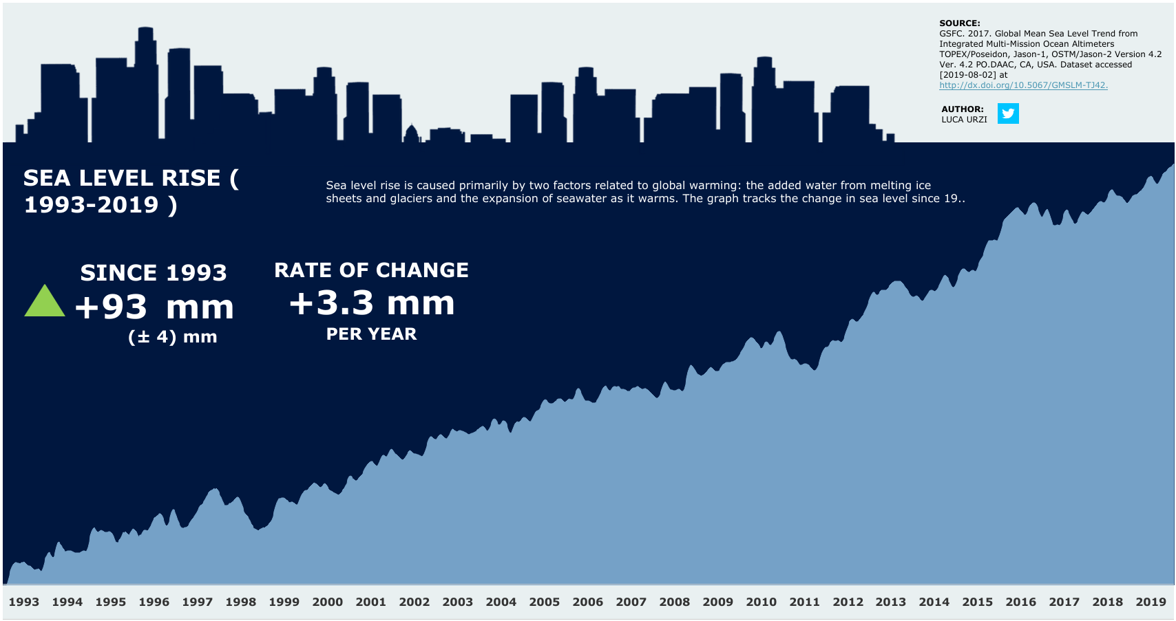
https://public.tableau.com/profile/luca7027#!/vizhome/SeaLevelRise1993-2019/SeaLevelRise1993-2019
Michael: Hello Luca. I have been a big fan of your work for some time. I was admiring your data visualization on Tableau Public, Sea Level Rise (1993-2019). Can you tell my readers about your process to harvest the data, design the dataviz, and then create this dataviz in Tableau?
Luca: Hi Michael. Thank you for inviting me into your blog! Well, let’s start saying that the majority of dataviz I create are inspired by things happening around me or interesting news I read on the internet. I have always been a curious guy, so when I hear something that get my attention… I like to investigate further and understand the background story. So yeah, few days ago I was reading about 12 billion tons of Greenland’s ice sheet melting in one day and how this was going to affect the global sea level during the next months. “That’s bad!” – I thought – “But.. what about the actual sea level rise during the last years? Is it really getting this bad, or are media just empathising this event?”. Therefore, I decided to do some investigations and find a reliable data source, which happened to be the official NASA website. As soon as I had a look at the numbers, I realized that the negative trend was there and I decided to go ahead and create a dataviz so to share this important info with the Tableau community.
The design process is always an important part of my projects. Normally, I like to integrate the actual data with some related graphic elements, aiming both to catch the reader’s eye and to frame the information in a consistent environment. In this case, as I was going to visualize the sea level rise, I thought to use an area chart in order to simulate the effective rise of the oceans throughout the years, whilst the dark-blue city landscape works both as a “suggestive” way to visualize the risk of cities being submerged and as a neat background to show the title and the numeric KPIs.
To be honest with you, I don’t sketch my dataviz before starting the creation process. I tend to have a clear picture in my head about how the final result will have to look like, and I make on-the-go adjustments while working on the dashboard. To do this, I like my data nice and ready before start approaching the visualization part. For example, I tend to do all the calculations and the graphs’ layout at the very beginning of the creation process, so I can keep the fun part at the end and free my creativity with colours, shapes, icons and formatting.
I can show you some more examples of dataviz inspired by news or topics triggering my interest. This one is titled Full-flowering history of Japanese cherry in Kyoto and shows how cherries are blooming earlier in Kyoto during the last decades (probably because the average temperature rise). As much as it just looks like a tree, the graph is a scatter plot, where the branch is a trend-line and the flowers represent the full flowering date within a specific year.
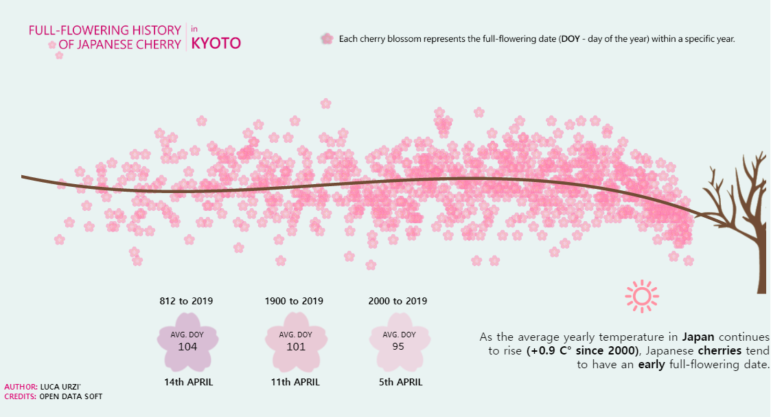
Link: https://tabsoft.co/2IrJgzq
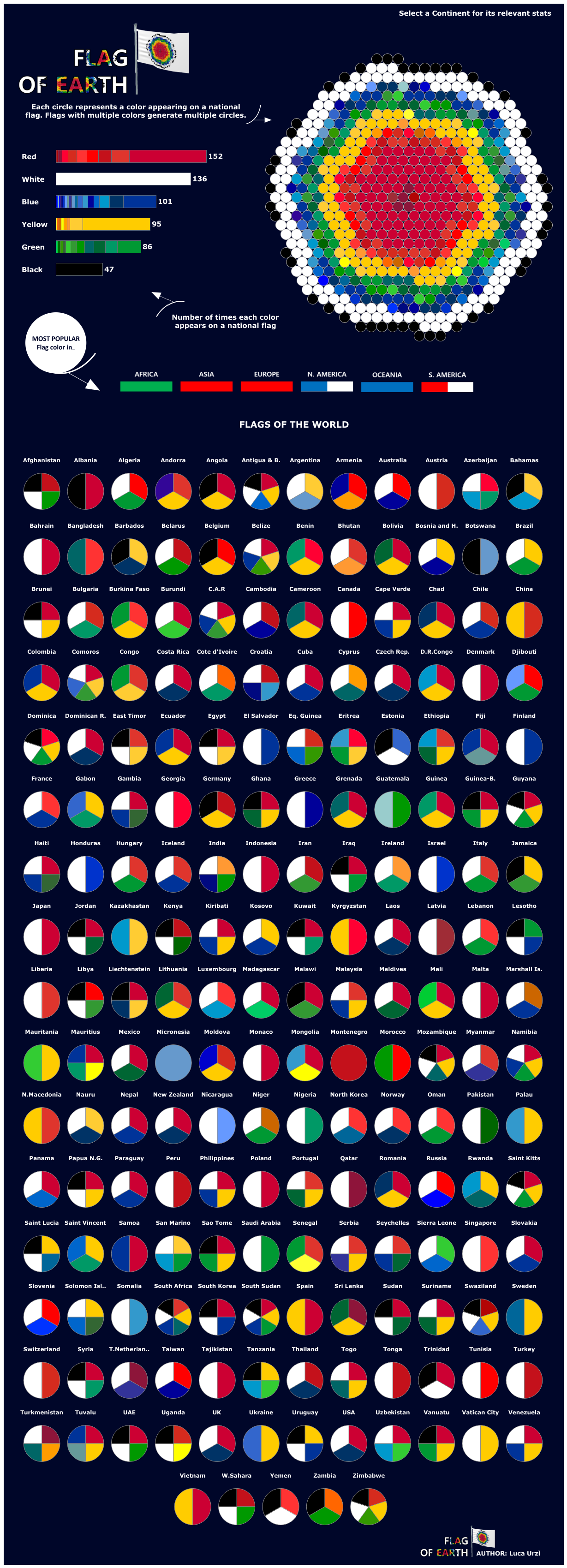
As I love geography and travelling (I had the luck to live and work in Paris, London and Sri Lanka), I also imagined how a Flag of Earth could look like, and I had fun creating it in Tableau by respecting the proportions of the colours used among all the country flags of the world. The data harvesting took a while… but I was very satisfied with the result!
Michael: You are an Data Academist with The Information Lab Italia. Can you tell my readers a little bit about your position at The Information Lab?

Luca: Sure Michael! I recently started this “new journey” with The Information Lab Italia after 4 years as a Web Project Manager and Data Analyst in London. My previous experience was focused in coordinating and delivering IT-related projects for a tourism-related company, aimed to improve their product and the online experience of their users. At some stage, I have also been asked to provide the company with meaningful insights about the platform performances… and it was at that point that I realized how important is to present data in the clearest possible way so to allow people understanding the real meaning of numbers.
So, two years later, I decided to take the next step in my career and look for new opportunities in the data analysis sector… And here we go! As soon as I discovered The Information Lab (TIL), I saw a big opportunity to learn how to master a powerful tool such Tableau (when joining TIL, you receive a 4-months training covering all the aspects from data preparation to data visualization) and help companies to learn how to boost their data analysis with meaningful visualizations.
The Information Lab was founded in 2009 with the mission to support companies understanding their data, and learning the analytics best practices. Our consultants have helped many organisations develop reporting solutions in Tableau. We have built suites of reports in industries as diverse as energy trading, football, healthcare, travel and professional service organisations. In addition to being expert Tableau users, our team members share a knowledge and passion for data visualization. This ensures that the reports we develop communicate a consistent message which informs and engages the audience.
Nowadays, with more than 250 consultants distributed in 7 European countries, The Information Lab are a leader group within the Self-Service BI & Analytics sector, being appointed Tableau EMEA partner of the year for 5 years in a row!
At the moment, I have just finished my 4-months training – yes, I am still a newbie after-all – but I already had the chance to work with clients on several projects (one of them was for my favorite football team. Bingo!)
Michael: Can you tell me three of your favorite Tableau Desktop tips and tricks?
Luca: Oh well, my very first advice is: “Be adventurous!”. When you approach Tableau Desktop for the very first time, you may be tempted to stick with the “Show me” functionality and create tens of nice and neat dashboards with the same graphs repeated over and over again. Which is fine – don’t get me wrong – but it is just the 10% of the software potential in terms of how you can visualize your data. Tableau Desktop has a lot of little tricks coded in its pack, and, even if it would be great to have them somehow highlighted in the user view, the Tableau Community offers a wide portfolio of tutorials and articles explaining how you can create more sophisticated charts (and therefore visualizations) taking advantage of features such dual axis, bins, paths, marks aggregation and more.
It may take a bit to master all these functionalities, but I recommend spending some time trying to experiment and explore new ways to represent your data. This will definitely help in the future whenever you will have to create something “wow” within a small amount of time. I mean, in Tableau you can even paint a Van Gogh using a scatter-plot!
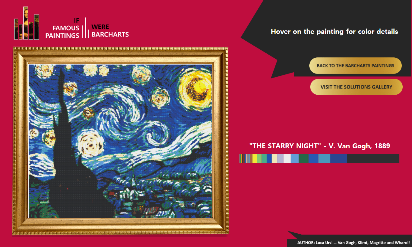
Link: https://tabsoft.co/2W7ttgx
My second advice is “Know your limits”, and this can apply both to the pure analytics and the visualization processes. Remembering all the formulas and the rules to compute your data within Tableau Desktop is quite hard, especially in the beginning when you must familiarize with the software. It doesn’t make much sense to start working on a very complex database if you don’t feel confident with calculations… Sure, one day you will certainly be able to compute LOD expressions whilst blindfolded at your desk and sipping a cup of tea, but, if you don’t feel ready yet, try to import in Tableau a database which is as more “clean” and “functional” as possible. A good data preparation can save you a lot of time and frustration, making your analytics process in Tableau smoother. With the same logic, don’t feel like you “must” design something incredible if you are not confident with your graphic skills: the sad reality is that a minimalist dashboard with all the elements in the right place will be appreciated more than an over-designed and dis-proportioned triumph of colours and shapes! You can always work on your designing skills trying to take inspiration from some viz you like and replicate their look and feel.
My third and last tip is “Find a style”, and with “style” I mean your own “mental approach” to data visualization. Taking inspiration from others is great because you open your mind to different solutions and ways to represent data, but, at some stage, try to develop your own view on how a dashboard should be visualized, which kind of charts should be used for each specific analysis, which colours satisfy your sight and even which set of fonts are in line with the way you want people to read your works. With time, the sum of all these aspects will contribute to define your style… a sort of visual “signature” which will help you to create viz faster and people to recognize your “touch” immediately.
In addition to this, developing a style is also great when it comes to feedback from the community: if you receive a negative comment, you can identify immediately what went wrong and metabolize the mistake so to avoid it in the future. If you receive a positive comment… well, then you can be proud of yourself because is “farina del tuo sacco!” *
*( Literally “flour of your own bag”, the Italian way to say “It’s all you!” )
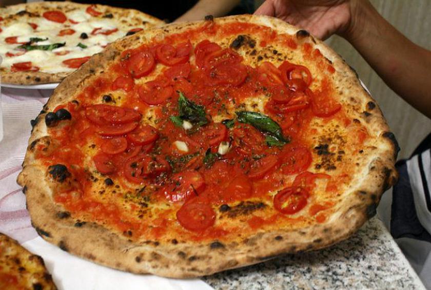
Michael: Several years ago, I had a friend from Italy visit and, of course, we took him to an Italian restaurant. He told us that in Italy, they do not put all of the heavy sauces and meatballs on their spaghetti but instead put a very light sauce (or olive oil) and vegetables. So, I love pizza. Can you tell me how pizza in Italy differs from the pizza made in the United States?
Luca: Ahah, mentioning flour, we finished talking about pizza! A very touchy subject for many of my fellow citizens! Where can I start?
First of all, Michael, you have to know that even in Italy there are some feuds between regions claiming to own pizza’s original recipe. Someone says that pizza must have a fluffy and oily dough, others say that the external crust has to be very wide and crunchy. I think we will never have a clear winner! For sure, there is only one thing making everyone agree: ingredients.
A traditional Italian pizza is made out flour, salt, yeast and water. Nothing more, nothing less. For the toppings we normally use traditional Mediterranean products (such tomato, basil, oregano, eggplant, ham, garlic, anchovies, artichokes, mozzarella, olive oil etc.) and this is why you can see a lot of Italians upset when they spot some pineapple, meatballs or beef on their “American pizza”. It simply “doesn’t look right” as people here are used to different flavors.
And do you want to know a fun fact about pepperoni pizza? Even if it sounds “very Italian” … it doesn’t exist here in Italy! “Pepperoni” is not even a word in our vocabulary (the closest one is “peperoni” and it means sweet pepper).
And do you want to know a fun fact about pepperoni pizza? Even if it sounds “very Italian” … it doesn’t exist here in Italy! “Pepperoni” is not even a word in our vocabulary (the closest one is “peperoni” and it means sweet pepper).
Another thing you will never see in a traditional Italian pizza is the stuffed crust. I guess some Italian could cry over it!
My opinion? I don’t mind pizza being adapted to the average taste of different countries. I think that it is great to see how a traditional dish is reinterpreted across the world. As I was mentioning before, I had the luck to travel a lot and to live in different countries, so I learnt how to appreciate all kinds of food (one of my favorites is kottu roti, a Srilankan dish made out chopped stir-fried bread and vegetables). The craziest pizza I tried was “Honey and mussels” in Paris… And I liked it!
Michael: What do you feel is missing from Tableau Desktop? What features would be on your wish list to see added to the application?
Luca: Tableau Desktop is a great software and the developers are doing a great job to introduce more and more sophisticated features in each release. However, I feel like there is a big gap between the cool stuff and some “basic” options that are still missing in the user interface.
For example, we now have the chance to use set actions and boost the interactivity of our visualizations… but we don’t have a simple “copy and paste” option to duplicate a text box or a logo within the same dashboard; we can now navigate and segment maps to the address level… but we don’t have an option to say “If I gave a 250 x 400 pixels format to my previous graph on a dashboard, I want the next one to keep the same size and formatting”.
I could continue, but I think you got my point.
In addition to this, I would also love to see some new graphs in the “Show me” menu. Radial bar charts, donut charts, waffle charts, gauge charts are now quite popular and accepted as a common way to visualize data… so what about saving us all some time and introduce a default template for them?
Michael: What is next on your “To Do” list? What can the Tableau community expect to see from you in the near future?
Luca: If I think to the next few months, I definitely want to continue experimenting with data visualizations and express my creativity through Tableau Desktop. I really enjoy harvesting data around the internet and transform them in meaningful information to share with the community and with everyone fascinated by how much numbers can tell us the story behind a topic, a social trend, news or how our world is changing.
Recently I was very glad to obtain the “special mention” in the 16th “Data for a Cause challenge”, which was focused on visualizing the Global Peace Gap. Knowing that my effort can help keeping people informed on such an important topic, made me think “Come on Luca, you are going in the right direction!”.
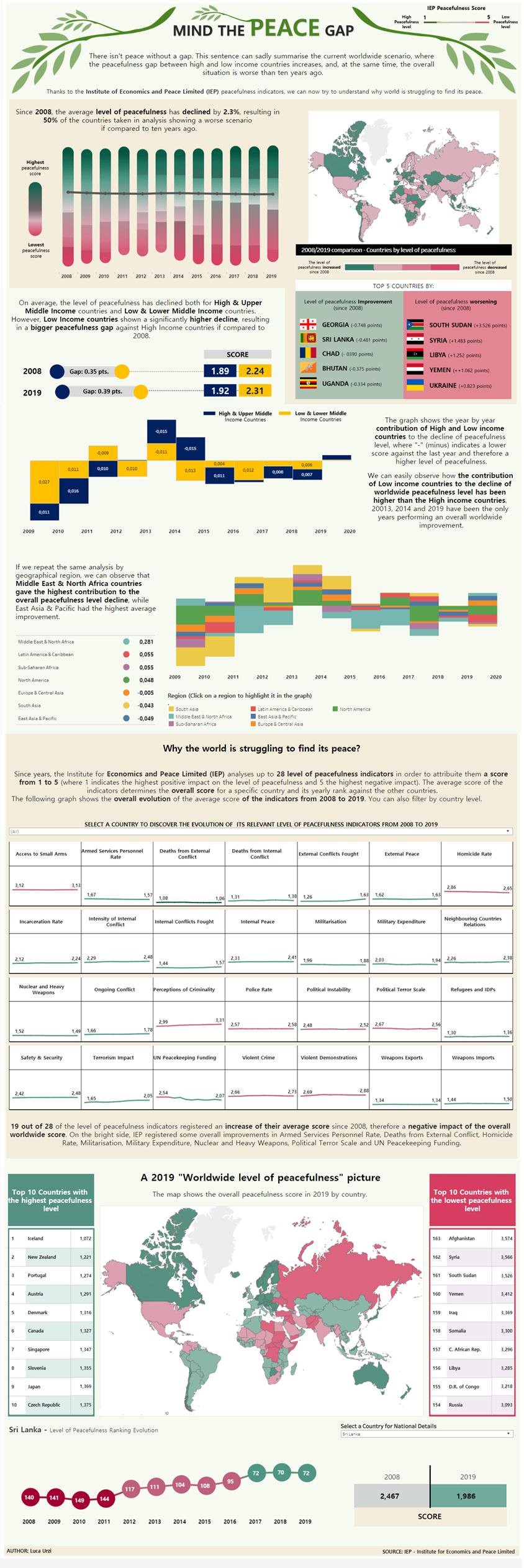
Link: https://tabsoft.co/2FwIVJv
Michael: And if I ask you “Where do you see yourself in 5 years”?
Luca: I would answer “somewhere in the world, working as a data journalist”.
Tableau Public
Link: https://public.tableau.com/profile/luca7027#!/


What an amazing post! I always look forward to reading your posts.
They are so engrossing and well-written. The way you consider your readers’ preferences and leave a hint of personally relatable experiences is simply exceptional. There are always a few lines in your posts that stick with me and keep me hooked on your writing. Reading one of your blogs immediately makes visitors want to read another and share it. This post was wonderful, and please continue to share such blogs in the future.
I believe that my expertise in the field in which you write will be very beneficial to you. You can get a sense of my writing style by browsing through my high-quality content.