

Ratnesh Pandey Bio
Deputy Manager – Data Visualization, at InfoCepts, Singapore
Ratnesh is Deputy Manager – Data Visualization at InfoCepts. In this role, he works to democratize analytics across the organization by enabling intuitive and user-friendly data visualization solutions.
He has over ten years of professional experience in the graphics, UI/UX design, and data visualization. Ratnesh is a certified Tableau and MicroStrategy Analyst, and his visualizations have been recognized internationally with two Tableau Viz of the Day nomination and a feature on Information is Beautiful Longlist.
Ratnesh is a Gold medallist in Bachelor of Fine Arts from Pune University. He has broad experience working with multiple Fortune 500 companies in BFSI, Retail, Media and Aviation.
Ratnesh loves to play cricket and badminton, has musical inclination, and loves the stage. He is married, and has a 4-year old daughter who keeps challenging Ratnesh to find innovative ways to keep her engaged all the time. Learn more about Ratnesh on LinkedIn.
QUESTIONS
Link to full viz:
Michael: Hello, Ratnesh. I was admiring your #VOTD data visualization, UP Performance Gamification. Can you tell my readers about your process to harvest the data, design, and then create this DataViz in Tableau? Also, can you explain to them how it works?
Ratnesh: Hi Mike. Honored to be interviewed for the blog. Great that you bring up the #VOTD UP Performance Gamification. That really took off on social media, and the #VOTD award was very humbling.
Here’s how I approach any visualization from ideation to realization.
I think there are so many people behind this very successful project. I was looking for something to automate the learning and encourage each member to make progress towards data viz mastery. Also, I was looking for how we can improve the overall experience of performance evaluation meetings as well. One fine day during a conversation with my mentor and manager, Sarah Burnett, presented a Data Literacy idea through a gamification module which was originally conceptualized by Fi Gordon (VizChic). And believe me, it was 99.99% what I was looking for.
Usually, for any such projects, I follow the simple design thinking methodology where I start with defining the objective considering the target audience, create an initial sketch, and then I create the final output in Tableau. In this particular viz, since we didn’t have any available data source from where we can fetch the data. Since my team size was really small, so we manually created the data in Excel, and we are currently refreshing it on a monthly basis. But we have ensured that going forward when this is executed for a larger team; it should be scalable enough to fit a large organization’s need.
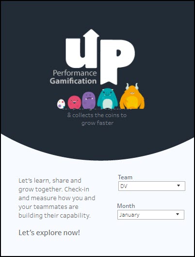
We tried keeping the design very simple and to make it more useful and handy we opted for the phone layout, instead of the desktop version. The concept is like a game where we all have a pet ghost- Viz Monsters, which will grow like a human. All that we have to do is to keep completing the objectives and collect the gold coins to help them grow faster.
We can track the performance of the selected team for a specific month from the landing page.
The details are bracketed into 4 major analysis areas:
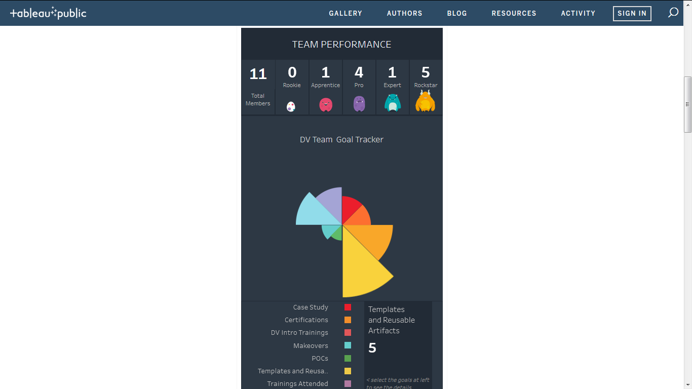
- Team Performance: This view covers the overall team performance. It shows the numbers in each of the levels of performance. At the same time, you can see as a team what you all are contributing to the organization.
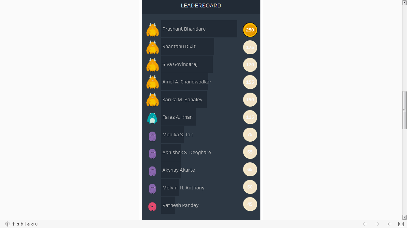
- Individual Performance: This view helps to see and track individual contributors in a fun way. The icons at left help you to see at which level the team members are. You can see how many gold coins they have collected on the right side of the screen.
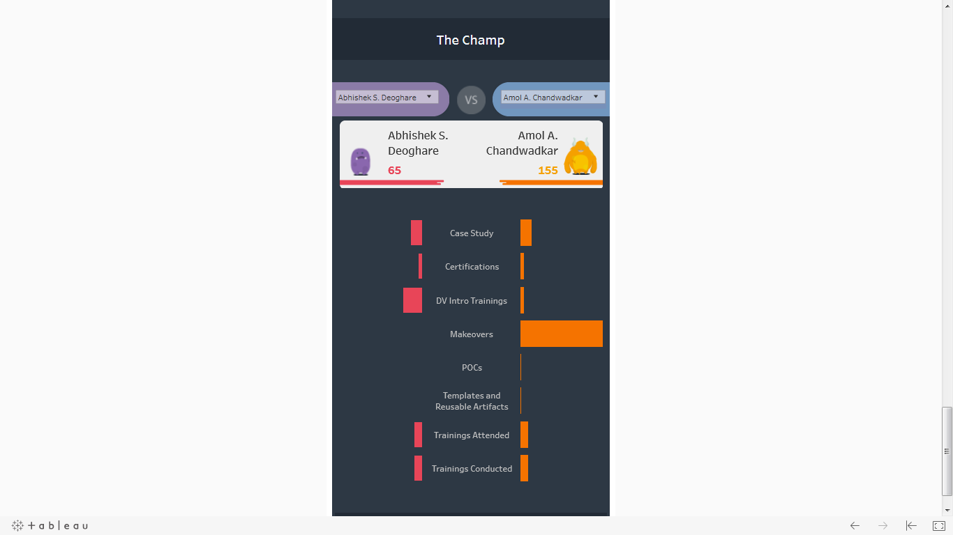
- Associate Comparison: This view helps us to compare two performers and track their growth.
- Associate Progression: This view is nothing but the extension of the previous screen, which helps us to track the progression of an individual associate. We can get to know their current level and what the next eligible level. You can see their performance against each of the goals.
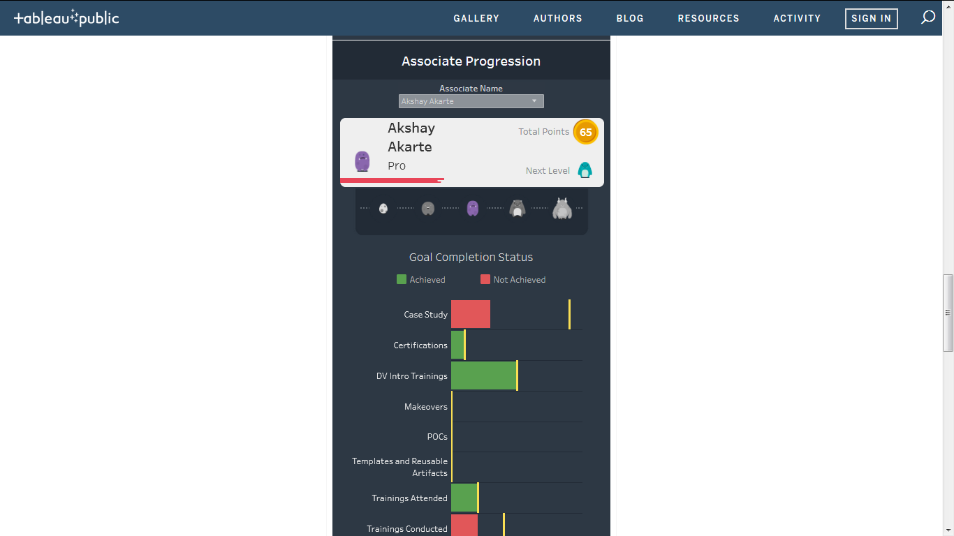
There are levels are defined as you grow and accumulate more points. These levels are defined as:
Rookie -> Apprentice ->Pro ->Expert ->Rockstar
The
amount of love this viz has received is truly fantastic. This also tells there
is a child in everyone who wants to play a game, and win, even at work. This
makes work more fun.
Michael: You are a Deputy Manager at InfoCepts in Singapore.
Can you talk a bit about how you help clients with their data analytics needs using Tableau?
Ratnesh: Deputy Manager – Data Visualization at InfoCepts to be precise. J
InfoCepts is a Gartner recognized top-40 Data and Analytics Services company worldwide*. InfoCepts works with multiple fortune 500 companies, and InfoCeptians are serving customers from 15 countries across the globe. We have our headquarter in Washington, DC, and offices in Singapore, India, and Switzerland. We provide services across the data and analytics spectrum, ranging from advisory to modern analytics and from cloud and platform modernization to data management and managed services.
I have been associated with InfoCepts for close to 8 years now. It was at InfoCepts that I found my real calling, analyzing data and visualizing data, putting my design background to its best use. The culture at InfoCepts is very inclusive and career-oriented. The focus on continuous learning meant that I was wetting my feet with tools like MicroStrategy and Tableau, names of which I had not heard in my career before InfoCepts happened. The focus on visualization has always been one of the things InfoCepts has given a lot of value and importance. In fact, my team of Data Visualization experts has won over 10 international data visualization awards and recognitions, and I have been more than happy to contribute a few myself.
In my role, I help customers visualize their data in a meaningful way, making sure I reduce visual clutter, choose the right viz for the data for easy consumption, enable a better understanding of data for end users and above all, tell a visual story that is insightful and actionable. Tableau for that proves to be a great tool for visualizing data. Using Tableau, I can import any and all sets of data fro multiple sources, utilize its fantastic visualization capabilities to present the insights, create interactive dashboards, and string insights into a guided story. Its one of the best analytics tools out there that don’t have a steep learning curve is easy to work on and enables even non-techies to build great visual stories.
*According to the Gartner Market Guide for Data and Analytics Service Providers, June 2019
Michael: Can you tell me three of your favorite Tableau, Desktop tips, and tricks?
Ratnesh: That’s a tricky one. There are plenty of tricks which I find very useful, and I really loved them as some of them were really a lifesaver for me in some of my projects. It’s really difficult to tell the top 3.
Tableau has a great visualization library that replete with thousands of ideas on how to visualize a certain dataset, and how to present a compelling story.
If I had to, compulsorily, I’d say these:
- First and foremost, will be the one tip I provide everyone who’s working on Tableau is to take inspiration. Tableau has a great visualization library that replete with thousands of ideas on how to visualize a certain dataset, and how to present a compelling story. The more you imbibe, the better you become day after day in building Tableau dashboards by your own. Inspire from the community. I really admire the works of Ken Flerlage, and Andy Kriebel and follow their blogs.
There are plenty of mentors I have online who have done some fabulous tricks in Tableau, which I am sure to have inspired and helped me somewhere. But the one link which I would like to share is from The Data School:
https://www.thedataschool.co.uk/laura-scavinoThave-a-look-at-my-top-5-tableau-tips/
- Revise and Review – How often have you built a dashboard and on the second look not liked the UI? The most plausible reason might be visual clutter. When we review and revise, we remove visual clutter. It’s important to take a step back and see what’s working and what’s not.
- Tell a story – Tableau empowers you to string together multiple insights to tell a visual story. Always ask questions on how will a non-technical person interact with your dashboard. How will they understand the flow of data and the what action are they going to take? Asking the right questions gives us the important inputs that define an insightful and actionable story-line.
Bonus Tip: Colors. Use colors judiciously; colorful doesn’t mean good always. Unnecessary color doesn’t add value and instead make it difficult to consume valuable information.
Michael: So, the latest version of Tableau Desktop, v2019.2 was released a month or so ago. Now, v2019.3 Beta has been released. What is still missing from Tableau Desktop in your opinion (e.g., spell checking in Text Objects)?
Ratnesh: I would call myself an amateur Tableau professional. I am a Data Visualization expert first who knows his ways around the Tableau tool and how to use it. So when I look at what the tool offers and what it doesn’t, it stems from the fact that I must have faced a problem while visualizing a certain dataset. I don’t look at features from a developer’s perspective, but I look from a designer’s perspective first. I would really love to see some more power to the designers in Tableau. Formatting and aligning multiple containers in Tableau is a painful task. It should provide the flexibility to select multiple containers to format and align then.
Michael: So, I actually attended a Cricket Match once while I was in India. I must admit I did not fully understand what was going on. For example, I would see players watch the cricket ball roll past them and not go after it. And the only person running is one guy between two sticks.
Can you explain the game of Cricket to a novice like me, and what makes it such a popular sport?
Ratnesh: You seem to have done your research. I am an avid cricket fan and a player myself. I still try to get a match or two every month over the weekends, whenever I get the chance. To explain cricket to someone completely new though is really tough. It’s a two-team game, 11 individuals each, and when one team bats – 2 batsmen are on the pitch at either end, while the opposition players – all 11 of them, field (including the bowler who bowls the ball at the batsman). I am not doing justice for cricket, I feel, explaining it to you like this.
The one guy you saw running the wicket, he is the batsman. And there are actually two of them running between the sticks (the sticks are called wickets). And the player who didn’t run after the ball must have known that the ball was out of reach and will roll on to the boundary once it’s past him. Now how do I explain a boundary to you?
You should really join me on one of my weekend cricket matches. It’d be fun, and I’d be able to explain everything much better, showing you what’s happening and what that means.
You know cricket is called a religion in India due to its immense popularity, and I never had someone who’d ask me to explain cricket to them. Thus, my ineffective description, which would have done no benefits to you. But I promise you to join me for a cricket game and a drink after the game is on me. J
Michael: What is next on your “To Do” list? What can the Tableau community expect to see from you in the near future?
Ratnesh: If you look at the visualizations I have made, you’ll see a pattern that the majority of my vizzes are for a cause. It’s sometimes the water crisis, or the wildlife endangerment, or the cause of eradicating Ebola. I would like to do more for a social cause. If my vizzes can bring about a change in mindset, if they can influence people to do well, and if they can somehow contribute to good for society, I’d like to jump on such projects.
I also want to collaborate more on Tableau projects with fellow Tableau authors. There is great fun and learning when you collaborate with someone. You learn so much; you get to know how someone else approaches a viz, how they analyze data. You always come out enriched after collaboration like this. I’d be glad if someone who reads this interview and reaches out to me for the next big Tableau viz that we’d do together. That’d be fantastic.
Collaboration ready, social project – make an impact.
Tableau Public
Link: https://public.tableau.com/profile/ratnesh2928#!/

Ratnesh, I think if you add your face picture in any tableau visualisations , will look great . I work with this guy , he is awesome and he makes dashboard visually appealing.