Anna Dzikowska Bio
Mom of one, love audiobooks and Ashtanga yoga.
In Professional life, I am Health Economist PhD, Health Systems Researcher.
Quit Academia Career after 15 years.
I have a passion of data visualization and keen to improve healthcare through the power of analytics. I am a highly qualified researcher with proven analytical and communication skills who found true passion in creative and logical problem solving by using data. In my work as a health economist I have extensive experience working multiple databases. My research interests cover:
– health care systems performance (financing, resources allocation, equity, efficiency),
– complexity of health systems,
– public and private sector in healthcare,
– cost of illness studies.
Questions

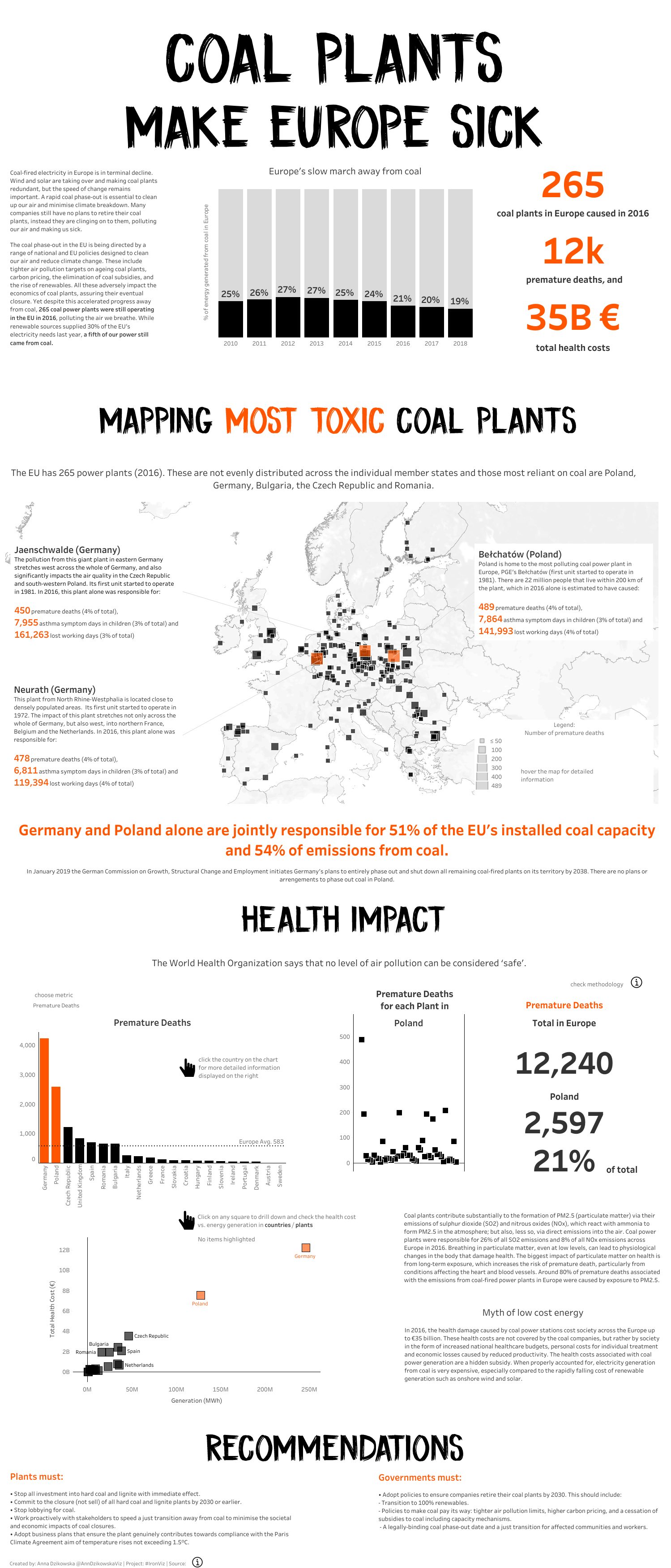
Michael: Hello Anna. On Tableau Public, your recently posted your IronViz entry, Coal Plants Make Europe Sick.
Can you tell my readers the process you went through to develop this data visualization? For example, how you gathered and prepped the data, created the design, and translated that into Tableau?
Anna: My goal for this year was to submit a feeder for IronViz Contest. When I first saw the contest topic Energy & Sustainability a few ideas popped up in my head. I knew from the very beginning that I want to connect somehow this topic with healthcare data. After quick research I found this fantastic Report and database prepared by Europe Beyond Coal organization (https://beyond-coal.eu/). I decided to create an interactive dashboard showing off the damaging impact of coal plants on our health. I used Tableau Prep for data cleansing. The goal was to keep it simple both in charts and colours, so I have chosen interactive map, bar charts and scatterplots. For colours it was just white, grey, black and orange to put more emphasize on the key facts. To make dashboard more interactive I was motivated to learn set actions from Lindsay Poulter blog (http://www.lindseypoulter.com/). My dashboard consists of three main parts: (1) Background and Context: with interactive map and some information about coal plants in Europe; (2) Analysis: a few metrics showing the impact of each coal plant on health (3) Recommendations: what should be done on plants and governments level to reduce the damaging impact of health. I wasn’t sure whether the dashboard meets IronViz criteria, so I asked Sarah Bartlett (@sarahlovesdata) and Lindsay Betzendahl (@ZenDollData) for their opinions. They provided me with a great feedback and encouraged to publish it and submit it. I was really excited to see my viz in the Top 3 Europe Iron Viz submissions as I would never expect it.
Michael: You are a Research and Data Visualization (Tableau) Freelance Consultant primarily working remotely. Can you talk a little about how you can help businesses in their data visualization needs using Tableau?
Anna: Hahaha! Yes, this is the information that I have put on my Linkedin Profile. Nevertheless, the fact is that I am currently on my annual maternity leave. I decided to make most of this this time to learn some new skills, that would help me to boost my career and ultimately change its path. Once my Tableau Public Profile became more attractive, I immediately started to receive multiple job offers within data viz field. Since working remotely was my only option I included this information within my Linkedin Profile. This part of my professional experience is mainly providing feedback to other Tableau users on created dashboards and help to learn data viz. All this contribution together with new data viz skills helped me to get a new job as Health System Researcher. I start my new assignment in July right after my maternity leave. I am very excited leaving Academia career after almost 15 years and looking forward to working in totally different environment.
Michael: Can you tell us three of your favourite Tableau Desktop tips and tricks?
Anna: I love two tricks which Adam Crahen (@acrahen) shows in his latest course: Tableau Desktop Playbook: Building Common Chart Types (https://app.pluralsight.com/library/courses/tableau-desktop-building-common-chart-types-playbook/table-of-contents):
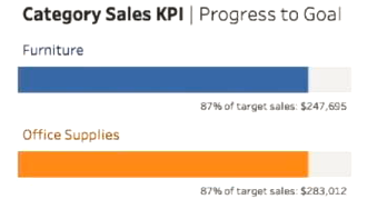
1. Labeling bar charts by using simple tricks with labels and spaces. It is subtle and powerful and provides context to the chart.

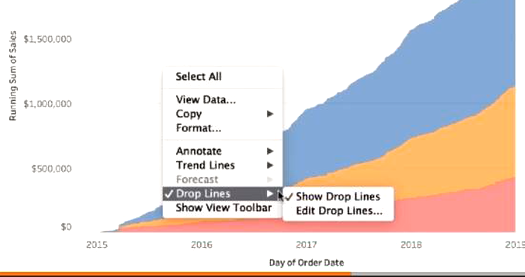
2. Dynamic Use of Reference/Drop Lines

3. And the last one is creating custom regions and using set actions to drill down. I found it on fantastic Andy Kriebel’s blog (http://www.vizwiz.com/2019/03/region-to-state-drilldown.html).

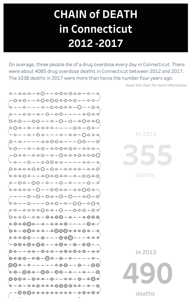
Michael: Back in January, you had the VOTD and VOTW for your Chain of Death in Connecticut data visualization. Can you tell us your thoughts on how we can help reduce the number of drug overdose-related deaths, and specifically, the opioid epidemic?
Link to full data viz: https://public.tableau.com/profile/anna.h.dzikowska#!/vizhome/ProjectHealthViz12019OverdoseinConnecticut/Dashboard3

Anna: It was really difficult and challenging dataset as it was dedicated to my younger brother Peter, I lost three years ago. The problem of opioids is very complicated and multi-dimensional. We see the problem is growing and more and more young people is losing their life. It’s a tragedy for their families and friends. As community we should use impactful dashboards to inform society about problem of opioids and depression. The magnitude, severity, and chronic nature of the opioid epidemic is of serious concern to clinicians, the government, the general public, and many others. Some time ago I read article about rising trend of opioid prescriptions and clinicians acting like “drug dealers” (https://www.cincinnati.com/story/news/2019/04/17/opioid-pain-pill-federal-prescription-bust/3482202002/) In my opinion, we should take further steps to reduce access to opioids.

Michael: If you could magically be alone in a room with Francois Ajenstat, what would you ask him to add into Tableau Desktop?
Anna: Tableau Desktop is such fantastic tool with so many possibilities which I am still learning. If there would be anything that I could add or change it would probably be dashboard formatting, which is very time consuming for me. It would be great to have copy paste options for annotations, text boxes, divider lines 😊
Michael: What is next on your “To Do” list? What can the Tableau community expect to see from you in the near future?
Anna: In June I will be on the big Stage of the European IronViz so this is my next big challenge. After the contest I plan to engage even more in Tableau User Groups starting from Warsaw TUG and HealthTUG
I still want to take active part in Tableau Community challenges, especially #ProjectHealthViz, #IronQuest and #MakeoverMonday. I plan to pass my DQA Exam by the end of the year.
Tableau Public
Link: https://public.tableau.com/profile/anna.h.dzikowska#!/

