DataViz as Maps: America’s Favorite Valentine’s Day Candy

Source: CandyStore.com

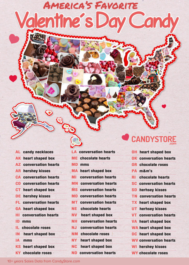
Continuing my week of data visualizations and infographics related to Valentine’s Day, here is one from http://www.candystore.com depicting a map of the United States showing which candy is the favorite Valentine’s Day candy for that State.
Leave a Reply

Fill in your details below or click an icon to log in:

WordPress.com Logo

You are commenting using your WordPress.com account. Log Out /  Change )

Facebook photo

You are commenting using your Facebook account. Log Out /  Change )

Connecting to %s

This site uses Akismet to reduce spam. Learn how your comment data is processed.