Josh’s Bio
Josh is the Senior Director of Data Visualization for Comcast’s Enterprise Business Intelligence team. He leads both the Tableau Center of Excellence (COE) and a team of data visualization experts.
Josh is also an adjunct professor of data visualization for Temple University and a co-leader of the Philadelphia Tableau User Group (PhillyTUG).
Questions
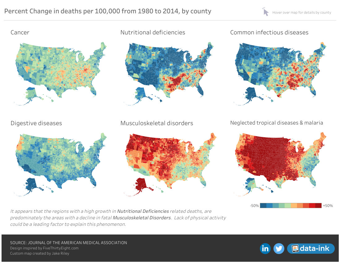
Michael: Hi Josh. I really like your Disease-Related Deaths dataviz you have on Tableau Public. Can you tell my readers the steps you follow to take a dataviz from an idea in your head to a finished product?
Josh: When I decide to build a visualization, I start by exploring the data. Once I have a good feeling for the data, I tend to focus on a story or theme and build the visualization around that concept. I’m highly influenced by the community, Pinterest and Dribbble as I think through my designs.
For the Disease-Related Deaths, I had already been struggling for the best way to put Alaska and Hawaii on the map. When I saw FiveThirtyEight’s version, I thought to myself, “I’m going to remake that today!”
The more I thought about it, the more I realized that with a single map, I could turn it into small multiples and that would be even more powerful. However, like most of my work, I like collaborating with friends and the community. When I came across some R code that would build the Albers projection map, I reached out to Jake Riley and he had it back to me as custom shapes a few hours later.
Link: https://public.tableau.com/profile/josh.tapley#!/vizhome/DiseaseRelatedDeaths/CountyMap
Michael: Can you discuss how you use Tableau at work and in the classes you teach? If applicable, can you tell us how you immerse your business community at work in using Tableau as a self-service analytics tool?
Josh: My focus at work and when teaching with Tableau is about enabling others with Tableau to create great things. That may be drag and drop self-service so that you can answer your own questions on massive data sets without writing SQL or creating actionable and data-driven stories/dashboards.
Data visualization as a skill is useful in a wide variety of tools. Tableau, PowerPoint and PowerBI are just a few, so the underlying skill is the most valuable. Once you understand what you are trying to accomplish, then master the tools at your disposal so that you can implement to the best of your ability.
Michael: Back in 2016, on your blog site, data-ink.com, you posted a blog titled, So You Want a Tableau Data Viz Job? and provide a copy of your presentation on this. Can you discuss what you look for in a candidate for a Tableau Data Viz job and what new skills you would add to this list since you first did this post?
Link: http://data-ink.com/?p=1610
Josh: Generally, I start with a data visualization portfolio to screen candidates. Data Viz jobs usually combine data, design, communication, and presentation, and the portfolio instantly allows me to understand your approach and design style. ‘10 years of BI experience’ on a resume isn’t a good indicator of data visualization mastery or dashboard design expertise.
I personally don’t require the portfolio to showcase a particular tool, but there are certainly considerations as to your support model if you are to hire a D3.js developer over a Tableau expert.
Beyond the portfolio, strong SQL skills and some initial capabilities with either R or Python would be highly valued in most analytical roles.
Michael: In the past, you participated quite a bit in MakeOverMonday. How has doing this helped you in improving your Tableau skills and are you still participating?
Josh: MakeoverMonday gave me an opportunity to practice my skills, try out new techniques and connect with others in the community. I feel that practice and feedback are the two most critical components to getting better at both Tableau and data visualization.
At this point in my career, I find that I’m more focused on finding and developing other people. Now when I have free time, I like to spend it on passion projects, like analyzing Tableau Public statistics.
Michael: Can you tell us three of your favorite Tableau Desktop tips and tricks?
Josh: My top three tips & tricks are:
- How to save a high-resolution image on a dashboard (that I just learned from Ramon Martinez): Rename your high-resolution image to include the @2x modifier by using <image-name>@2x<file-extension> format. For example, logo@2x.png.
- Adding the formulas of calculated fields to the comments so that they will display when you hover over the field. Great for published data connections!
- Using Unicode characters in labels and tooltips.
Michael: Now that you have attended TC18 in New Orleans, can you tell us your three favorite things you learned or attended there?
Josh: My three favorite things from TC18 were:
- Chris DeMartini’s D3.jsExtensions
- Learning how other enterprise customers are running their COEs and Communities
- Tamas Foldi’s photos of his Ford 150s after moving to America
Michael: What is next on your“To Do” list? What can the Tableau community expect to see from you in the near future?
Josh: I’m actually super excited to bring my Tableau Public dashboard (Cerebro) to the next level. If every MakeoverMonday visualization had a consistent hashtag in the description, we could find and highlight all of those visualizations. The same goes for other initiatives like WorkoutWednesday and Viz for Social Good.
I’m hoping to build out a platform to make it easier for people who are seriously time-constrained (like myself) to find amazing content while also helping people get their work noticed.
Tableau Public Profile
Link: https://public.tableau.com/profile/josh.tapley#!/