
Tableau Community Spotlight: An Interview with Sarah Bartlett
Sarah Bartlett – Biography
 Sarah Bartlett works as a Data Visualisation Consultant in London, helping clients to visualize their data and answer business questions using Tableau. After working in data analysis and reporting for almost a decade, Sarah was introduced to Tableau in 2014 whilst working as a Senior MI Analyst and has never looked back. As somebody who is naturally creative and enjoys finding insights in data, Tableau was the perfect solution.
Sarah started a blog in late 2016, SarahLovesData.co.uk where she writes about her data visualization journey with a focus on different projects she has worked on and her design processes. She also shares her experiences in the Tableau Community and offers advice to newcomers.
In her spare time, Sarah is a co-leader of the London Tableau User Group where she spends time engaging with her local community on all things Tableau. In March 2018, Sarah was a co-host of the first-ever EMEA Tableau Fringe Festival where 20 speakers presented talks virtually over a 12-hour period.
Michael: Hi Sarah, you recently submitted an entry into the Iron Viz Europe titled Explore European Cities on a Budget. I think it is not only beautiful to look at but is chock full of information. Can you tell my readers the process you used to research, then design, and then build this infographic in Tableau?
Sarah: Thank you, Michael! To be honest I struggled to find a dataset suitable for the Iron Viz Europe theme; European Cities and almost didn’t enter. I spent a lot of time performing Google searches in the hope I would stumble upon something interesting but I didn’t have much luck. A few days before the Iron Viz deadline I found a website called priceoftravel.com that calculates the cost of traveling to different parts of the world (not just Europe) to help holiday-makers budget for their trips. Unfortunately, the data wasn’t downloadable. At this point, I was close to giving up on the idea of entering Iron Viz altogether! Thankfully Lorna Eden offered to scrape the data using Alteryx for me and 10 minutes later I had my dataset!
I explored the data using Tableau to familiarize myself with it. I then wrote a list of the things I could potentially focus on in my viz; things like the most expensive places to stay versus the cheapest, the cheapest places to stay, etc. Once I have an idea for a viz my mind tends to go into overdrive with ideas and this occasion was no exception! In the end, I decided to focus on the top 10 cheapest cities, so I researched all 10 to get a feel for each city and a few facts that readers might find interesting. This step probably took longer than building the viz itself! You’ll notice I only ended up including 5 cities on my viz but I simply didn’t have enough space to include all 10 on the viz in the end.
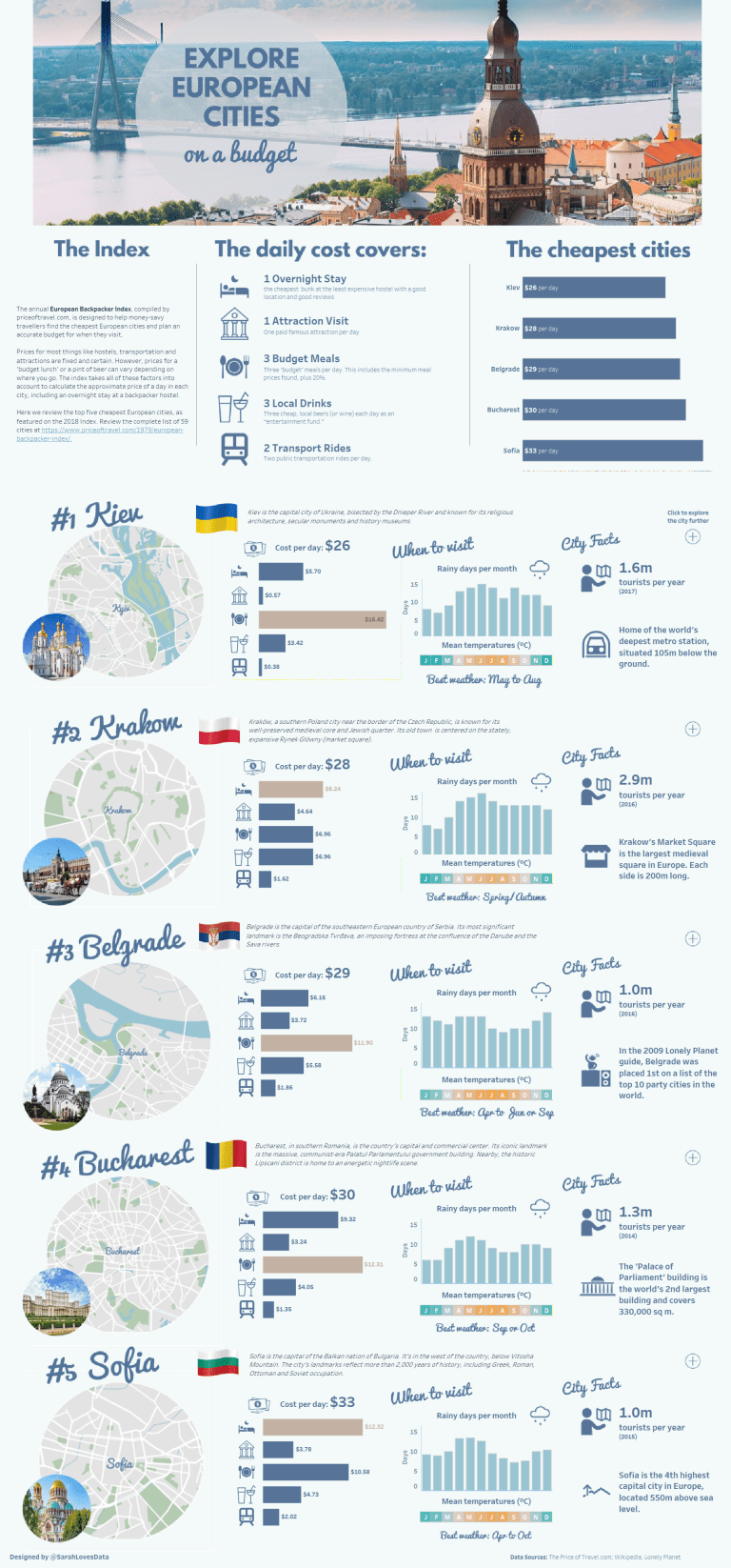
The design inspiration came from some pins I saw on Pinterest when I was researching the cities. I built a custom color palette using the photo in the header (a photo of the Latvian capital, Riga which actually never made it into the viz in the end) and I used custom fonts to give the viz a more unique look and feel. Once I was happy with the viz I sought feedback from some friends in the Tableau community. It was interesting to get other peoples’ opinions of what worked and what didn’t. They suggested some things I hadn’t even considered but made perfect sense, so I went back to the drawing board and made some adjustments.
Michael: You are part of the leadership team of the London Tableau User’s Group. London has a real “rogue’s gallery” of Tableau talent living there. Can you discuss a bit about some of the events and speakers you have had at your events in the past year?
Sarah: Of course! #LondonTUG meets every 6 weeks so we have had quite a few speakers in the last year. We are very lucky that for most of our events we are able to make use of the meeting space in Tableau’s London office. We are also privileged to have had so many great speakers take the time to join us. My highlights of the last 12 months include talks from Cole Nussbaumer Knaflic (Storytelling with Data), Chloe Tseng, Russell Spangler and Jacob Olsufka (all of whom were on the shortlist for the Kantar Information is Beautiful Awards so joined our TUG whilst visiting London for the awards ceremony), Tableau’s own Francois Ajenstat (who has visited us twice in the last 12 months) and Elissa Fink. Tableau CEO Adam Selipsky even dropped by last summer when he was in town. For Christmas last year we hosted a data visualization-themed quiz that was really fun too! One of our TUG co-leaders Pablo Gomez streams all of our content live on our Workplace by Facebook site so we frequently have international viewers joining us virtually too.

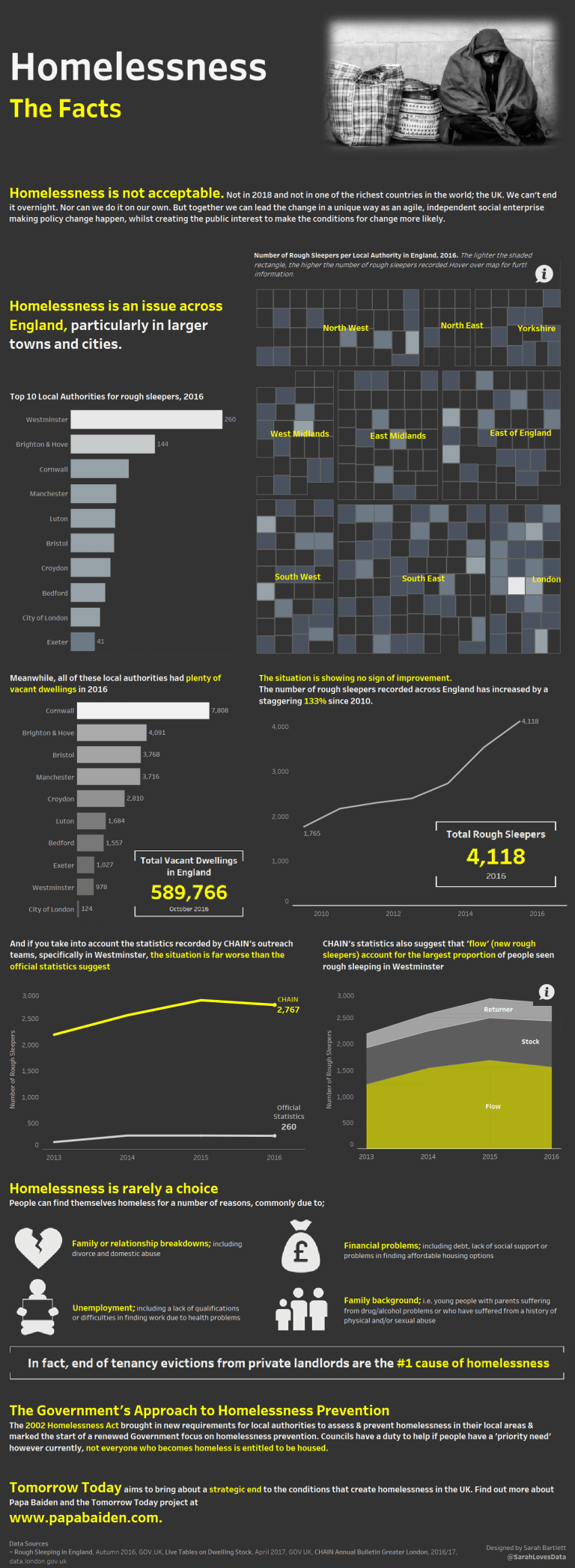
Michael: You have been involved in #VizForSocialGood. Your dataviz profiling homelessness in London is very powerful. Can you tell my readers how you became involved in this and how others can join and help this wonderful cause?
Sarah: Sure. #VizForSocialGood is a project I am particularly passionate about. Chloe Tseng officially launched Viz For Social Good in January 2017 but before this, in November 2016 I published a viz on suicides in UK prisons. Chloe noticed my viz on Twitter and ended up featuring it on her brand-new website before Viz For Social Good was even a thing! Since then I have participated in many Viz For Social Good projects for causes including the UN Social Development Goals, the Central Asia Institute, UNICEF and Papa Baiden (Tomorrow Today); the viz on homelessness in England. This project was of particular interest to me as it focuses on an issue I witness on a daily basis in London. Papa Baiden is doing some excellent work to help draw attention to the issue of homelessness in the country and it’s been great to see how the vizzes submitted for this project have been put to good use.
It couldn’t be easier to get involved. Simply sign up as a volunteer at www.vizforsocialgood.com and you’ll receive an email when a new project is launched.
There are a few tricks I regularly incorporate into my work:
- Clickable Text Boxes – Float a blank PNG image over a text box and add a URL to the image. This creates a clickable text box which is great if you want to add a direct link to your data source or Twitter profile.
- Workbook-Level Formatting – I tend to spend a long time formatting my vizzes to get everything looking right. One step that makes this easier is setting the format at the workbook (rather than sheet) level. This can be found in the Format Menu, under ‘Workbook’. It saves repeating the same formatting process over and over again for each sheet.
- Info Button – Info buttons make great additions to dashboards, particularly when used to help navigate the user through the dashboard or when used to hold additional information that would otherwise take up valuable space when placed on the viz itself. To add an info button, first, download an info icon and save it to your Tableau Shapes repository. Next, on a new sheet place number of records on Detail, set the Marks Type to Shape and then in the Shapes card, select your info icon. You can then edit the tooltip to display whatever information you need.
Michael: Do you think you will be going to the TC18 in New Orleans? What are the kinds of events and presentations you would like to see there if you do go?
Sarah: I wouldn’t miss TC18 and have my flights booked already! This will be my third U.S. Tableau Conference and I couldn’t be more excited to attend. My priority this year will be to attend sessions by speakers whose work I am familiar with; either from their blogs, their Tableau Public profiles or on social media. I took this approach last year and left the conference with plenty of inspiration and knowledge that I was able to apply to my Tableau projects back home. However, as the community grows, as does the number of sessions and speakers. It’s almost impossible to attend all of the talks you want to hear (thankfully you can catch up online once you’re back home though). I liked the lightning talks that were held in the Expo Hall last year. Being shorter sessions it was easier to fit more in and many of the sessions I attended were in this format. I hope Tableau run similar sessions again this year. At #TC18 I also hope to visit the Tableau Labs as I have missed out the last two years and I’m interested to see what they are working on and take part in some experiments if I can! What I like most about the conference, aside from the break-out sessions and keynotes, is the opportunity to connect with so many like-minded people and catch-up with friends in the community. Many of my Tableau friends live overseas so the conference is the only time we get to catch up in person.
Michael: It is getting more and more difficult to believe what we read and see in newspapers, on television, and on social media. What can we do to ensure what we are presenting in a public setting is taken seriously and that what we are stating is indeed fact?
Sarah: First of all I think it’s important that we only use credible data sources in our visualizations. Sometimes we might visualize a dataset that has been published on a 3rd party website so I believe it’s important we try to locate the original source of the data before working with it. Often, if you can’t find the original source the data may not be trustworthy. Secondly, I always do some background reading before preparing any new visualization to help familiarise myself with the subject matter. If I don’t fully understand the data I am working with, chances are I won’t be able to tell a credible story with my analysis and my work may not be taken seriously. Lastly, I believe as data analysts we have a duty to interpret and relay data accurately and in an easy to understand manner for our audience. Things like truncated axis, pie charts where the segments total over 100%, intentionally limited time ranges (where date ranges have been removed to tell a different story) or over-simplification (for instance, where items have been grouped into large categories unnecessarily) should always be avoided. We should always reference our data source/s on our visualizations if we want to be taken seriously too. I don’t trust any visualization that does not include the data source.
Michael: Finally, what is next on your list of things to conquer?
Sarah: I want to continue to be active in the community by writing blog posts and helping to inspire a new generation of Tableau users, both in the workplace and in the wider Tableau community. I continue to challenge myself to participate in as many social data projects as possible such as #MakeoverMonday, #VizForSocialGood, and #SWDChallenge. I find that consistently participating in such projects is a rewarding experience which helps me to stay active and engaged in the community. It also gives me the opportunity to practice new techniques, experiment with new Tableau features and gives me skills I can apply at work too. I intend to sit my Tableau Desktop Qualified Associate exam in the coming months. I’ve been wanting to do this for a long time but various other things have got in the way. I also hope to do more public speaking this year and have applied to speak at the Tableau Conference Europe in London in July and will be applying to speak at #TC18 in New Orleans also.
Michael: Thank you for the interview and I hope we run into each other at TC18.
Tableau Public Link: https://public.tableau.com/profile/sarah.bartlett#!/

