
Readers:
Last Friday, I was given the opportunity to present at the Tableau Fringe Festival – EMEA. I wanted to share my presentation slides with you and have posted them sequentially in this blog post.
I want to thank the #TFFEMEA team for providing me this opportunity and for providing 12 hours of pure bliss content for all of us in the Tableau Community.
Best regards.
Michael
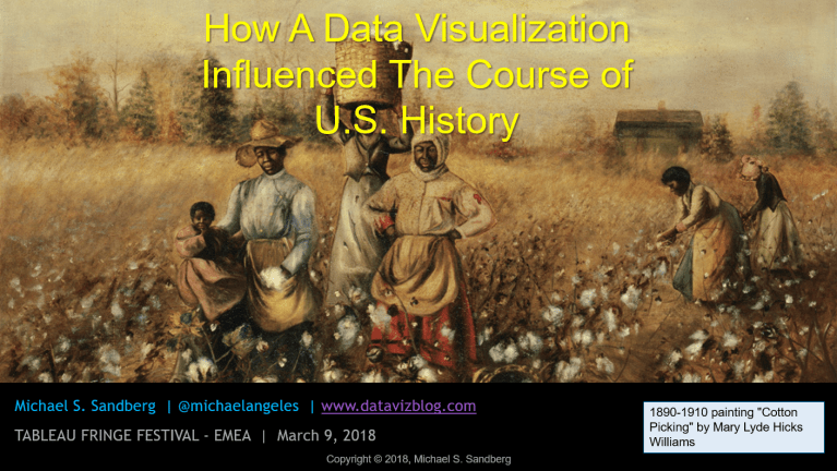
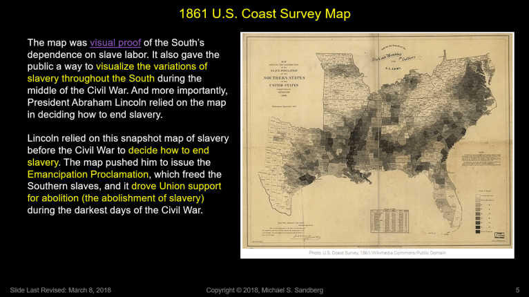
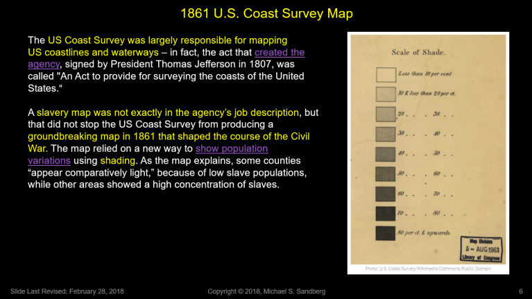
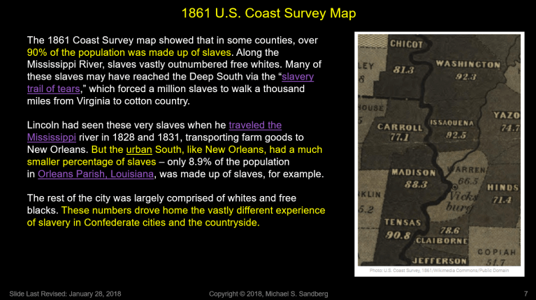
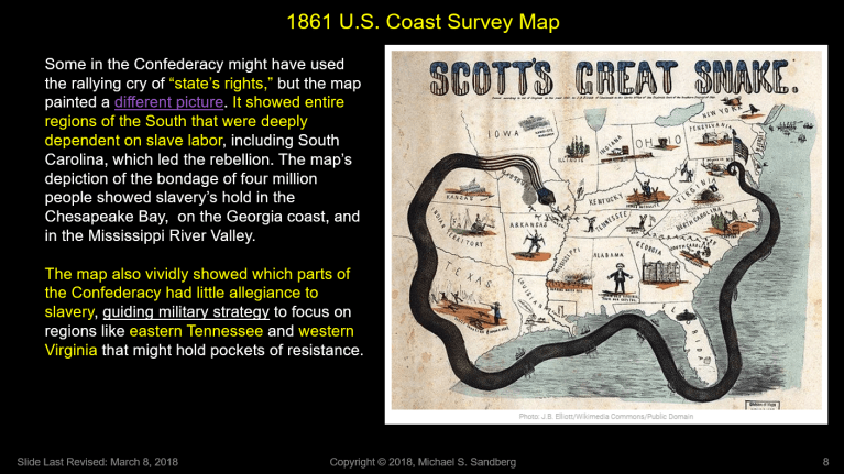
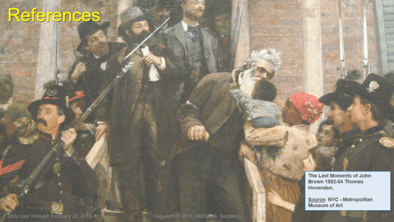
How a Data Visualization Influenced the Course of U.S. History

Sir;I am a fan of your blog and look forward to it. I routine forward your message to others and exhort them to subscribe.You weave valuable information for life in general into your instructions regarding data visualization.Both are valuable.In this case, your recent example is one to keep in mind for dispelling the thought that the Civil War was not about slavery. Thank you.dhDavid A. HelgersonPresident & Senior Naval ArchitectDavid Helgerson & Associates, LLCwww.dhelgerson.comdh@dhelgerson.com571-239-9435 Please support the Teaching With Small Boats Alliance,and your local educational boatbuilding organizations, such asThe Alexandria Seaport Foundation.(I have not included the links since some email systems object to embedded hyperlinks; a simple search will find the TWSBA site, which will point to many educational boatbuilding organizations.) Thanks.