
Readers:

Bridget Cogley
Bridget started her professional career as an American Sign Language interpreter. She loved it, did a fair bit of medical and post-secondary interpreting, and enjoyed analyzing language. Bridget feels it set the stage for what she does now.
Since interpreting, Bridget has worked in training, management, HR, process improvement, sales support, grant writing, and lastly data analysis. She helped roll out Tableau in an organization and, at one time, had near unlimited control of the database. How often can you say that? Data joys aside, She reported to the COO and had her own office when she left to go do Tableau consulting full time about 4 years ago – simply put, she loved that the software let her use all the best of her skills to help clients. We’re getting close to 2 years ago that she joined Teknion and started making Joshua crazy.

Joshua N. Milligan
Joshua has been a consultant with Teknion for 14 years now and is still loving it! He started as a software developer and then transitioned into BI, doing data modeling and ETL work. When a colleague introduced him to Tableau and visual analytics, I was hooked!
Joshua has been honored to be named a Tableau Zen Master four years now and loves engaging with the community and pushing the limits with Tableau. His wife and he have three children with another on the way!
A Roundtable Interview With Bridget Cogley and Joshua Milligan
Michael: Your presentation last month on What’s New with Tableau v10.5 was excellent. With that said, let me start with some Tableau specific questions. You both work as consultants for Teknion Data Solutions and deal with many Tableau clients (I am assuming here). What are some common pain point themes (e.g., in regard to data and analytics) you see with your clients and why is Tableau the right solution for them?
Bridget: What’s really neat is Joshua and I both get different types of clients and problems. I get a lot of ‘quick burn’ assignments – clients that need a dashboard or are looking to get started quickly with Tableau. Common pain points I see are trying to get a deeper understanding of what is going with the business in a cadence that makes sense. Maybe I’m working with a college – not only are they going to look at admission numbers today, but they also want to start preparing for the next round. Their cadence at first may be annual, but as they start to get better access to data, they may move to each semester. Then, they start looking at withdrawals, transfers, and grades. Then, they dig deeper into what makes a student successful. That to me is the success of Tableau when the questions STOP being about reporting and more about insight and exploring questions that were previously hard to answer.
Joshua: My main focus is helping clients see their data and answer questions using Tableau. But the biggest pain points are usually still around the structure of data and bringing together disparate sources. Many clients have some kind of database, but it’s rare that it contains all the data they really need and work with and it’s almost never structured in a way that makes analytics perfectly easy. Usually, there is a dozen of Excel spreadsheets, another database or two with various versions of “the truth”, and other random sources of data.
I find myself working with others at Teknion to build data models and then collaborate as they use WhereScape to automate the build of a data warehouse, or Alteryx to transform and structure various sources of data, or, just about as often, I’m pioneering some rapid data discovery and prep with Alteryx or custom SQL or crazy joins in the Tableau interface or (soon) Maestro, to get the data so it is usable.
Bridget: With that, as you start getting more information from various data points, the questions get deeper. Tableau makes this possible because it frees up the initial pipeline and also helps shape the path towards what the long-term structure should include.
Lastly, another common pain point I see is the paradigm shift TO Tableau. It’s not just learning a new software or to present information visually, but learning how to ‘facet’ the data. (Link: http://www.tableaufit.com/magic-tableau-small-multiples-faceting-design/) When we come from a world of flat style reports, we’re terrified to not show all the information at once. If we approach Tableau with the idea of small multiples and use that idea for the dashboard, not just the sheet or chart level, it creates a very elegant logical build that is highly interactive and achieves far more with a lot less.
When we come from a world of flat style reports, we’re terrified to not show all the information at once. If we approach Tableau with the idea of small multiples and use that idea for the dashboard, not just the sheet or chart level, it creates a very elegant logical build that is highly interactive and achieves far more with a lot less.
Michael: Both of you are Tableau Zen Masters. Can you tell us the path you followed to reach this goal?
Joshua: I had been using Tableau for a couple of years on my own when I attended my first Tableau conference in San Diego. It was there that I saw the first class of Zen Masters and became aware of a broader community of users that helped each other and shared knowledge.
Through the forums, I started interacting with some of the leaders in the community such as Joe Mako, Jonathan Drummey, Shawn Wallwork, and many more. They were and are such great role models, always helping, teaching, and especially correcting. I say “especially correcting”, because that was where I learned the most. As I would share “answers” on the forums they would gently correct me as needed and show me that often there’s not one correct or even one best way to solve problems. From them, I saw that everyone has a different flow of thought and different approach to gain insight. Tableau (and now Maestro too) enables this flow of thought and allows you to solve problems in numerous ways. And that’s fun and exciting!
And so I continued to grow and learn and then followed in the footsteps of those who had come before by sharing what I learned with the community. I pushed the limits of what Tableau could do, making games with Tableau and finding new ways of building dashboards and visualizations. And I’ve been able to interact with the developers and share ideas for features that would help make Tableau and Maestro even better!
And just like there are numerous ways to solve problems with Tableau, I think there are many paths to being a Zen Master. It’s a diverse group of individuals with different skills, passions, and ways of expressing themselves. But the main thing all have in common is that the Zen Masters have taken those skills and passions to engage with and help the community and to help make Tableau an even better product!
But the main thing all have in common is that the Zen Masters have taken those skills and passions to engage with and help the community and to help make Tableau an even better product!
Bridget: I have to second Joshua’s response. I don’t know that there’s a path per se, but a wide variety of things that catches Tableau’s eye. I started writing my blog with the hopes of helping “the Bridget of Before” – the one that came from Excel, called Michael Cristiani dozens of times begging for help on calculations, and finally having it all make sense quite late in the game. The responses I get from time to time on Twitter let me know I’m at least being somewhat helpful, and naturally, this recognition from the community and Tableau continues to leave me quite floored. It’s an includible and humbling honor and I really hope that anything I’ve done makes it easier for others to leapfrog past some hurdles I experienced.
Michael: Double bonus! Can each of you tell us three of your favorite Tableau Tips?
Joshua: Tableau is designed for the flow of thought, so find the flow that works for you. Ask questions of the data, get answers, and keep iterating! Try different things and don’t be afraid to make mistakes. Ask for help from the community when needed and then share what you learn!
Bridget: I can’t second this enough.
Joshua: Double-click the border of an object in a dashboard to select the container it is in. I didn’t even know that until I saw a video by Tim Messar where he just casually dropped the hint.
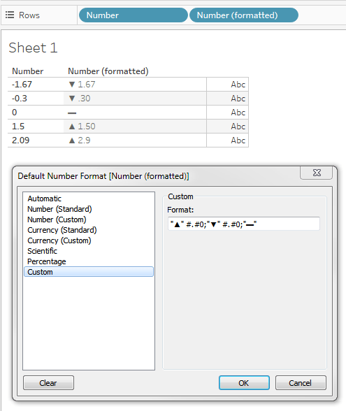
You can use a custom format string to display a number differently based on whether it’s positive, negative, or zero – just separate by semi-colon.
Bridget: Love that KPI one and use it a lot as well. Joshua provided one of my favorite tips – moving things off the edge and into the grey space. (Link: https://vizpainter.com/going-off-grid-secret-way-hide-something-tableau-dashboard/) You can’t drag it, you need to type those XY coordinates, but is that ever helpful! I use this a lot for documentation.
My remaining tips owe a massive debt to the inimitable Kelly Martin – name absolutely everything in a logical fashion – sheet names, actions, dashboards, you name it. This comes from probably the best-named post in the history of Tableau (Link: http://vizcandy.blogspot.com/2014/10/playing-nice-with-tableau-or-how-to.html) and features Pinky and the Brain.
Lastly, don’t show off (Link: http://vizcandy.blogspot.com/2016/03/top-10-dashboard-donts.html) – it’s not just about keeping it simple but keeping it accessible. The graphics with this tip should win an award. It is massively sticky in my brain.
Joshua: That’s a great one!
Michael: Joshua, your book, Learning Tableau 10, Second Edition, is my go-to book at work. Can you tell us how it came to be that you wrote this amazing book? And what were some of the challenges in writing it?
Joshua: Wow! What an experience!
It all started when one of my colleagues at Teknion, Jonathan Walder, forwarded an invitation to be a technical reviewer for a Tableau book. I wrote the publisher and expressed interest and started reviewing the Tableau Data Visualization Cookbook by Ashutosh Nandeshwar. It was a process of reading the book and commenting on the technical accuracy and clarity of each section.
Upon completing that, the publisher reached out and asked if I’d want to author a Tableau title. I talked to my wife and she asked how many hours a week it would take. Being naïve I told here, “I don’t know… maybe 5 or 10.” She agreed and I started writing… and writing… and writing! And then I had a couple of technical reviewers who were very helpful in pointing out areas where I wasn’t clear or accurate and I went through an entire editing process.
Overall it was a very rewarding process. I learned a lot! It’s one thing to know how to use a tool, but another thing to know it well enough to teach someone else to use it. It did take more time than I thought, and while my wife was very glad when I was done, she was gracious enough to let me write a second edition, and now I’m starting a third!
Michael: How do you incorporate your knowledge into your teaching? Everyone learns at a different pace and different ways (e.g., visual learners, struggles with Dyslexia, etc.). How are you able to address the needs of all styles of learners when teaching them Tableau?
Joshua: This is definitely true! I don’t know that I always succeed, but my goal is to equip people to find answers with Tableau in a way that makes sense to them.
The beautiful thing about Tableau is that it enables people to find the flow that works for them. Do you need a bar chart or a line chart? Either one will give you insight and you can iterate through variations very quickly to decide which gives you the insight you need or helps you communicate the story you want to tell. Should you use a table calc or a LoD? We can argue over which is “best” for a given situation, but if one approach gets you the answer you need and you understand how you got there – then great!
The key is to embrace the paradigm of having a conversation with your data and developing a flow of thought.
The key is to embrace the paradigm of having a conversation with your data and developing a flow of thought. So, in all of my teaching and mentoring, I’m trying to show various ways of approaching different problems. And along with that, I’m trying to use various techniques and methods to help people learn. It may be showing an example, having them develop a solution on their own, reading a blog post, or watching a video.
Bridget: The only thing I’d add is to find your hero. I think having role models and mentors is so imperative and Tableau Public makes a phenomenal avenue for it.
Michael: Bridget, I am going to put you on the spot too. What is a Simply Elegant Tableau Dashboard?
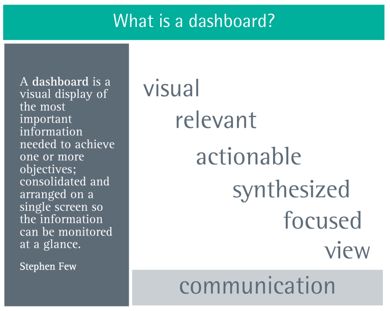
Bridget: Again, I’ll re-reference Kelly Martin to start this one off: “Beauty is meaningful design.” (Link: http://vizcandy.blogspot.com/2013/11/tableau-designs.html) She clarified, and I will too, that this is not “pretty” but that all the items on the dashboard have earned their spot to be there, that the charts aren’t all competing for attention, that the whole is cohesive, presentable, and intelligible. I often cite Stephen Few’s dashboard definition, but I add one thing: communication.
I chose the words “Simply elegant” for my work, because I strive for the end user to receive the message and for that person to have to do as little work as possible in understanding my intent. That’s the simple part. The elegant part is that I’ve refined this to the best that it can be, that I’ve taken the time to ensure this provides enough navigational support on its own as a product, that it’s clear what I’m doing, and that I’ve tidied behind myself by naming sheets, creating titles that matter, and actions that flow properly. Together, these words – simply elegant – are a finished product that makes you feel like you do when you open a new purchase from Apple – their package and “first glance” presentation is stellar.
I compare dashboard design a lot to interpreting: (link: http://www.tableaufit.com/an-interpreters-approach-to-data-visualization/) it’s my job to ensure the message I put out is as accessible as the message I got. I’m interpreting, I’m on the hook to be true to what the data says about the question and to own the message I give to my end users.
Michael: O.K., another one for Bridget. I loved your blog post, Women + Data Minus the Struggle on your TableauFit blog. I loved your relating to you previously being an interpreter for deaf children to the struggles/frustration women may feel in IT. BTW, my wife was a SPED teacher for 40 years and now teaches classes on it at our local university.
First a great quote from your blog post.
For women in data (and a host of other identities and professions), the challenges can also feel invisible. The sense of isolation can be profound. When things happen, there’s no one like you who knows how to address it in a way that feels natural. There’s an unease that lingers. And, the difference, however slight, seems to invisibly affect things, like communication. Everything feels just a little harder and some things, well, they may as well be unreachable. And the path does seem less visible and many do vanish. They go into other fields, go solo, or simply fade out. And, yes, the bonds that seem so strong between women and all the female duos that you see, that’s not an accident. When you look all around and see people like you, the goal is to stand out. When all you do is stand out, fitting in is a true joy.
Do you feel things are getting better for women in IT or is it just the same just shined up a bit?
Bridget: I really struggle to find a good answer to this. I don’t have an easy yes or no, or appropriate short answer. I wish I did. This post comes with its own story – it’s one I wrote very early in my blogging career and wasn’t sure if it’d ever see the light of day. The 6 different drafts and collective 100 revisions tell a story of hesitation, and the time spent sitting on it should be a good indicator of how uncomfortable this topic is. Yet, it was also imperative to get it right when I finally did publish it.
We often hear the adage, “There’s your truth, my truth, and what really happened.” As an interpreter, I’ve been in a very rare situation where I was the only person in the room who understood everything. Understanding isn’t just a sum of the words, it’s the cultural and linguistic implications we take for granted, a history we share, and a cultural lens we use as a shortcut to life. I wanted to bring that experience to this situation, to both de-escalate the emotions we have with this topic while putting forth some of the ones that get experienced.
These emotions themselves are not unique – we’ve all been on the outside or faced differences we couldn’t pierce through. What’s unique is the frequency, pattern, energy spent, and lack of shared realization around this. I lost track of how many times I used to have to remind people that American Sign Language has to be seen and not heard so I couldn’t interpret through a wall or from behind the Deaf person (spoken language interpreters do these things). Our reality is such that we’re used to hearing. I think of these things because they’re a part of my reality, that people in my world don’t all use sound for cues, but CAN talk through windows or across traffic (really cool superhero ability, if you think about it). We see this with men too when they have daughters. Suddenly, they have to look at how women have to navigate the world and it’s quite eye-opening.
I think the key to that post is the last sentence you captured. When you live in a world where so many are like you, you fight fiercely to be different. We see this in almost every ‘hero’ story out there, from Tolkien to Harry Potter to others I’m sure I’m missing. But, if we take the Harry Potter example, you also have a lonely boy who just wants to belong, so when he looks in the Mirror of Erised, he sees his family. So, for women, minorities, and a host of others I know I’m missing, there’s a desire to belong, to look out into the great expanse and see another one like you. We all have moments where we don’t belong and want to. Some of us have more of them than others. Too many and we feel like imposters. (link: http://www.tableaufit.com/mathematics-imposter-syndrome/)
Here’s my take here – pick some people that inspire you. Write down those 3 names. Now pick 3 mentors in your career. Write down those names. Now, write down 3 people who are absolute visionaries in your mind, regardless of industry. Great – you should have 9 names written down and some of those may be repeats. Totally fine.
Now, here’s my question: how many of those names are female? How many of those people who are minorities? Now, keep in mind, that question came in the middle of this topic – you were biased from the start to include people you might not normally consider off the bat. Try this with others with no warning. Review your own historical answers elsewhere.
So, that’s where I don’t have a good answer to this question. Some people will have amazingly diverse answers to this question. Most people will not. Sadly, I’m in the ‘not’ camp when I do this exercise – as a woman with a professional background working cross-culturally. Until women and minorities are equally recognized as mentors and heroes by the bulk of the population, I don’t think we’ll see the change we want. We can’t make the change with half the room and men are so vitally important to this piece when it comes to women. We are the Kraken to our own sinking ships and we are as much a part of the problem as we are the solution. I hope that by looking at our lives, we can find shared experiences where we’ve been on the outside and use that to bond to, and elevate others.
Michael: So, I am going to get on my soapbox for my next question.
Michael standing on his soapbox
I have been a big proponent of self-service BI & Analytics since the early 2000s. I have also worked, in the past, for large Fortune 25 Companies, which means lots and lots of data. However, I have seen what I will call the Chicken-and-the-Egg affect with it. That is, if you introduce the BI & Analytics tool before you have the data properly prepped, normalized and “dimensionalized” in a database, data lake, etc., you run the risk of frustrating your clients and business partners with them having a tool, but not good, robust data to use it against. On the other hand, if you work on the data first, which can take months to prep and load, you run the risk of shadow IT organizations being created as they lose patience waiting for the data from the IT Department, buy their own tools, and venture off on their own. This often leads to the proliferation of Spreadmarts (think of Excel being used as a database), which often leads to varied versions of the data, conflicting truths, etc. as they may be processed differently.
Michael stepping down from his soapbox
How would you approach this dilemma?
Bridget: To me, this IS the value of a partner like Teknion, where we have answers like Tableau, Alteryx, and WhereScape. This trifecta allows us to do both without it feeling like chaos. You can start with getting the buy-in that is so critical to keep the funding, support, and business moving. Alteryx, for example, allows you to quickly massage data from a number of sources and truly bend it to your will. I think having these quick transformation tools at the analyst level that allow (and trust) analysts to reshape their data means we have access to a lot more analyses. So, you start there, bringing in data, massaging it, visualizing it, and whetting appetites. But you ALSO start scheming big time. Yes, it can be expensive, which I think feeds the chicken and egg problem, because it feels like you’re spending twice. But, you’re already seeing what data is important, what new questions are emerging. In short, you’re getting a nice priority list for that agile project plan you’re creating.
Joshua: I have to agree, I don’t think it has to be an either/or – I think it’s a both/and. And here is where I’ve really embraced what Tableau calls Drive.
The idea is that you have a small dedicated team that includes a Tableau expert and they are focused on rapidly uncovering insights using Tableau on the existing data. They might be rapidly reshaping the data as needed on a small scale using Alteryx or Maestro or the Tableau data connection screen. But they aren’t taking a long time to build out data marts or complex structures. Their goal is to quickly understand the data, see what’s there, what isn’t, what can be done, what questions can or can’t be answered. And they’re answering questions and helping the business make decisions and providing a quick ROI.
But at the same time, they are working with other teams, maybe including IT, that will be focused on building the foundation of a data warehouse or other structures that can be reused and trusted across the enterprise. And this then becomes a foundation on which the solutions can be scaled and adopted across the enterprise.
It’s definitely a balancing act and can be challenging, but as a consultant, these are the types of projects that I want to be on!
Bridget: A part of this is being able to live in the house while remodeling it. For a while, you may be able to get by, but there often comes a point, particularly during a drastic remodel, that you spend a bit of time elsewhere and pay for both places. I do feel like there’s a strong urge to stay in the house, if you will, even when it becomes detrimental, hence the spreadmarts. I also think we live in a society where we have embraced perhaps too rigidly the idea of “do it right the first time.” I also blame the house model for this. I worry we take the idea of architecture a bit too literally when dealing with these bits and bytes. They’re really quite malleable, particularly with the right toolset.
So, perhaps, we think of it more like biology. If you’ve had a heart attack, you might get a stent put in place. That solves the immediate problem, much like an Alteryx would. But, ideally, you also go home and change your diet. That’s the data warehouse. Even with all this, you may still need more stents, medicines, or other things, which is where Alteryx or Project Maestro would come into play. There will always be that urgent, analyst-level need.
Michael: I haven’t use WhereScape a lot, but saw a demo of it years ago at a MicroStrategy Conference. Can you discuss this toolset and how you use it in as part of your Tableau toolset?
Joshua: I love WhereScape! Now, having said that, I haven’t personally used it. But, there are others at Teknion who have and they tell me that they love WhereScape for data warehouses in the same way I love Tableau for visual analytics – it makes building data warehouses fast, easy, and fun!
And I’ve seen this in practice. Back when I was focused on ETL, using very traditional methods, projects would take months or even years. WhereScape automates it and compresses the iterations greatly! And this works really well for the Drive methodology I mentioned in the previous question!
Bridget: From an analyst side, I get a nice tidy dataset with WhereScape, which I absolutely love.
Joshua: Combined with Tableau and Teknion’s other partnerships such as Alteryx and Data Robot, we’re able to work with data at any stage of the cycle of analytics and really help our clients find value!
Michael: Finally, what is next on your list of things to conquer?
Joshua: I’m really excited about Project Maestro! I’ve been evaluating the alpha and beta versions and interacting a bit with the developers. What has me so excited is that it has the same feel as Tableau. With Tableau, you are dragging and dropping fields and you’re seeing the data visualized right before you in real-time. With Maestro you’re dragging and dropping and clicking and you’re getting instant visual feedback as you shape the data. You’re transforming the data in real-time! It makes data prep as fun as data visualization! So I’m really excited to offer feedback to the developers and get ready to use it in a production environment.
Beyond that, I’m continuing to push myself when it comes to visual analytics and visual storytelling. There’s a lot to learn! And in many ways, I feel that I’ve barely scratched the surface!
Bridget: I’m really getting into APIs, Maestro, and Alteryx, particularly for the idea of web scraping and soft app dev. I also have a long-term hobby, which is learning about the brain and human genome. I’ve always been fascinated by medicine and biology in general, but both the brain and genome represent complex structures that both change throughout our lives and control so much. One of my latest heroes, Katherine Peterson, (Link: https://public.tableau.com/profile/katherine.peterson#!/) is using Tableau to solve macular degeneration. How cool is that?!
