Readers:
Today, I am blogging my interview with Robert Rouse. As I continue to do interviews with folks in the Tableau community, almost everyone mentions Robert as part of their interview. It is like, in the Tableau World, he is the Six Degrees of Robert Rouse!
Robert grew up in Shreveport, LA, and earned a mechanical engineering degree from the Air Force Academy. He has lived and worked around the world: Japan, Iraq, New Mexico, Montana, Utah, Ohio, Indiana and now Texas.
As an engineer, his passion for data grew to a point where he decided to switch careers. He has been a Tableau user for eight years and a full-time Analytics Consultant the past four. Robert lends that expertise to all industries and to his personal collection of biblical metadata.

An Interview With Robert Rouse
Michael: Hi Robert. As I mentioned prior to our interview, all roads in the Tableau universe lead to you. You are Tableau’s Kevin Bacon! That is, almost everyone I have interviewed so far, seem to mention you as part of their interview. Why do you think that is?
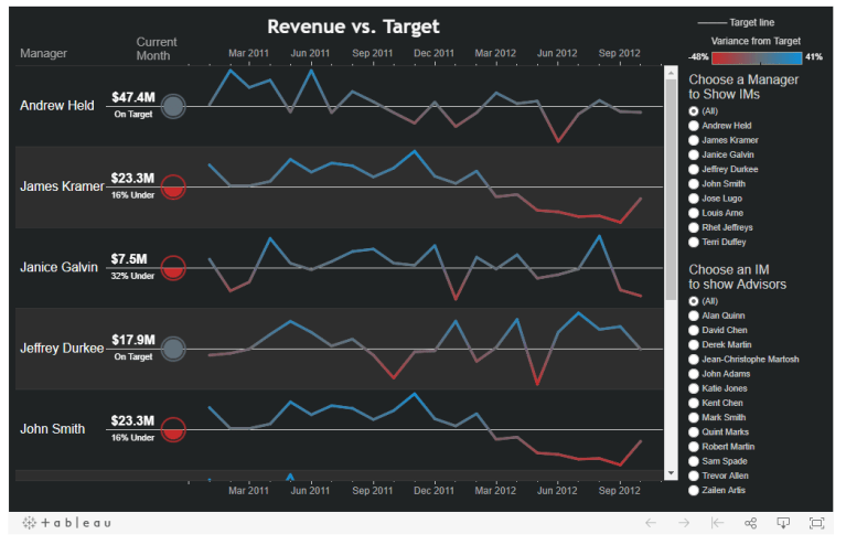
Robert: I can’t say for sure what it is. I know it’s not my irresistible charm. It’s not because I ride the wave of popular topics. There are two dashboards people talk about often on social media and blogs. One is on political polarization, which earned me a spot in Iron Viz (NOTE: see screenshot below. Click on the image to work with this dataviz interactively). The other is a KPI dashboard with a sliding container trick. But, the most talked about things are not my most viewed ones – not by a long-shot.

My most viewed dashboard, by a margin of over 30%, is a KPI viz with only a couple of special tricks. It’s not the kind of thing that will get a lot of likes and re-shares but it’s useful in day-to-day business. That one eventually led to a section in the Big Book of Dashboards. I hope people mention my stuff because it helps them solve a problem and makes their work lives a little easier.
NOTE: This is one of my favorite datavizzes Robert has created. Click on the image to work with this dataviz interactively.
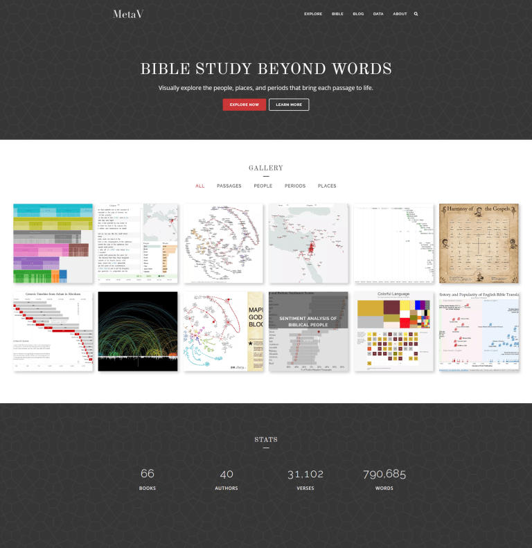
Michael: I have seen several visualizations from your metadata Bible Study site. Can you tell us a little more about how you created the site and the various components to it?
Robert: Over many years, I’ve fished around for pieces of interesting data related to the Bible. Around the time I started investigating BI tools for a new role, I realized that many business analysis concepts translate well to my collection. Every business wants to see data related to time, people, geography, and count everything along common dimensions. The data model to describe “[Customer] ordered [product] at [store] on [date]” isn’t all that different from “Jesus visited the temple in 30 A.D.”
As I’ve learned more about handling data and communicating it effectively, I’ve grown my site, viz.bible a page at a time. I started with some Flash tools which have since faded into oblivion. When Tableau Public was first announced, I immediately saw it as a way to do more of what I wanted without the challenge of learning ActionScript from scratch. But, I still consider that a prototype of sorts. Ultimately I’d love to make a fully customized application out of it.
Michael: Can you tell us three of your favorite Tableau Tips?
Robert: The big things that come to mind are small actions that save a lot of clicks or add a touch of professional polish:
- Right-click and drag fields. Just using the right button can save you several clicks if you need to pick a date part or change the default aggregation. I have to put in a shameless plug for training here. I had been using Tableau for four years before I knew about this, which I discovered during a Tableau Fundamentals class with Carly Capitula.
- Hide all unused fields. This and its sister tip, aggregating to visible dimensions, has helped me clear the clutter with a few easy clicks and boost extract time immeasurably.
- Special characters and other typography tweaks. I love using special characters in places where all you have is a text area. You can add up/down arrows to labels, use block elements for a text-only color legend, or take advantage of special shapes for other tricks. Also, I stress about text alignment more than I should. Here’s a post on it.
Michael: Tell us a little bit about the work you do for InterWorks. What do you feel are your client’s primary struggles with data and how can you best help them?
Robert: My role is very broad. I help people shape data, build high-visibility dashboards, and now and then I get to do some Python or JavaScript work. My favorite is when I can come in early on a project and set it in a direction that will prevent big headaches down the road. When people start on the wrong foot, I may come in later to help them get back on track.
Everyone struggles with data shaping. You can make a few charts in an hour, and a nice dashboard in less than a day. But, that’s only possible after spending days or weeks on data prep. Most of my clients struggle to get the right data in the right format with accurate business logic on top of it. A lot of companies are competing to solve that problem, including Tableau with Maestro. Until one of them cracks that nut, a very large part of my job will be helping people wrangle tables, joins, and calculations.
Michael: Have you been experimenting with Project Maestro at all? What are your thoughts on this product and what do you think is still missing from Tableau Desktop?
Robert: Yes, I’ve been watching the development of it very closely. I’m impressed at how fast it’s coming along and how approachable it is for new users. I don’t know yet how it will fit with enterprise-scale data management, but it’s sure to be a great add-on for individual analysts.
Data prep is often a multi-step process and Tableau Desktop doesn’t handle much more than basic join logic. Maestro will solve that problem in ways similar to existing tools. Legacy products usually stay in the back-office IT shop, so I hope Maestro will be offered at a price that makes it easy to justify for analysts everywhere. Anything to make their jobs and their lives easier will be a big winner.
Michael: Finally, what is next on your list of things to do?
Robert: My collection of Bible data includes some location information. I’m now linking it to historical gazetteers to create the next generation of biblical maps. It’s demanding all the free time I would have used for blogging, but it has been highly rewarding so far.
Like I said earlier, most of my Tableau stuff is a prototype. Now I’m doing the hard work of converting early ideas to a fast, fluid, purpose-built tool. Mapbox has been a dream to work with and the speed is stunning. My near-term future involves lots of research, lots of map layers, and lots of fun!
Michael: Thank you, Robert, for your time and your thoughts!
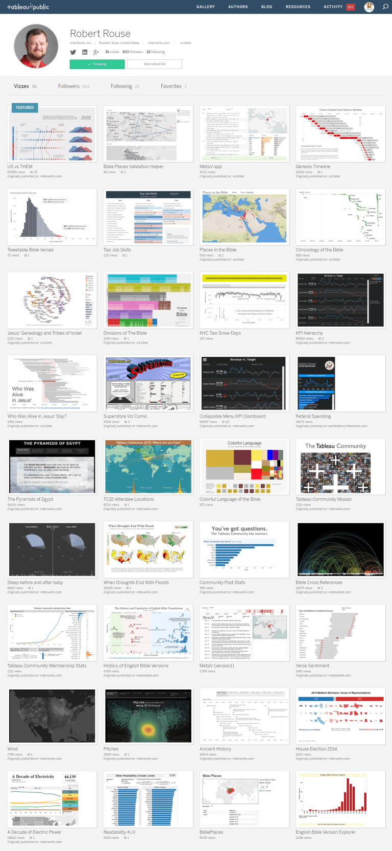
Below is a screenshot of Robert’s data visualizations on Tableau Public. Click on the image below to view Robert’s datavizzes.