Readers:Today I am blogging my interview with Jeffrey (Jeff) A. Shaffer, one of the most prolific Tableau knowledge and information sharers in the Tableau Community. Jeff is the Chief Operating Officer and Vice President of Information Technology and Analytics at Unifund. He is also Adjunct Professor at the University of Cincinnati teaching Data Visualization where he was the 2016 Outstanding Adjunct Professor of the Year.
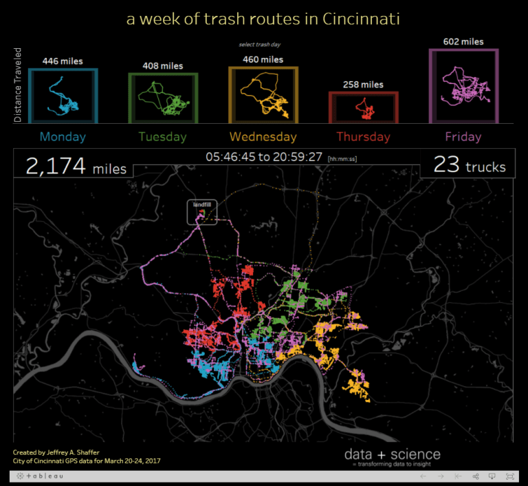
He is an author of the Big Book of Dashboards and is a regular speaker on the topic of data visualization, data mining, and Tableau training at conferences, symposiums, workshops, universities, and corporate training programs. He is one of twenty-seven Tableau Zen Master in the world, and the winner of the 2014 Tableau Quantified Self Visualization Contest which led him to compete in the 2014 Tableau Iron Viz Contest. His data visualization blog, DataPlusScience.com, and the Big Book of Dashboards were on the shortlist for the Kantar Information is Beautiful Awards and his Beautiful Trash visualization of Cincinnati garbage truck routes was on the long-list and featured as one of the 75 best Infographics of 2017 by Column Five Media.
An Interview With Jeffrey A. Shaffer
Michael: Hi Jeff, it is very nice to finally meet you. I have followed your blog and your work for quite a while now. If you don’t mind I am going to dive right into the questions.
Michael: You are one of the authors of The Big Book of Dashboards. What motivated you to write this book and how do you feel it will help people in the data visualization profession?
Jeff: I was finishing up a 52-week project with Andy Kriebel, Dear Data Two (Dear-Data-Two.com), where Andy and I followed in the footsteps of the wonderful Dear Data project. This took a good bit of time, gathering data, drawing post cards and mailing them, creating Tableau workbooks, and then blogging about it. Steve Wexler approached me about being a co-author on this book toward the end of that project. Writing a book is a monumental effort, but it seemed like a good time. We then approached Andy Cotgreave, actually at TC15. Once he agreed to join, we were off to the races.
The short answer is, there was a need. That seemed obvious from the moment Steve first pitched me the idea. There are lots of books on how to create data visualization, but there are not that any books related to dashboard design and most of them are either dated, or spend much of writing focusing on what not to do. The goal from the beginning was to feature dashboards that work in the real-world. Our hope is that it will help people in a number of a ways. First, to offer examples and inspiration when people are creating their own work. Steve and I have done a good bit of training, in workshops and presentations, and we often get questions that go like this.
“I have this data that I’m trying to visualize. What’s the best way for me to visualize that?”
As an example, here’s a recent conversation on Twitter.
Rodrigo was asked to build a chart showing 2017 values compared to 2016 for five different product KPIs which are on different scales. This is a great example of what people encounter every day.
https://twitter.com/tableauing/status/954024228352864256
Instead of two bars next to each other, each on different y-axis scales, I suggested a bar with a target line on a common scale of 100%, but I also offered some other options that might work, depending on the overall goal. Ultimately, Rodrigo created a bar and target line and I think the solution works much better.
https://twitter.com/tableauing/status/954047987549908994
This example and conversation was identical to the examples and conversations we had around Chapter 9 in the Big Book of Dashboards. We hope that people will be able to pull from these examples for years to come, to help them solve these kinds of issues they encounter on a regular basis.

Michael: Andy Kriebel (Head Coach at The Information Lab) and you did 50 minutes of “speed tipping” at the last two Tableau conferences. Can you tell us how that came to be and how you find or develop these great tips?
Jeff: For many years, Andy has published “Tableau Tip Tuesday” and over the past few years, I’ve been posting a regular series on Tableau Tips. The inspiration for my Tableau Tips series actually came from a conference call we had on the Big Book of Dashboards. Every dashboard in our book had a lengthy review process. We held conference calls with the designers of those dashboards and discussed what worked and what might work better. It was a collaborative process and it was a very rewarding process. This also led to the author commentary in the book.
Robert was lamenting the placement of some of the labels on the line chart and I responded, “just drag them and move them where you want them.” Robert said, “yeah, I forget about that.” Then Andy Cotgreave jumped in and said, “Wait. What?” He did not know that you could click on a label in Tableau and drag it to any location.
We were on one of these calls with Tableau Zen Master Robert Rouse discussing the dashboard that we featured in the book (Chapter 8). Robert was lamenting the placement of some of the labels on the line chart and I responded, “just drag them and move them where you want them.” Robert said, “yeah, I forget about that.” Then Andy Cotgreave jumped in and said, “Wait. What?” He did not know that you could click on a label in Tableau and drag it to any location. We both posted this to Twitter that day and I was really surprised by how many people didn’t know this, even people like Andy who had been using Tableau for a very long time. And that’s how my Tableau Tips series was born.
What I find with Tableau is that no matter how long you’ve been using it and no matter what skill level you achieve, you can always learn something new. I really love those “aha moments”. Also, there are so many ways to do things in Tableau and so many of the tips that I’ve published aren’t new ideas, they are simply a different or faster way of doing something. For example, double-clicking a color legend in Tableau to edit colors is simply a short cut to clicking on Color in the Marks card and then selecting “Edit Colors”.
Michael: O.K., I am going to put you on the spot here. Tell us three of your favorite Tableau tips that you consider priceless.
Jeff: I would struggle to call any tips my “three favorites”, so I’ll just pick three and talk about them.
The first tip came from watching the Developers on Stage presentation at my very first Tableau Conference in Seattle in 2014. That was my first Tableau conference, but I had been using Tableau for many years and was there that year to compete in the Iron Viz. During the Devs on Stage session, one of the presenters was demonstrating something in Tableau and they dragged a pill from the Columns shelf up toward the menu to remove it from the view. I had one of those “Wait. What?” moments. I didn’t know you could do that. I had been dragging these pills down and across to take them off the canvas. I really love simple, little tips like that.
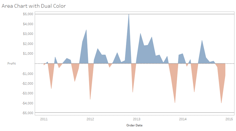

The second tip I would pick is Tip #1 in my 5th volume of tips. It was Creating Area Chart with Dual Color. When coloring a line chart or area chart, you can’t simply place a number on color and have it color above and below a line. This little trick came as a result of a real-world application. Someone in my office wanted to create an area chart similar to the image above and this was my solution.
https://www.dataplusscience.com/TableauTips5.html
I use the tips from my maps post all of the time. So, I’ll pick the “Minimalist Map Styles” from my 6th volume of Tableau Tips, especially Tip #7, as my third tip.
https://www.dataplusscience.com/TableauTips6.html
https://www.dataplusscience.com/TableauMapTips.html

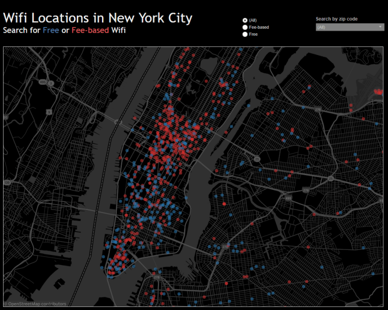
Michael: One of my favorite data visualizations you have created is the WIFI Locations in New York City. Not to sound trite, but I find it elegant in its simplicity. Can you tell us the process you followed to find the data, design it, and then build it?
Jeff: I first saw this data used by Michael Cristiani in a presentation on Tableau at a local meetup group. The data comes from the NYC Open Data. I starting using this data in my data visualization class at UC and in my workshops. It’s a great data set to teach geocoding and plotting latitude and longitude in Tableau. People can easily relate to the data and the data just seems right for the task. It also allows me to introduce some filtering as well as some formatting things, for example, a useful tooltip and building a color legend into the subtitle.
Michael: Tell us about the workshops you offer through your company, DataPlusScience? What are the key topics and skills you want attendees to walk away with?
Jeff: I offer workshops on Data Visualization and Tableau Training. I have also been conducting a new workshop along with my co-author Steve Wexler, Building World-Class Dashboards, based on the content from the Big Book of Workshops and other content we’ve put together.
For data visualization, I focus on the fundamentals of data viz. This content is based on the same content I teach at the University of Cincinnati. I cover things like visual perception, the pre-attentive attributes, the use of color in data visualization, the various chart types and lots of design concepts.
In my Tableau Training workshops, I teach Tableau from the ground up. It’s a 2-day class, and that’s not enough time to cover every aspect of Tableau. So, I give an introduction on how Tableau works and we work through interactive visualizations. I teach people to think about Tableau as an X and Y canvas. You simply move pills around on the columns (X), rows (Y) and the marks card to create everything. I just finished a 2-day workshop teaching Tableau at the University of Cincinnati Center for Business Analytics and at the end I realized that I only used the “Show Me” one time on the second day.
Our Big Book of Dashboards workshop is fairly new. Steve and I started teaching them last year. We have a number of them planned this year. You can find more information about them at www.BigBookofDashboards.com. The content for these workshops is a mix of things. We cover the fundamentals of data visualization and best practices, but we also focus on lessons we learned from the book. It’s been great working with Steve on this and we’re very excited about the content we’ve created for these new workshops.
Michael: You have become the unofficial Jedi Master for Viz in Tooltips. Can you touch on a few key uses cases where Tableau developers can use this feature?
Jeff: I originally posted the idea to the Tableau Idea Forum back in July 2014, so I’ve been waiting a long time to see this feature in production. It was demonstrated on stage a number of years ago and then the feature went dark. We didn’t hear much about it until last year when it popped up in one of the Alpha releases. I was very excited and I started playing with various use cases. It’s such a powerful feature and there’s so much that can be done.
I think it solves some problems that we encounter in data visualization, for example, mapping. There’s certain limitations with mapping. A classic example is pie charts on a map. While many in the data visualization community frown on pie charts, they have been generally accepted on a map. After all, there is a moving baseline when you go from city to city, how else can you visualize this? A good solution to that particular problem is a viz in tooltip. You can see one level of data on the map, but hovering over a city can give you a much more granular level of detail.
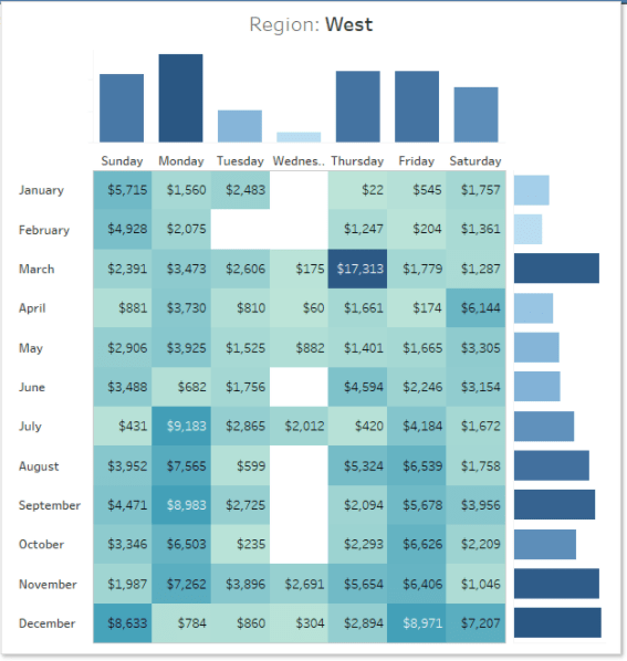
It’s not just maps though. Here’s an example of a marginal histogram on a highlight table as a tool tip. This really keeps you in the flow of analytics, when you can dive into this level of detail right from a tooltip.
My hope is that Tableau will continue to improve this feature, specifically the rendering speed on Tableau Public and Server.
Michael: What features are missing in Tableau Desktop that you would like to see addressed in the near future?
Jeff: One I mentioned earlier, faster rendering of the Viz in Tooltips on Tableau Public and Tableau Server. However, the number one thing I wish for is support for custom fonts. I want to be able to use web fonts in Tableau Public and Tableau Server. Something similar to the way we use custom fonts in CSS. The fonts we have now are very limited. I do love the new Tableau font family, but the community could be much more free with their design if they had this option.
I have two other features that are equally important to me, but one has been released, and that’s Padding. It was painful to have to use blank tiles to create space in visualizations. The padding feature is really helpful and solves that. That other is grid design. This was demonstrated in Las Vegas in the Devs on Stage. We really need more formatting control of the objects, and grid design will go a long way in getting us there.
In general, I just want more design control over my canvas.
Michael: So, what is next on your list of things to conquer?
Jeff: 2018 is already starting off to be a busy year. I have a number of workshops planned for Q1 and Q2, so I’ll be starting to plan the rest of the year. I will be conducting a workshop in Madison, Wisconsin on February 28th, and will be presenting at the Madison TUG on the 27th and the Milwaukee TUG on March 1st. Steve and I will also be in Seattle presenting a workshop together on March 22nd.
http://bigbookofdashboards.com/workshops.html
I have a number of other things planned for 2018. Some are just ideas I’ve been thinking about and others are more formulated. One thing that I’m excited about is a blog post (possibly a series of posts) related to women in data analytics. This idea is a work in progress, but it’s a really important topic that needs attention. I hope to publish more about this in the coming weeks and months.
Michael: Thank you, Jeff. I really appreciate your knowledge sharing of Tableau, your tips and tricks, and most of all, your insights. I look forward to seeing you again at the Tableau Customer Conference 2018 in New Orleans.