
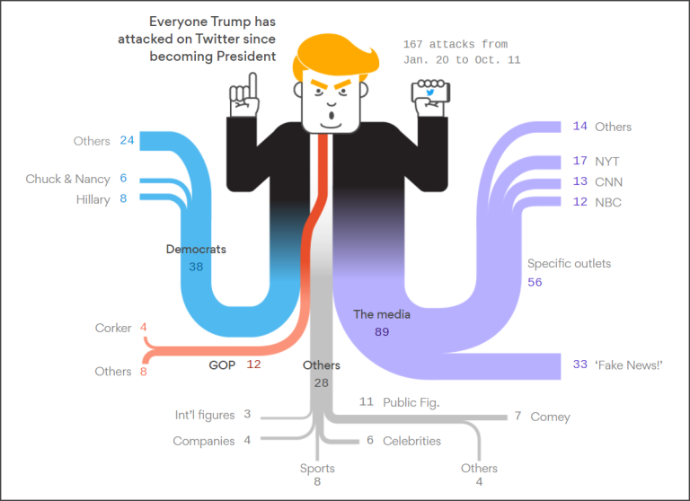
![]() Donald Trump has become well-known for attacking people, news agencies, and even his own cabinet, using Twitter. AXIOS, a new media company, has visualized these attacks using a sankey diagram. Here is a blurb how AXIOS describe themselves.
Donald Trump has become well-known for attacking people, news agencies, and even his own cabinet, using Twitter. AXIOS, a new media company, has visualized these attacks using a sankey diagram. Here is a blurb how AXIOS describe themselves.
AXIOS is a new media company delivering vital, trustworthy news and analysis in the most efficient, illuminating and shareable ways possible. We offer a mix of original and smartly narrated coverage of media trends, tech, business and politics with expertise, voice AND smart brevity — on a new and innovative mobile platform. At Axios — the Greek word for worthy — we provide only content worthy of people’s time, attention and trust. [1]
What is a Sankey Diagram?
Sankey diagrams are a specific type of flow diagram, in which the width of the arrows is shown proportionally to the flow quantity.
The illustration (see image above) created by AXIOS shows a Sankey diagram which represents all of the people POTUS has attacked on Twitter since taking office. The widths of the bands are directly proportional to the number of negative tweets related to that person or agency. The primary targets of President Trump are Democrats and News Outlets such as The New York Times (NYT), CNN and NBC.
Sankey diagrams put a visual emphasis on the major transfers or flows within a system. They are helpful in locating dominant contributions to an overall flow. Often, Sankey diagrams show conserved quantities within defined system boundaries. [2]
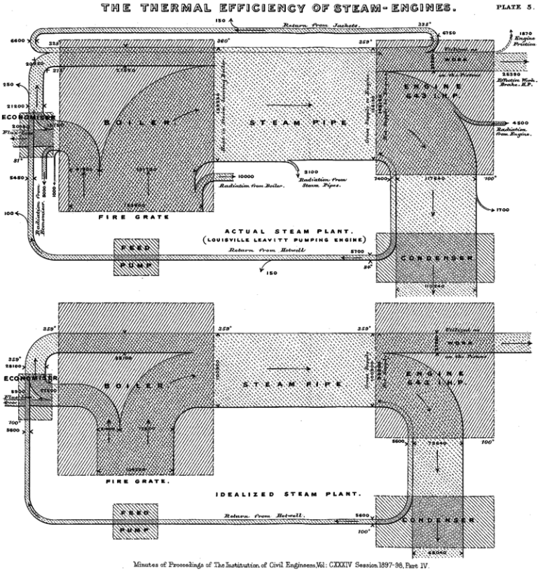
Sankey diagrams are named after Irish Captain Matthew Henry Phineas Riall Sankey, who used this type of diagram in 1898 in a classic figure (see image below) showing the energy efficiency of a steam engine. While the first charts in black and white were merely used to display one type of flow (e.g., steam), using colors for different types of flows has added more degrees of freedom to Sankey diagrams.
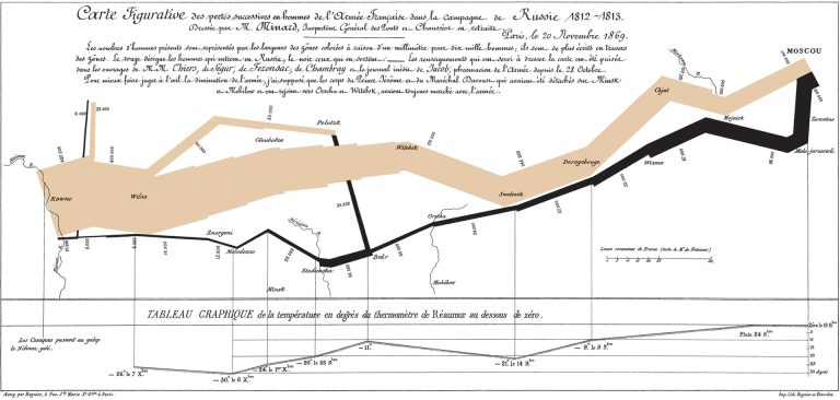
One of the most famous Sankey diagrams is Charles Minard’s Map of Napoleon’s Russian Campaign of 1812 (see image below). It is a flow map, overlaying a Sankey diagram onto a geographical map. It was created in 1869, so it actually predates Sankey’s ‘first’ Sankey diagram of 1898.
Sources:
[1] Kight, Stef W., Who Trump attacks the most on Twitter, AXIOS, October 14, 2017, https://www.axios.com/list-of-people-trump-attacked-on-twitter-since-becoming-president-2484429964.html.
[2] Wikipedia, Sankey Diagram, https://en.wikipedia.org/wiki/Sankey_diagram.

“Attach” or “attack”?