
Readers:
I am hosting Tableau training this week at work. It is always a good feeling watching the newbies working with Tableau and getting excited about how easy and fun it is to be able to visualize their data.
Since I never had any formal training with Tableau, I have been sitting in the class this week too. It is never too late to teach an old dog new tricks (or at least fill in the holes in my knowledge).
Below are a couple of things I wanted to share from the two-day Tableau Desktop Fundamentals class. The portion on Jacques Bertin and Marks was something I added in case anyone ever asked you what a “Mark” is.
Thanks to Evan Alini and Celeste Luna for keeping the class interesting and fun.
Best regards,
Michael
Tableau File Types
Celeste drew a nice visual explanation of Tableau File Types on the whiteboard. I liked it so much, I recreated it in PowerPoint and added a few more details. Below is a screenshot of the visual I created based on her example.

Dual Axis Pills
I learned something new. I did not notice before that the inside rounded ends are missing off the pills to indicate that they participate in a dual axis.

Plus (+) and Minus (-) Icons on X-Axis
This is a nice thing to know. Tableau seems to provide you an infinite number of ways to do things.
![]()
What the Heck is a Mark?
 I have seen people get a puzzled look on their face when a Tableau instructor starts talking about “Marks.” I thought I would provide some history and some background on where this term originated and how it ties into the Tableau Desktop product.
Our usual way of communicating is with words. Written words consist of single symbols (letters), gaining meaning when arranged in certain combinations. The question is: If there are basic visual symbols arranged in a particular way, can they be used to convey information in a similar manner? All of those developments were primarily made for cartographic purposes. With the computerization of information these visual variables were adapted and used for information visualization. The concept of information visualization began in the 1930’s, but after the 1950s became more developed by cartographers. Since the development of computers has revolutionized all aspects of information visualization. [2]
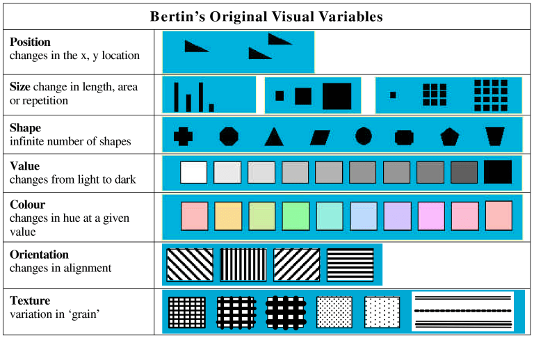
 Jacques Bertin was a French cartographer and theorist, known from his book Semiologie Graphique (Semiology of Graphics), published in 1967. This monumental work, based on his experience as a cartographer and geographer, represents the first and widest intent to provide a theoretical foundation to Information Visualization. [4]
Mr. Bertin described “marks” as these basic units and also developed a given number of methods through which these units can be modified, including position, size, shape, or color. These predefined modifications are called visual variables. Each of these variables can have certain characteristics. Sometimes visual variables are also called visual attributes. [2]
A mark is made to represent some information other than itself. It is also referred to as a sign. Marks can be
-
Points are dimensionless locations on the plane, represented by signs that obviously need to have some size, shape or color for visualization.
- Lines represent information with a certain length, but no area and therefore no width. Again lines are visualized by signs of some thickness.
- Areas have a length and a width and therefore a two-dimensional size.
- Surfaces are areas in a three-dimensional space, but with no thickness.
-
Volumes have a length, a width and a depth. They are thus truly three-dimensional.
Mr. Bertin defined seven Visual Variables consisting of:
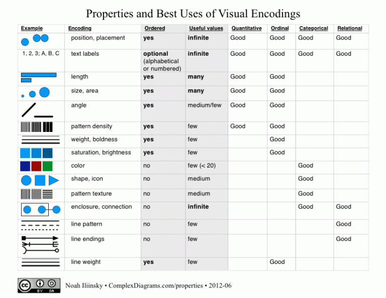
Noah Iliinsky refined this chart year’s later and his chart is shown below. [3]
O.K., so now you are asking, how did this end up in Tableau Desktop? Let’s introduce Jock Mackinlay.
 Jock D. Mackinlay is an American information visualization expert and Vice President of Research and Experience at Tableau Software. [5] Jock invented a number of Information Visualization techniques such as the Information Visualization Reference Model. He also expanded the list of visual variables. In addition, he provided different sorting for their accuracy, based on the task. [2]
Ranking of perceptual tasks:
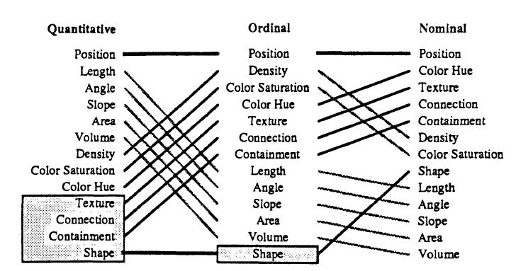
The list was further expanded by several later publications. Most of them are also grouping the visual variables, e.g. combining length, area and repetition to shape or breaking down position in the three dimensions of space and one time dimension. [2]
Since nowadays information is presented by computers, the addition of motion as a new visual variable becomes important. Changes in motion can include direction, speed, frequency, rhythm, flicker, trails, and style. [2]
I hope this helps you understand why Tableau incorporated the concepts of Marks into their Tableau Desktop product.
Stay tuned for my notes from the Tableau Desktop Intermediate class in a few days.
Sources:
[1] Tableau Software, Tableau Desktop Fundamentals Training v10.2, Glendale, Arizona, June 12-13, 2017.
[2] Infovis Wiki, Visual Variables, http://www.infovis-wiki.net, http://www.infovis-wiki.net/index.php?title=Visual_Variables.
[3] Iliinsky, Noah, Properties and Best Uses of Visual Encodings, ComplexDiagrams.com/properties, June, 2012, http://complexdiagrams.com/properties.
[4] Wikipedia, Jacques Bertin, https://en.wikipedia.org/wiki/Jacques_Bertin.
[5] Wikipedia, Jock D. Mackinlay, https://en.wikipedia.org/wiki/Jock_D._Mackinlay.

Mike,
Thanks for that one. I liked learning the history and a few new Tableau insights.
Ken