Readers:
 Ann K. Emery (photo, right) just released her Data Visualization Checklist, 2016 Edition. This is the link to the PDF version.
Ann is a sought-after speaker, trainer, and designer who equips organizations around the globe to visualize their data more effectively.
Within the past year, she led more than 60 trainings for more than 2,800 participants. Every workshop is customized for the client. Popular topics include data visualization best practices, dashboard design, and spreadsheet skills. Workshops range in length from 90 minutes to 3 days. Clients include professional societies, for-profits, nonprofits, foundations, and universities in nearly every sector and content area.
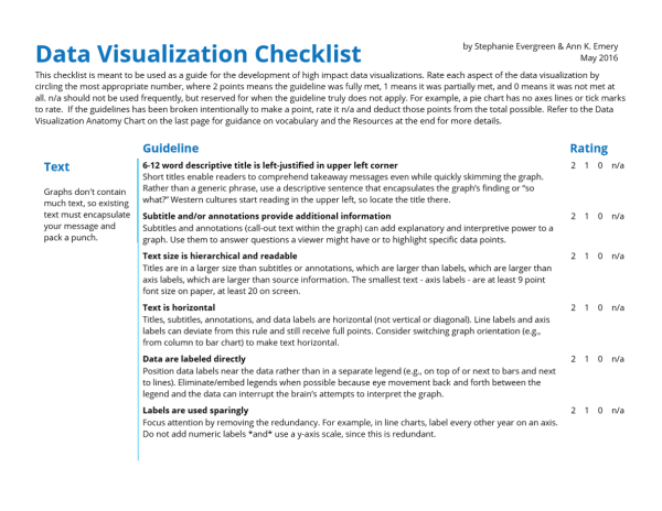
What’s included in the updated Data Visualization Checklist?
Ann and Stephanie Evergreen tweaked five items on the checklist:
- Text size is hierarchical and readable
- Labels are used sparingly
- Proportions are accurate
- Axes do not have unnecessary tick marks or axis lines
- Graph has appropriate level of precision
Expect more tweaks in the future as the field of data visualization evolves.
What’s not included?
The Data Visualization Checklist contains the foundational techniques needed for clear, effective graphs. But it can’t cover every single nuance under the sun. That’s what workshops, webinars, custom consulting projects, and blogs posts are for–to explain the strategies that’ll reallllly take your graphs from good to great, to explain when it’s okay to break these “rules,” and to explain how to customize these guidelines for your viewers.
I hope you find this useful in your dataviz escapades.
Thanks, Ann and Stephanie for creating this for the community.
Best regards,
Michael
