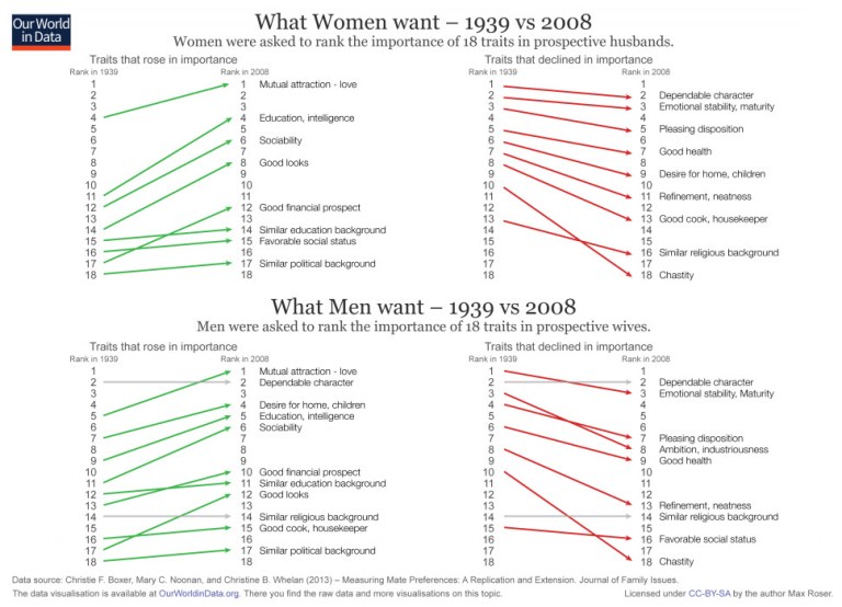
The chart above shows what people want in a spouse now compared to 70 years ago — and the differences are striking
There’s more to marital bliss than finding someone who texts back quickly.
We also want our partners to be loving, financially secure, and maybe have a college education (or two).
It wasn’t always this way.
Before we had modern medicine and casual attitudes toward sex, people held far different opinions about what constituted a worthy spouse. According to a 2013 study, people in 1939 focused more on maturity, good health, and chastity compared to people in 2008.
The results of that study, which compared data across both time periods for 18 different traits, recently made its way to University of Oxford data visualization expert Max Roser, who runs the research website Our World In Data.
Source: Chris Weller, This chart shows what people want in a spouse now compared to 70 years ago — and the differences are striking, Tech Insider, November 30, 2015, http://www.techinsider.io/charts-show-what-men-and-women-want-2015-11.

From the dataviz point of view, this kind of data is a tough challenge to visualize. It’s the first time that I see slopecharts separated in two parts — up- and down- slopes. Such a design gives a reasonable solution to the clutter. At least in this case, separating items by the change direction makes a lot of sense.