Readers:
 I am in Portland, Oregon this week attending three data visualization workshops by industry expert, Stephen Few. I am very excited to be sitting at the foot of the master for three days and soak in all of this great dataviz information.
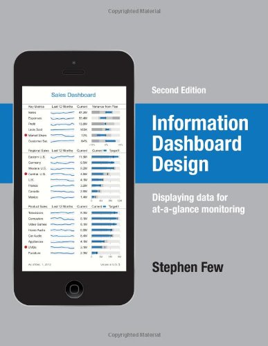
Today, was the second workshop, Information Dashboard Design which is based on Steve’s best-selling book (see photo below).
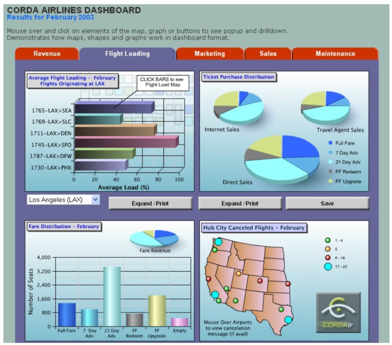
To not give away too much of what Steve is teaching in the workshops, I have decided to discuss one of the dashboard exercises we did in class. The goal here was to find what we feel is wrong with the dashboard.
I will show you the dashboard first. Then, you can see our critique below.
You can find future workshops by Steve on his website, Perceptual Edge.
Best Regards,
Michael
Dashboard To Critique
Critique Key Points
- Top left chart – Only left hand corner chart has anything to do with flight loading
- Top left chart – are flight numbers useful?
- Two Expand/Print buttons – Need more clarity (right-click on chart would be a better choice)
- Top right chart – Poor use of pie charts – size of pies are telling largest sales channel – use small multiple bar charts, total sales as a fourth bar chart
- Redundant use of “February” – In the title and in charts
- Bottom left chart – why does it have a pie chart in it?
- Bottom right chart – map may be better as a bar chart (geographical display could be useful if we had more information). Current way bubbles are being expressed is not useful (use % cancellations instead). Symbols may have a different meaning every day
- Bottom right chart – CORDAir Logo – is this necessary?
- Location of drop-down. Not clear if it applies to top left chart or all charts
- Backgrounds – heavy colors, gradients
- Instructions should be in a separate help document. Only need to learn this once.
- Top left chart: Faint Image in background. Suppose to look like a flight seating map. Do you really want to see this every day? It is a visual distraction.
- IMPORTANT: Is there visual context offered with any of the graphs? No. This is critical.
————————————————————————————————-
Dashboard Example Source: Website of Corda Technologies Incorporated, which has since been acquired by Domo.


How many people were in this workshop?
25-30 people