Readers:
 In the past, I would have highly condemned pie charts without giving you much explanation why. However, Dr. Robert Kosara (photo, left), posted a great thought study of pie charts on his wonderful blog, EagerEyes.org, that I want to share with you.
Dr. Kosara is a Visual Analytics Researcher at Tableau Software, with a special interest in the communication of, and storytelling with, data. He has a Ph.D. in Computer Science from Vienna University of Technology.
Also, as part of his blog post, Robert offers an alternative way to create pie charts: using waffle charts or square pie charts.
Dr. Kosara is also one of the great minds behind Tableau’s new storytelling feature. I hope you enjoy his creative thoughts as much as I do.
Best Regards,
Michael
The Pie Chart
Dr. Kosara contends that pie charts are perhaps the most ubiquitous chart type; they can be found in newspapers, business reports, and many other places. But few people actually understand the function of the pie chart and how to use it properly. In addition to issues stemming from using too many categories, the biggest problem is getting the basic premise: that the pie slices sum up to a meaningful whole.

Robert points out that the circle (the “pie”) represents some kind of whole, which is made up of the slices. What this means is that the pie chart first and foremost represents the size relationship between the parts and the entire thing. If a company has five divisions, and the pie chart shows profits per division, the sum of all the slices/divisions is the total profits of the company.
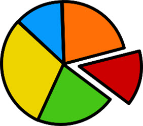
If the parts do not sum up to a meaningful whole, they cannot be represented in a pie chart, period. It makes no sense to show five different occupations in a pie chart, because there are obviously many missing. The total of such a subsample is not meaningful, and neither is the comparison of each individual value to the artificial whole.
Slices have to be mutually exclusive; by definition, they cannot overlap. The data therefore must not only sum up to a meaningful whole, but the values need to be categorized in such a way that they are not counted several times. A good indicator of something being wrong is when the percentages do not sum up to 100%, like in the infamous Fox News pie chart.
The Infamous Fox News Pie Chart

In the pie chart above, people were asked which potential candidates they viewed favorably, but they could name more than one. The categories are thus not mutually exclusive, and the chart makes no sense. At the very least, they would need to show the amount of overlap between any two (and also all three) candidates. Though given the size of the numbers and the margin of error in this data, the chart is entirely meaningless.
When to Use Pie Charts
Dr. Kosara points out that there are some simple criteria that you can use to determine whether a pie chart is the right choice for your data.
- Do the parts make up a meaningful whole? If not, use a different chart. Only use a pie chart if you can define the entire set in a way that makes sense to the viewer.
- Are the parts mutually exclusive? If there is overlap between the parts, use a different chart.
- Do you want to compare the parts to each other or the parts to the whole? If the main purpose is to compare between the parts, use a different chart. The main purpose of the pie chart is to show part-whole relationships.
- How many parts do you have? If there are more than five to seven, use a different chart. Pie charts with lots of slices (or slices of very different size) are hard to read.
In all other cases, do not use a pie chart. The pie chart is the wrong chart type to use as a default; the bar chart is a much better choice for that. Using a pie chart requires a lot more thought, care, and awareness of its limitations than most other charts.
Alternative: Squaring the Pie
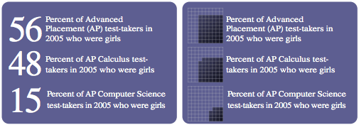
A little-known alternative to the round pie chart is the square pie or waffle chart. It consists of a square that is divided into 10×10 cells, making it possible to read values precisely down to a single percent. Depending on how the areas are laid out (as square as possible seems to be the best idea), it is very easy to compare parts to the whole. The example below is from a redesign Dr. Kosara did a while ago about women and girls in IT and computing-related fields.
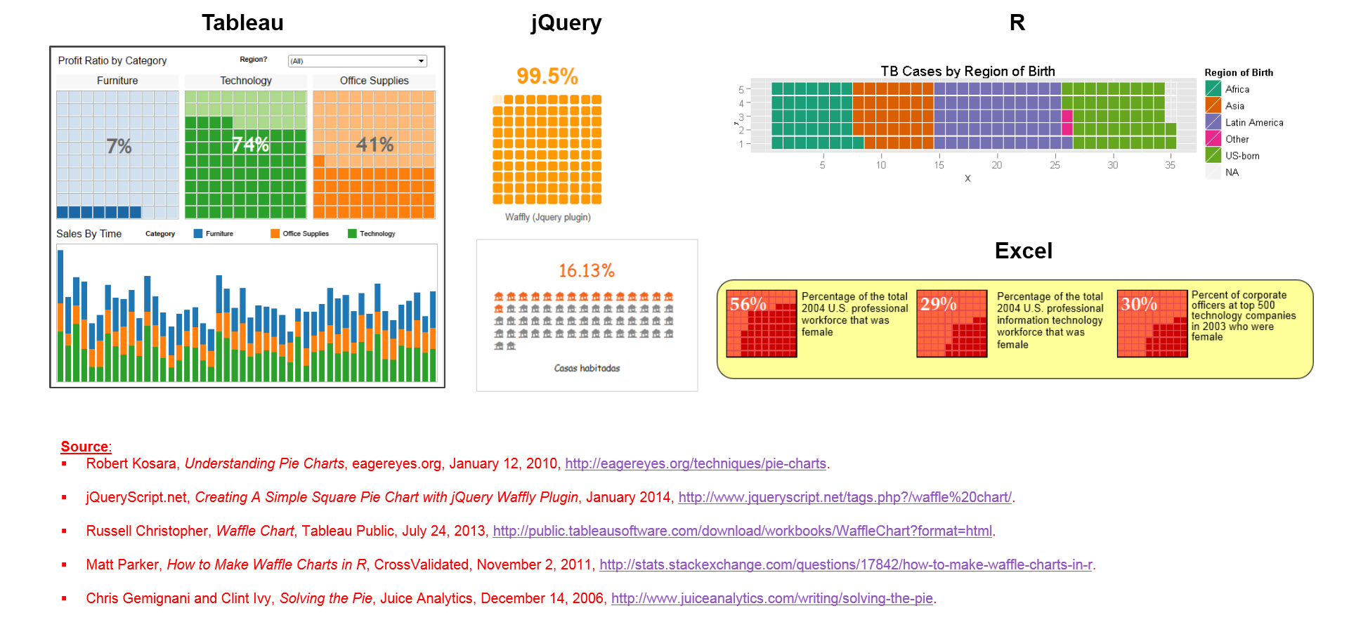
Links to Examples of Waffle Charts
I did a little Googling and found a few great examples of Waffle Charts. I have provided links to examples in Tableau, jQuery R and Excel.
Sources:
- Robert Kosara, Understanding Pie Charts, eagereyes.org, January 12, 2010, http://eagereyes.org/techniques/pie-charts.
- jQueryScript.net, Creating A Simple Square Pie Chart with jQuery Waffly Plugin, January 2014, http://www.jqueryscript.net/tags.php?/waffle%20chart/.
- Russell Christopher, Waffle Chart, Tableau Public, July 24, 2013, http://public.tableausoftware.com/download/workbooks/WaffleChart?format=html.
- Matt Parker, How to Make Waffle Charts in R, CrossValidated, November 2, 2011, http://stats.stackexchange.com/questions/17842/how-to-make-waffle-charts-in-r.
- Chris Gemignani and Clint Ivy, Solving the Pie, Juice Analytics, December 14, 2006, http://www.juiceanalytics.com/writing/solving-the-pie.
