
Your car gets towed, and who do you blame? Yourself? God no, you blame that impossibly confusing parking sign. It’s a fair accusation, really. Of all the questionable communication tools our cities use, parking signs are easily among the worst offenders. There are arrows pointing every which way, ambiguous meter instructions and permit requirements. A sign will tell you that you can park until 8 am, then right below it another reading you’ll be towed. It’s easy to imagine that beyond basic tests for legibility, most of these signs have never been vetted by actual drivers.
Like most urban drivers, Nikki Sylianteng was sick of getting tickets. During her time in Los Angeles, the now Brooklyn-based designer paid the city far more than she would’ve liked to. So she began thinking about how she might be able to solve this problem through design. She realized that with just a little more focus on usability, parking signs could actually be useful. “I’m not setting out to change the entire system,” she says. “It’s just something that I thought would help frustrated drivers.” [1]
Sylianteng notes: [2]
I’ve gotten one-too-many parking tickets because I’ve misinterpreted street parking signs. The current design also poses a driving hazard as it requires drivers to slow down while trying to follow the logic of what the sign is really saying. It shouldn’t have to be this complicated.
The only questions on everyone’s minds are:
1. “Can I park here now?”
2. “Until what time?”My strategy was to visualize the blocks of time when parking is allowed and not allowed. I kept everything else the same – the colors and the form factor – as my intention with this redesign is to show how big a difference a thoughtful, though conservative and low budget, approach can make in terms of time and stress saved for the driver. I tried to stay mindful of the constraints that a large organization like the Department of Transportation must face for a seemingly small change such as this.

The sign has undergone multiple iterations, but the most recent features a parking schedule that shows a whole 24 hours for every day of the week. The times you can park are marked by blocks of green, the times you can’t are blocked in a candy-striped red and white. It’s totally stripped down, almost to the point of being confusing itself. But Sylianteng says there’s really no need for the extraneous detailed information we’ve become accustomed to. “Parking signs are trying to communicate very accurately what the rules actually are,” she says. “I’ve never looked at a sign and felt like there was any value in knowing why I couldn’t park. These designs don’t say why, but the ‘what’ is very clear.”
Sylianteng’s design still has a way to go. First, there’s the issue of color blindness, a factor she’s keenly aware of. The red and green are part of the legacy design from current signs, but she says it’s likely she’d ultimately change the colors to something more universal like blue. Then there’s the fact that urban parking is a far more complex affair than most of us care to know. There’s an entire manual on parking regulations; and Sylianteng’s design does gloss over rules concerning different types of vehicles and space parameters indicating where people can park. She’s working on ways to incorporate all of that without reverting back to the information overload she was trying to avoid in the first place. [1]

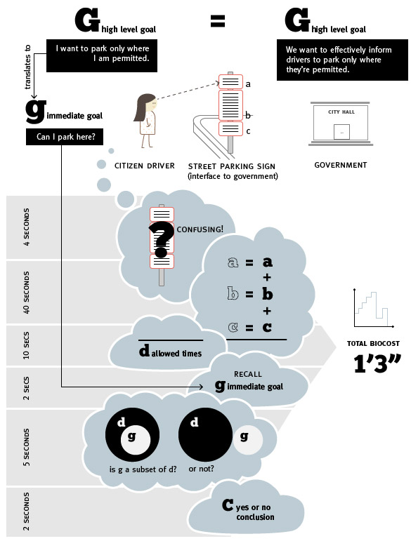
Sylianteng also posted on her blog an illustration of the problem in terms of biocost, as part of her Cybernetics class with Paul Pangaro. [2]
Sylianteng has been going around Manhattan and Brooklyn hanging up rogue revamped parking signs. “A friend of mine called it functional graffiti,” she says. She’ll stick a laminated version right below the city-approved version and ask drivers to leave comments. In that way, Sylianteng’s design is still a ways away from being a reality, but so far, she’s gotten pretty good feedback. “One person wrote: ‘The is awesome. The mayor should hire you.’” [1]
————————————————————————
Sources:
[1] Liz Stinson, A Redesigned Parking Sign So Simple That You’ll Never Get Towed, Wired, July 15, 2014, http://www.wired.com/2014/07/a-redesigned-parking-sign-so-simple-youll-never-get-towed-again.
[2] Nikki Sylianteng, blog, http://nikkisylianteng.com/project/parking-sign-redesign/.
