
Readers:
This is something I find to be very worthwhile and a great tool to have available when you have data, but can’t decide on which visualization is best to use.
The Data Visualisation Catalogue is currently an ongoing project developed by Severino Ribecca.
Originally, Severino started this project as a way to develop his own knowledge of data visualisation and to create a reference tool for him to use in the future for his own work. Fortunately for us, Severino thought it would also be useful tool to not only other designers, but also anyone in a field that requires the use of data visualisation regularly (economists, scientists, statisticians etc).
Severino website is very comprehensive, detailed and can help you decide the right method for your needs.
He plans on adding in new visualisation methods, bit-by-bit, as he continues to research each method to find the best way to explain how it works and what it is best suited for.
The project itself is in the developmental stages at the moment.
All news and website updates can be found on Twitter.
I also encourage you to donate to this cause. I just donated today.
Best regards,
Michael
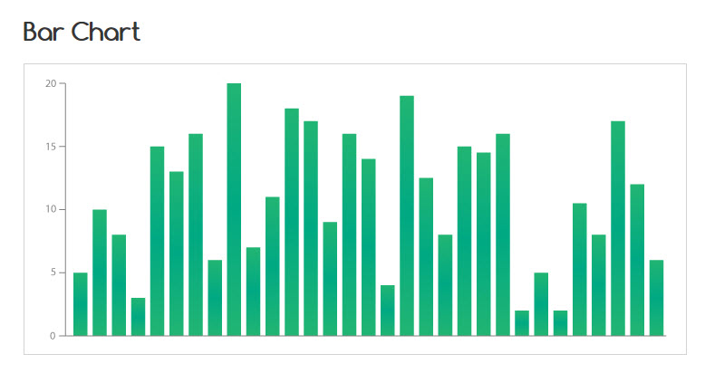
Below is an example of how Severino has catalogued the Bar Chart


Thanks for this piece. The site helped me put a lot into perspective. The part I really love is the link to software one could use in creating the visualization under discussion.
a good resource, thanks for the recommendation.
Reblogged this on What It Is…? and commented:
Had to repost this. Excellent resource for data visualisation designers