![]() Hello Readers:
Hello Readers:
![]() I just found out I am one of the 2014 winners of the MicroStrategy World Dashboard Contest. I was also one of the winners last year.
I just found out I am one of the 2014 winners of the MicroStrategy World Dashboard Contest. I was also one of the winners last year.
I get a free pass to MicroStrategy World in Las Vegas which is the last week of this month. Last year, they gave us awards too. Not sure yet if they will do the same this year.
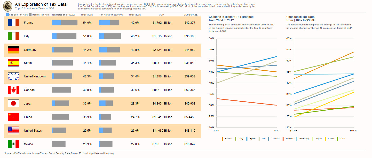
An Exploration of Tax Data
My dashboard is an exploration of tax data. It explores taxes rates for the top ten counties in terms of GDP.
I used horizontal stacked bar charts instead so that the viewer can visually see how social security and income tax rate add up to the total and explains visually why the countries are ordered the way they are on the dashboard. I also separated out $100K and $300K percentages into separate visuals.
In addition, I added the flags of the countries. Yes, I know, chart junk!
Now, you don’t see any numbers on the data points in this dashboard. The reason you don’t see them is because they appear when you mouse over a bar where you then see the country, category and the percent value as a tooltip.
Here is a screenshot of my entry. It was written with MicroStrategy v9.3.1, Report Services and the Visualization SDK.
Best regards,
Michael
Click on image to enlarge