*sigh*
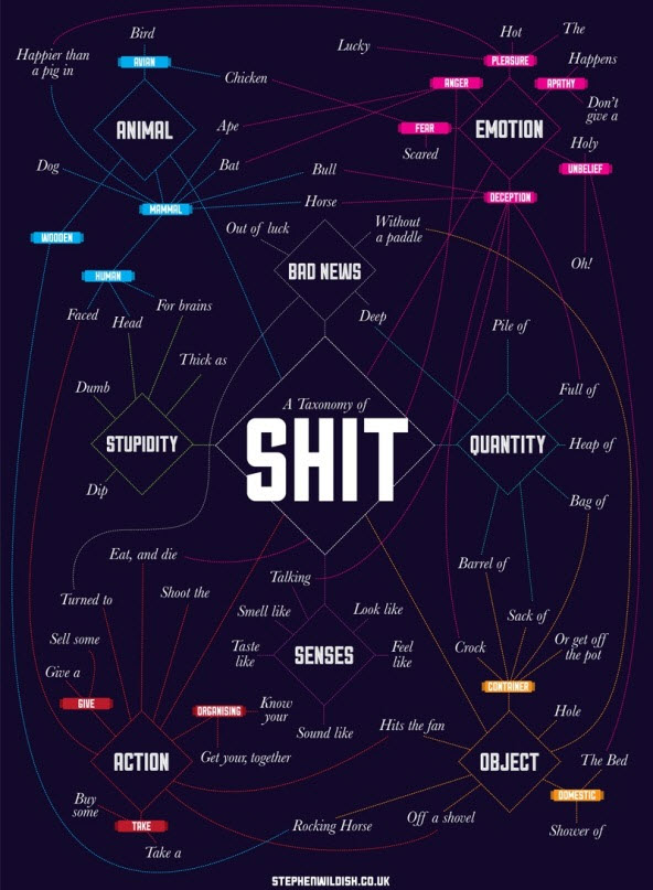
So, here we are at the end of 2013. I came across this infographic the other day and have been debating whether to post it or not. It is an infographic of a taxonomy of the word “shit”.
Now, to be fair, I did post an infographic months ago about the composition of poop. And, I did post another one about pee. So, the bar for these types of infographics has already been set (sort of). In the end, I went with the fact that I found this infographic to be not only humorous, but also interesting in how it visually shows the various ways we use the word “shit.”
I suppose we could take a lot of common words we daily use and substitute them in this chart. I am sure we would be surprised by the different way we use that word.
