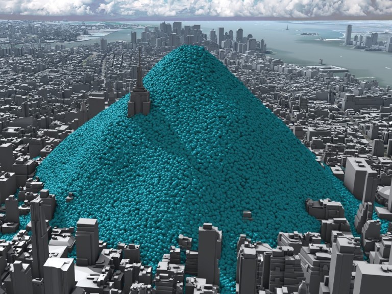
New York’s Carbon Emissions—in Real Time, by Adam Nieman, Creative Director, Carbon Visuals and Chris Rabet, freelance director and digital visual effects artist
This is a still from an infographic video that conceptualizes the 54 million metric tons of carbon dioxide that engulfed New York City in 2010. Designing the blue spheres—which each represent about a ton of CO2—took serious consideration. “We want the audience to focus on the rate that the spheres emerge and the size of the pile. We don’t want [people] to be distracted by questions such as, ‘Why are they moving like that?’” says Adam Nieman. “We put effort into making them move in a way that fits with viewers’ expectations of how slightly heavier-than-air gas might move.”
