Note: I was supposed to have attended Stephen Few’s three data visualization classes this week in Portland, but preparations for a client presentation in Paris next week made attending impossible.
Dashboard Insight posted a synopsis of a post Stephen did on Data Visualization and the Blind. My wife has worked in Special Education for over 39 years and I feel this is a very important topic as we become more of a visual society. I am including the synopsis from Dashboard Insight which also has a link to the full post on Stephen’s Perceptual Edge Website.
One “6 degrees” side note. Stephen mentions in his article that he received an e-mail from Mark Ostroff which motivated his blog on this topic. I knew Mark many years ago. Mark was (and probably still is) the definitive guru on all things Hyperion. I actually went to the Hyperion World Conference one year in Chicago and attended several of Mark’s sessions. A very innovative and passionate speaker.
I will be doing some Paris/France themed data visualization blogs over the next week or so. So stay tuned and laissez le bon temps rouler.
Best regards,
Michael
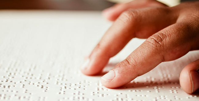
Dashboard Insight had posted an article on data presentation for the blind a couple of weeks ago. There was little information out there on how to handle it and what measures there are for translating information displayed within data visualization or a dashboard to the blind. When Stephen Few posted on this subject a couple of days ago we were quite excited.
“I’ll begin by stating my fundamental position: a dashboard that is accessible to the blind is a contradiction in terms. “A dashboard is a visual display of the most important information needed to achieve one or more objectives, consolidated and arranged on a single screen so the information can be monitored at a glance” (Few, 2005). No forms of data visualization, not just dashboards jam-packed with graphics, can be made fully accessible to someone who is blind. I am not insensitive to the needs of people who are visually or otherwise impaired. I am merely pointing out what anyone who understands data visualization knows: no channel of perception other than vision can fully duplicate the contents of graphs. Similarly, what someone can communicate through the audio channel in the form of music cannot be fully expressed visually. If it could, why bother performing or recording music? Why not just distribute the written score? Vision is unique in its abilities to inform and enable thinking. Those who lack vision can develop their other senses to compensate to an amazing degree, but never in a way that fully duplicates the visual experience.”
“The information that is displayed in a dashboard can and should be presented to people who are blind in a different form when needed… Unfortunately, an alternative form of presentation will not convey all of the information contained in a well-designed dashboard and it won’t communicate the information as efficiently, but if someone who is blind needs the information, it behooves us to provide a reasonable, even if imperfect, alternative. The alternative, however, will not be a dashboard. By definition, a dashboard is a visual display, because the visual channel provides the richest and most efficient means of presenting information for monitoring purposes, which no other channel can match—not even close. If airlines were required by law to provide flight-phobic customers with an earthbound form of transportation, that alternative would be called a train or a bus, not an airplane. In like manner, a means of monitoring that uses braille or a screen reader as its medium should not be called a dashboard. There’s enough confusion about the term already. Let’s not muddy it further.”

It is an insightful and educational read we recommend. You can find the full article here.
