
Source: Jeff Clark, Neoformix, February 26, 2013
Back in February of this year, the Guardian Datablog published an interesting post called Obesity worldwide: the map of the world’s weight. It contains a map that shows with color the rates of obesity around the world. If you click on a country (for example, I clicked randomly on Denmark), it triggers a pop-up window which gives you more detailed statistics for that country for different time frames and for both male and female (see screenshot below).

As you review the chart, several other interesting questions come to mind that could not be easily answered with the map or chart.
- What is the trend over time?
- Do these trends exist worldwide?
- Which countries are exceptions to the trend?
- Which countries have the highest or lowest rates of obesity?
- Are there large gender-based differences in obesity rates in various countries?
Mr. Clark has a background in science, He decided to try to build an interactive visualization that helped answer the questions above. He wanted to try to build something that explicitly highlighted some of the more interesting aspects of the data without sacrificing freeform exploration. Ultimately, he settled on using a Slopegraph which was first described by Edward Tufte and is featured on the cover of Cairo’s excellent book The Functional Art.
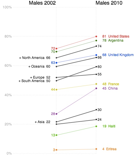
This first image below shows the trend for male obesity organized by continent. It’s a difficult problem to show labels for so many countries along one axis so Mr. Clark tried to alleviate it by letting the user expand or hide countries by continent group. In this case ‘North America’ is expanded to show its’ individual countries. Labels are only shown if they don’t overlap with others. The largest countries by population are placed first.
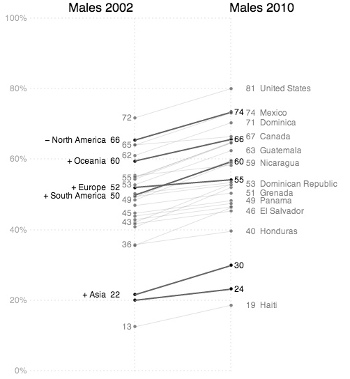
Individual country lines can be clicked on to emphasize them with color.
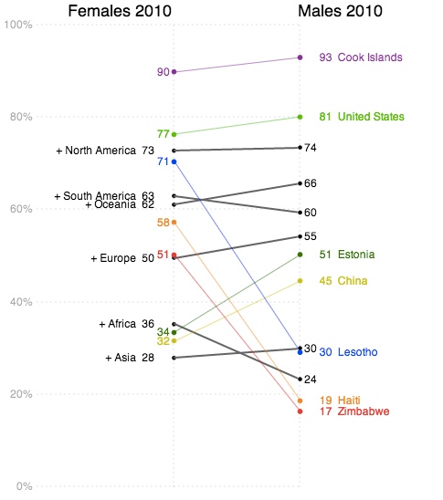
The third example shown below charts female values on the left against male values on the right in order to emphasize gender differences.
The interactive visualization includes a ‘stepper’ that takes the user through four different views. This helps introduce functionality gradually as well as serving to emphasize important patterns in the data.
Mr. Clark used Processing and Processing JS to build the application. The code for the dashed lines comes from J David Eisenberg.
