 Steve Wexler
Steve Wexler publishes the blog Data Revelations ( http://www.datarevelations.com ). He is a Certified Tableau Trainer who has developed thousands of interactive data visualizations. As Director of Research and Emerging Technologies for The eLearning Guild, Steve designed, developed, and managed the world’s largest e-Learning data collection and analysis laboratory. As Director of Research Systems for i4cp, Steve applied data visualization and advanced quantitative research expertise to transition the company from a static survey publication model to an online interactive model.
As founder and president of WexTech Systems, Inc., Steve was a pioneer in the development and use of single source publishing software and embedded help systems. Steve also helped create AnswerWorks, a natural language search engine embedded in scores of commercial products that are used by millions of people every day. Steve was also chief architect for Microsoft Windows 95 Starts Here, the official learning companion to Microsoft Windows 95.
Steve has consulted to and developed systems for major corporations including Microsoft, The Department of Defense, Chase, American Express, and Citigroup Global Markets Holdings. Steve has also written several best-selling computer books and is a top presenter at trade shows and conferences.
Steve attended Princeton University and was awarded a fellowship from the University of Miami.
Monthly Makeover
Steve recently posted on his blog a makeover of Utah State Univeristy’s recently published Survey of Student Engagement. Utah State is one of many collegiate institutions that have participated in NSSE’s national survey of student engagement (see http://nsse.iub.edu/ and http://nsse.iub.edu/html/about.cfm).
The Good
Utah State University should be lauded for making its survey results available in an interactive format. This is a great way to foster engagement from students, faculty, administration, and other interested parties.
The Bad and The Ugly
It’s almost impossible to glean anything useful from the published results.
The “Before” Picture
Here’s a screenshot of the analysis of the first set of questions in the survey (see http://usu.edu/aaa/nsse_paged.cfm?pg=1)
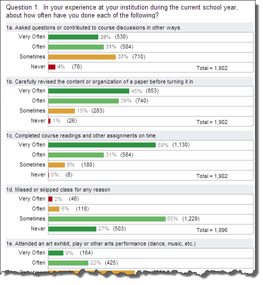
Five of the ten questions in the group — this requires lots of scrolling and makes it impossible to compare results across questions
Note that there are a total of ten Likert scale questions in this set and they are presented in the same order that they appeared in the survey.
Steve decided on a few questions he wanted answered from the graph above. Here is a list of things that he wanted to know, but could not glean from the visualizations:
- Which activities were done most often and which were done least often?
- Are there any significant differences when you compare results by gender?
- Are there any significant differences when you compare results by ethnicity?
The “After” Picture
Steve has written extensively on the best ways to visualize Likert Scale data (see http://www.datarevelations.com/likert-scales-the-final-word.html and http://www.datarevelations.com/mostly-monthly-makeover-masies-mobile-pulse-survey.html).
Here’s what happens if we apply this approach to the Utah State University NNSE data.
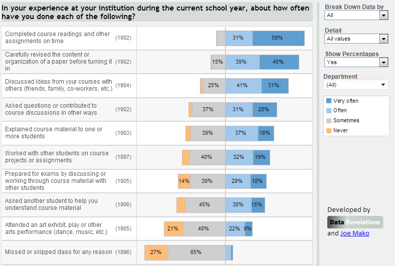
Divergent stacked bars showing all responses
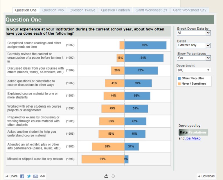
And if we apply a parameter setting to only show extremes (e.g., “very often/often” vs. “sometimes/never”) the results are even easier to sort and grok.
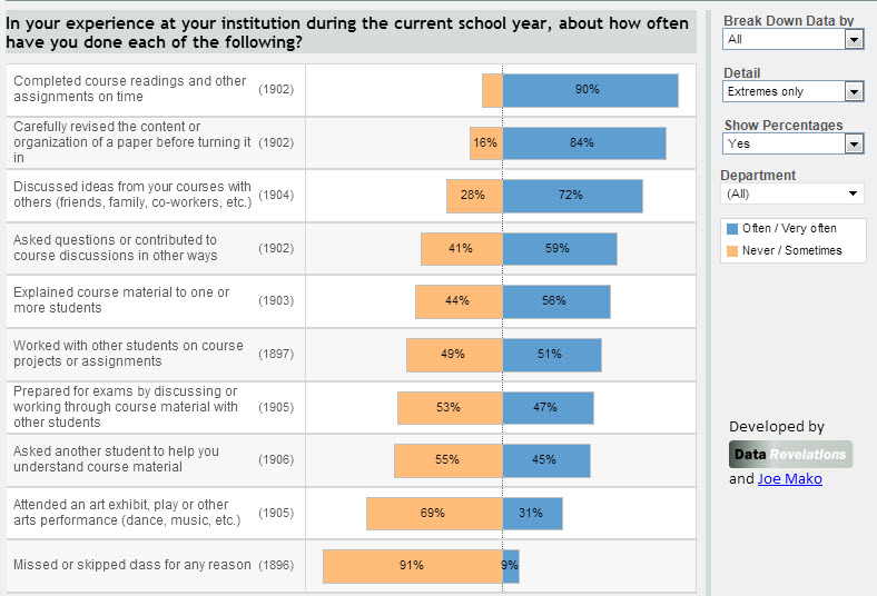
Divergent stacked bars combining responses
This approach also allows us to break the data down by gender and see if there are any questions where there are major differences (and there are major differences).
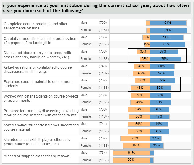
Comparing results by gender
We can likewise distinguish major differences from Caucasian / non-Caucasian respondents when we look at the results from Question 14.
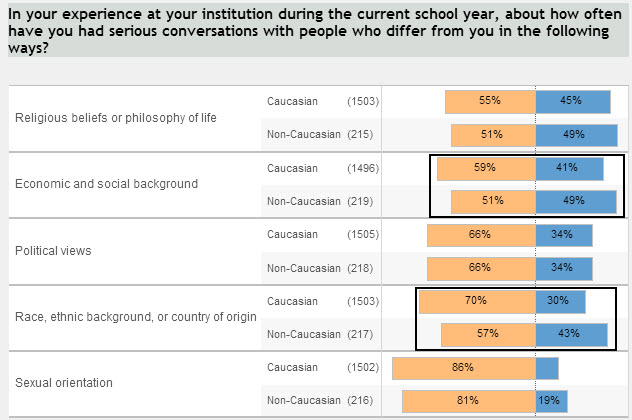
Comparing results by ethnicity
Seven-Point Likert Scale Examples
Here’s another set of results for questions where the students could provide seven possible responses.
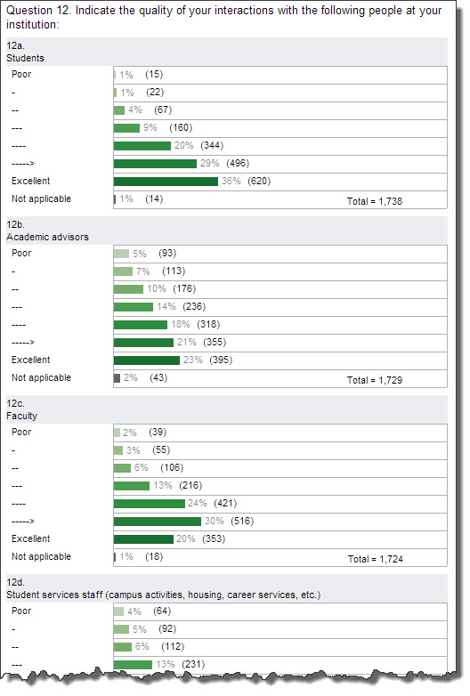
Impossible-to-compare seven-point LIkert scale questions
We can’t make any sense of the data when it’s presented as a bunch of bars, but when we use divergent stacked bars it becomes very easy to compare and sort the results.
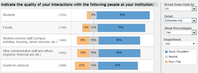
Combined values for seven-point Likert scale questions
Recommendations Steve had for Utah State University
- Continue to make these results public, but make the results usable. You can do this by…
- Reshaping the data to make it much easier to manage in Tableau (see http://www.datarevelations.com/using-tableau-to-visualize-survey-data-part-1.html).
- Using divergent stacked bar charts to display Likert scale data.
Steve has published on his blog site four sets of questions from the survey as Tableau Public interactive dashboards.
Here is a screenshot of what the dashboard looks like. Click on the screenshot to be re-directed to Steve’s site to see the dashboard in action.