 Ben Jones is a Tableau Public Product Marketing Manager with Tableau Software. Ben recently spoke at Data Visualization New York. I wanted to share some of Ben’s thoughts. You can also find the full article on his blog.
Ben’s presentation focused on how to use Tableau as a data discovery tool. Lucky for Ben, the amount of data about New York is as abundant as everything else about the city. There was no shortage of material, from garbage to graffiti to rat sightings and electric consumption. New York hiccups, and it gets recorded.

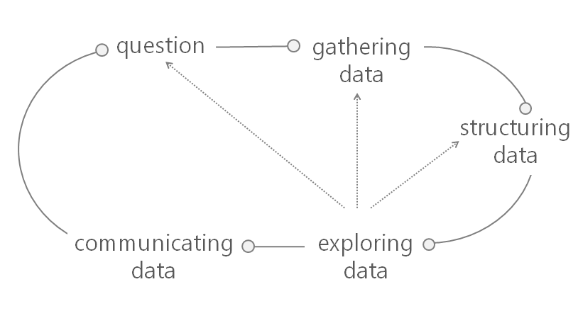
Ben made the analogy that using Tableau is like riding Secretariat – you get the distinct advantage of being able to race around the track a rapid rate, transitioning between the phases and quickly identifying patterns, outliers and trends in your data.
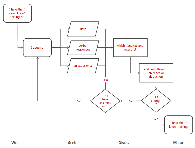
Ben also made a somewhat philosophical point that data is only one type of input in the overall learning process. Using data has its benefits and limitations. A benefit is that you can obtain valuable “explicit knowledge” – who, what, when and where? A limitation is that it’s often difficult to answer “why?” and “how?” using only data. Consider riding a bike: what’s a better way to learn, reading about it or doing it? And consider New York: no matter how many charts you see about the city, nothing replaces the unique experience of walking its streets and riding its subways. Tacit knowledge. Often the best outcome of data discovery is that you know what questions to ask in the analog world.
Here is a diagram showing the overall learning process, and how data fits in as a specific type of input:
As pointed out earlier, there was a wealth of data to explore and visualize about New York. Ben explored a number of those data sets, and here are a few of the projects he recreated during the 1 hour time slot he was given at Data Visualization New York (focus was on learning, not fit & finish).
Click to open an interactive version:
1. “Know what” – Garbage data: DSNY Collection Tonnages (get the data here) 
2. “Know where” – The Bridges of NY & NJ (get the data here): 
3. “Know when” – Rat sightings in NYC (get the data here) 
